42,341
69
3,738
INSTALLATION:
For FM Edition:
Extract the vexillium and vexillium widgets folder to:
C:/Users/<yourusername>/My Documents/Sports Interactive/Football Manager 2014/skins
If this folder does not exist, create it.
For FMC Edition:
Extract the vexillium and vexillium widgets folder to:
C:/Users/<yourusername>/My Documents/Sports Interactive/Football Manager 2014/skins
If this folder does not exist, create it.
For Both:
Extract the vexillium, vexilliumfmc and vexillium widgets folder to:
C:/Users/<yourusername>/My Documents/Sports Interactive/Football Manager 2014/skins
If this folder does not exist, create it.
CHANGELOG:
31/3/14 - Updated to v1.2
1. I've sorted the fonts out so all fonts use Lato now.
2. I've put the next match day details back on the processing screen (and added something)
3. I've fixed some alignment issues
4. Fixed lack of continue button on FMC (still doesnt show on matchday, spacebar still required)
5. Fixed nation selection screen at game start
6. I've edited the background opacity overlay to be 40 not 60 so screens aren't so dark by default
7. Added FMC style panels to Vexillium FMC
20/3/2014 - Updated to v1.01
1. Fixed a bug that caused the FMC version to use the default text colours
2. Fixed an issue causing black writing on the match screen
20/3/2014 - Updated to final v1.0
1. Replaced all remaining images
2. Removed bgselector in favour of user backgrounds.
3. Changed actionbar background to black in a match to make things easier to read.
4. Created overlay on background to ensure writing is legible
5. Changed text colours on menus and match panels
6. Created in-game overlay so the match screen is dimmer, this prevents eye-strain aswell as making the match look more natural and realistic.
7. Improved the header to make it even more ribbon-like :p
8. Improved to processing panel so its easier to read.
9. Fixed any language bugs that were left over (I've had my game playing in Portuguese for the last 2 days :p)
15/3/2014 - Updated to final BETA v0.9b
1. Fixed lack of header image on the match screen
2. Replaced most buttons and other GFX (about 80% done now)
3. Fixed transparency and images in the processing screen
4. Removed transparency from sender bar in news feed to be more flat
5. Changed the dialog and wizard boxes
14/3/2014 - Updated to 0.8b
1. Graphics replacements done for all boxes, processing screen, header and menubar, still got buttons and other things to replace.
2. Fixed unreadable text issue on actionbar.
3. Text colours changed.
4. Show filters button working again.
11/3/2014 - First Release - Version 0.7b
CREDITS:
Kiwi for the base skin, Nuu, that I worked from.
kun for his work on the player panels (I have modified them slightly)
Me, for being patient enough to go through hundreds of images in Photoshop, editing and saving, editing and saving....
Everyone who BETA tested it and helped me go through fixing the bugs.
Comments
You'll need to Login to comment
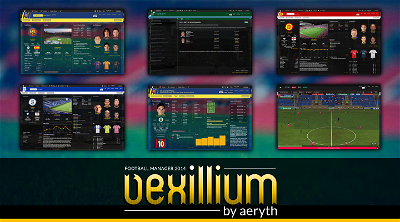
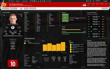
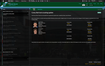
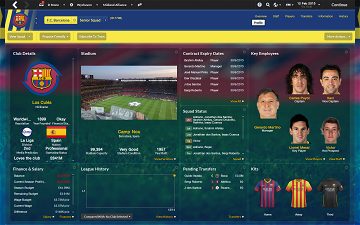
Aerythrylin
You may indeed Kiwi.
Marc Calladine
kenshin2k
Also it seems that training information is not editable in fmc.
Aerythrylin
kenshin2k
I didnt know about the space bar
Jordi_7
And also all backgrounds are extremely dark, can i change the opacity and the brightness somehow?
nyg87
Aerythrylin
@Jordi_7: I've noticed main text font doesn't change to Lato like the rest, I will fix that aswell if you like, the fonts are controlled by the vexillium/fonts folders files. As for the background, if you want it brighter do this.
Open your vexillium/graphics/boxes/overlay folder and choose an opacity percentage (20, 40, 60 or 80) copy the images from the corresponding folder and paste them to your vexillium/graphics/bgoverlay folder overwriting any images it asks you to.
@nyg87: You need to download a stadium images pack, you can get one HERE
Fred2woh
How can I have a lighter background like in this pic : https://imageshack.com/i/eui5dgp
Mine is so dark, like you can see in that one : http://cl.ly/image/1b3i3k3h2i1r/Capture%20d%E2%80%99e%CC%81cran%202014-03-31%20a%CC%80%2000.28.42.png
It would be sooooo awesome!
Aerythrylin
Open your Vexillium/Panels folder and open client object browser.xml in Notepad. Find this bit of code:
<!-- overlay to dim the background - covers entire screen -->
<widget class="picture" file="bgoverlaywhite/paper" />
Delete it all and then save the file.
Go into FM and delete your skin cache and reload the skin. No more darkness.
Fred2woh
Also, you made an amazing skin, congrats!
Aerythrylin
The only reason I put the overlay on the background was because text became hard to read if you used user backgrounds (stadium/player/club)
y1ann1s85
Aerythrylin
y1ann1s85
Aerythrylin
y1ann1s85
y1ann1s85
Groktah
This is for FMC i'm talking about by the way.
Aerythrylin
AstroZombie1
Aerythrylin
Aerythrylin
venomix
Hope you can help.
Deano1903
If you could let me know what panel(s) I need to edit that would be great please.
Aerythrylin
The red bar is controlled by the header.xml, the bit that says titlebar and match titlebar, change the heights to something smaller.
The white bar is controlled in the client object browser.xml and is in the bit about action bar, change the height again to something more appropriate
This look better? (Current Version)
gizeL
Right menu and players name/role over compressed, smaller logos. result: less stylish than before.
Maybe a middle way could be the best.
Anyway great work on that, really. I tried to wrote my suggestions about your skin on the skinning hideout forum in the Si community, but im still waiting a mod to approve it. If they'll not publish my comment there, maybe i'll copy it here.
Keep it up bro, definitely best dark skin around
stef3127
Deano1903
Yeah, I really like those, any chance you could zip up and forward the panels for me please?
korny87
Guys can somebody tell me how to make font littlebit larger couse this is very small on 1680x1050 resolution.