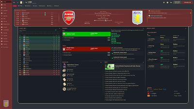
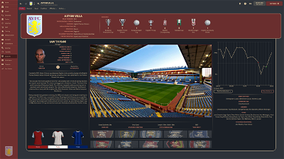
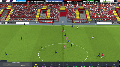
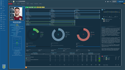
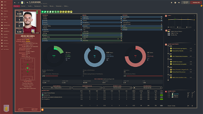
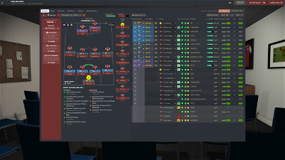
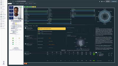
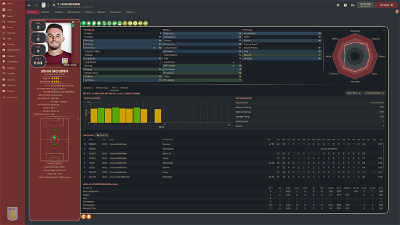
A simple, clean skin, ideal for those playing at higher resolutions who don't want to be bombarded with information they rarely (or never) use. QHD version for 2560x1440 (up to 110% zoom) and FHD version for 1920x1080 (up to 100% zoom)
TEAM COLOUR VERSION NOW AVAILABLE
Testimonials
"It's different, I'll give you that" -- anonymous
"You sure do like boxes and the colour grey" -- anonymous
"I don't play your stupid football spreadsheet game. Stop asking me for a quote!" -- anonymous
Features
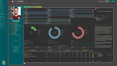
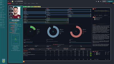
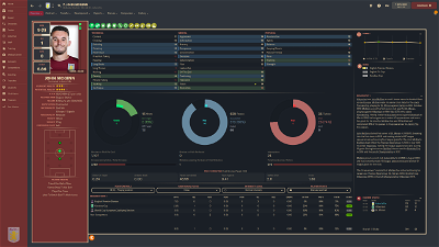
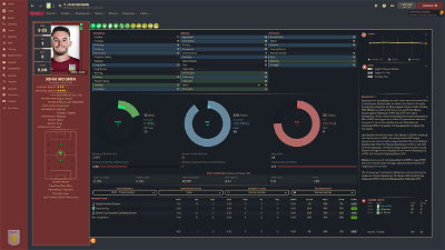
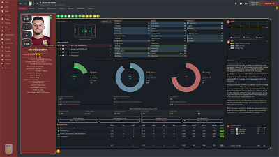
- Customisable colour scheme, frame style and player layout (instructions in zip file)
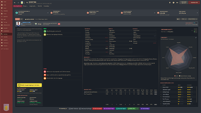
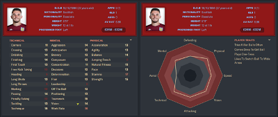
- Attributes shown in Scouting Card
- Inobtrusive Pros & Cons layout, minimizing unused blank space for non-scouted players.
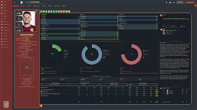
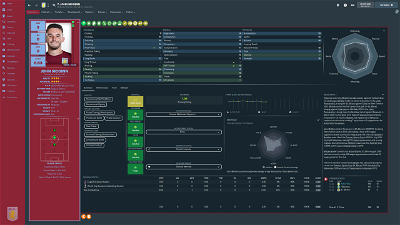
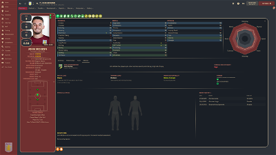
- Unique home and player profile panels, including combined Scouting Centre with Reports summary, full Medical Centre & Team injuries panel, Player Training Feedback
Patch Notes
v1.6 - Winter Update response
- Removed customised scout report views
- Edited visualisation on player overview
v1.5
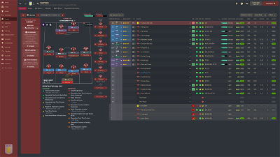
- Adjustments to pre-match tactics page on FHD version to prevent players at bottom of screen being inaccessible
- Translation fixes
v1.4
- Updated layout for FHD version
- Added Team Colour for FHD version
- Fixed: "Quit to Start Screen" not available - intro panel removed
v1.3
- Added Team Colour skin
- Fixed: Unable to pin data hub reports from Player -> Reports -> Player Performance
- Fixed: Deadline Day: text unreadable for selected row on sidebar
- Added alternative scorecard layouts
- Added tabbed player overview to allow greater focus on the areas that matter to you
- Removed alternative player overview folder, with functionality available from selectors on profile
v1.2
- Added Instant Result button
- Updated player pop-up to include preferred foot, personality, attribute analyser and traits
- Added alternative layouts with both footedness shown
- Added new frame type ("double border")
v1.1
- Fixed: Unable to leave inbox with unread messages when "icons only" on sidebar
- Fixed: Alternative colour schemes not working on FHD - fix expected on 29/11/21
- Fixed: Key stats not visible when using alternative role & duty overview on FHD - fix expected on 29/11/21
- Updated Attribute Analyser to fit colour scheme
Credits
sebastian_starttrbts & Tyburn - whose work on creating non-numeric attribute skins inspired me to learn myself
Michaeltmurrayuk - for his base skins, and assistance in various skinning queries
wkdsoul - for his assistance in various skinning queries
bluestillidie00 - scouring through the xmls for TCS taught me a lot about how half of this stuff works, as well as his assistance in various skinning queries
Wozzie - for fixtures and results panels for club overview
Heffem - for training selectors on player profile
Bugs/Future Requests
If you notice any bugs/issues, please do get in touch, and I will see if they can be resolved. Similarly, if you have any requests for future features, please let me know, although for full transparency I have no intention of adding any information pertaining to hidden information (CA/PA etc...)
Known Issues
- Club Info not showing for some users (still under investigation)
Future Plans
- Light version
- Graphical attribute version (non-numeric attributes)
Usage Rights
This skin is completely free for personal use, but may not be sold or placed behind a paywall. If you plan on using the skin publicly, or repurposing a unique element for own skin, please provide credit and a link to this post. If, for whatever reason, you are so enamoured with this skin you want to send me a coffee, feel free to donate via PayPal here
Comments
You'll need to Login to comment


aaron austin
will you add instant result in future love the skin tho
gimn85
Yes! I've actually just finished adding it, and it will be included in the next update, which is likely to be Thursday evening/Friday morning.
gimn85
Instant result has been added, and the download link is updated with the new version.
JoãoCarvalho92
The button to go to initial menu have a error, sometimes stop working and i have to close all game.
Can you see that error ?
gimn85
Hi Joao,
Can you send a screenshot of the problem, as this might help me identify the problem? Also, can you tell me which skin you are using and what resolution your screen is?
AML
Incredible, really love the ability to customize your own colour scheme.
This is mine for my save with Valencia I am about to start
Thank you so much @gimn85
gimn85
Looks fantastic. Really like the blue-orange combo
km995
how do you customise your own colour scheme?
AML
In the mustermann alternatives folder there is a readme.txt file that explains how. You can open an rgb color generator and play with it. Copy the rgb code from the settings file and see what color it is and which color you want instead
AML
Is there a way to have the club logo more visible? Seems like it is a bit blurred now, would like it to be really strong and visible
km995
thank you!
gimn85
A few options here:
1) Try different logo packs. I think most are at 200x200, so might not make much difference, but obviously wherever anything is scaled it will lose fidelity whether it is enlarged or shrunk.
2) Edit the .xmls and remove scaling, I've provided the code to change it to below. This may cause problems if the logo file is bigger than the space it occupies. Less of an issue if smaller, but it will just leave a little more space around it.
panels/club/club overview panel, row 12:
<widget class="picture" id="pict" scale_picture="false">panels/generic/sidebar menu table, row 140:
<widget class="picture" id="lgtF" scale_picture="false" keep_aspect_ratio="true" transparency="0.5" image_alignment="bottom">3) If it's just the logo on the club overview header, you could edit the height of the panel. Below I've made the header smaller, changing default height from 230 to 200:
panels/club/club overview panel, row 12:
<container class="bordered_box" appearance="mustermann/frames/frame" blue_replacement="fg" red_replacement="fg accent1" transparency="10" draw_vertical_dividers="false" inset="0" default_height="200">*in terms of the header/search bar, I've not touched this in the skin, so there won't be a file to play around with that will directly target the logo up there.
AML
Sorry, I meant stronger in color. If you look at my SS a few posts ago the Valencia logo on club profile in the bottom left corner looks a bit blurred/hidden behind the blue color. If I am making any sense.
I would like the logo to be on top so to say, to have the logo colors be more prominent instead of the sidebar color. Thanks
gimn85
Apologies, I misunderstood. Thankfully, it's in the same place as mentioned before - you will need to change the transparency. Perhaps counter-intuitively, you'll want to increase it from 0.5 to make it less transparent. I'd recommend trying the below code.
panels/generic/sidebar menu table, row 140:
<widget class="picture" id="lgtF" scale_picture="true" keep_aspect_ratio="true" transparency="0.9" image_alignment="bottom">AML
Thank you, this worked like a charm.
Can you take a look at this next SS please. Idk if I changed something or was it no green pitch on tactics screen from the start, but I would like to have the green pitch if possible please. Right now I have only black background.
gimn85
@AML The green had been taken out deliberately, so to change it back you'll need to edit panels/tactics/tactics overview side panel, row 68 and panels/tactics/tactics overview side panel minimised, row 69 to:
<container class="main_contrast_box_no_margin" entity_layout_id="it15" id="bakC" wants_mouse_events="true" inset="0" red_replacement="pitch_box_background" width="890" name="green background" navigation_container="true">AML
Thank you very much, but I did that and still have the black pitch only
JoãoCarvalho92
If i delete the skin the button to the initial screen come back, is very strange. Is the only skin i have.
i use the FHD, is the resolution for my pc
gimn85
You might need to edit settings.xml as well, line 323. The default would be:
<colour name="pitch_box_background" value="rgb(0,125,63)"/>gimn85
Thank you. I'm looking into this, and once I've worked out what's causing it, I'll let you know!
felixxxx79
how do I install this alternative blue background? what files to replace?
gimn85
There is a readme file in the Alternatives folder that tells you what to do. Easiest way open two folders in separate windows:
1) The alternative you want to use
2) The skin you are using
Copy the folder inside the alternative you want to use over to the folder inside the skin you are using. When it asks you if you want to override the files, click yes.
felixxxx79
thanks a lot
gholliday87
HI, lovely skin. Any way too shift the picture to the right slightly so the boxes aren't that far over? Or reduce them slightly?
gimn85
Unfortunately I am now away for a course, and only have a Chromebook with me, so will be unable to give exact answers. A couple of options:
1) Wait until Thursday. The next update will include an option with the scorecards beneath the player picture.
2) Have a go at editing panels/player/player overview panel.xml - there will be a section marked as <!--PLAYER PICTURE--> and then a few lines below that a bit that starts <widget class="picture"… - add a blank line below with the following code:
<layout class="stick_to_sides_attachment" alignment="right" inset="-50"/>You might need to play around with the value in inset. If that ends up shifting the picture to the left, try a positive value instead of negative. Sorry I can't be more definitive right now.
JoãoCarvalho92
@gimn85 Did you check the other problem ? Or didnt found the problem ?
And another thing,
How can i change the of the stats black and red ? For me needs to be more clearer, i cant see them very well. The whites are good but the others are a problem.
gimn85
Hi João,
The attribute colours are controlled in settings/MustermannFHD settings.xml, rows 341-344. They currently look like:
<colour name="low attribute" value="bg lighter"/><colour name="normal attribute" value="fg accent1"/><colour name="good attribute" value="fg" /><colour name="excellent attribute" value="bg accent1" />You will want to change the values for low attribute and normal attribute. To make them a little more visible I'd recommend:
<colour name="low attribute" value="card bg lighter"/><colour name="normal attribute" value="fg lighter"/><colour name="good attribute" value="fg" /><colour name="excellent attribute" value="bg accent1" />I've still been unable to find out what's causing the other problem, but still got a few other ideas to try to see if that fixes it. It is pure guess-work at the moment, so may end up being something I'll never be able to solve!!
gimn85
A little later than initially planned, but I've just uploaded the new version, which includes scorecards underneath the player picture
gimn85
@JoãoCarvalho92 There's been a breakthrough!!!
The issue is caused by the customised start screen (the silly subbuteo image). I'll be trying some fixes tonight or, if none of them work, I'll just go back to the default start screen. Either way, there should be a new release by tomorrow morning.
mydreamteam11
excellent skin but would like a version without the stat boxes near the players faces, the updated version is better but would like to see the boxes either taken away or positioned away from the player faces. otherwise this is a top skin