So a friend of mine has recently started a racing Santander, and I decided to help him with some new kits inspired by retro designs, regional legacies, brands and traditions.
The home kit takes on the typical Kappa ‘old school’ feel with the chunky shoulder panels and trying to feature a faded green design to carry over into the away kit which takes on the clubs badge colours, featuring the distinct green featured on its flag. The third kit takes all things Santander and Cantabria (the region from which Santander is found) and combines it all into one. The Red is the kits first ever colours, in 1912/13. The waves and the blue/white collar accent are featured on the Cantabria coat of arms as well with all three tied together with the “Cierva” sponsor, a beer brewed directly in Santander.
I'd love some feedback OR if this is posted in the wrong area, please let me know. Thanks!
I would made the sponsor and kappa logo on the red shirt white.
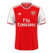
Decided for FM25 im going to rebrand the entire BPL and redo all the kits. any chance people you could take a look at the list and give me some ideas if i've missed anything?
Arsenal - Adidas - Emirates Red/White/Gold Yellow/Navy 94/95 inspired Blue/White Striped 1892 Royal Arsenal
Aston Villa - Adidas Claret/Blue/Yellow White/Claret Black/Green/Red 94/54 Away inspired.
Brentford - Hummel - Red/White Blue/Sky Blue Burgundy 1889 Inspired
Could someone do fantasy kits for Paris FC? I mean, after rumours about takeover by Arnault Family and RedBull, I was thinking to have something like kits made by louis vuitton and sponsor on kits just redbull logotype without any letters (like other rb clubs have). Can anyone help with this?
Good evening, everyone. My first contribution to the Forum will be with the jerseys of Brazil, my country, Fluminense (the team I love), Ceilândia and Capital-DF (the teams from my region that play in the Série D of Brazil. There are some great updates that allow you to play the lower divisions of our championships). I posted the 2D and 3D kits in their respective Forums.
If you like them, I have many other kits available (2D and 3D), mainly from clubs in the lower divisions of the Brasileirão and from national teams. Some of the kits are fantasy, but I still make them very similar to the originals. These other kits can be found in the links below: https://postimg.cc/user/paulopavel (make sure to always download the 3D kits in the correct resolution: 1024 x 1024), or here https://fmkitcreator.com/showcase/user/623950 .
In my spare time the past few weeks I have been creating many, many kits for a number of teams so i shall share them here, I do have 3D kits for all of the kits i post on here also 🙂
ARSENAL HOME 1ARSENAL AWAY 1ARSENAL THIRD 1ARSENAL HOME 2ARSENAL AWAY 2ARSENAL THIRD 2ARSENAL HOME 3ARSENAL AWAY 3ARSENAL THIRD 3
Thomas “Kaziniho” White
So a friend of mine has recently started a racing Santander, and I decided to help him with some new kits inspired by retro designs, regional legacies, brands and traditions.
The home kit takes on the typical Kappa ‘old school’ feel with the chunky shoulder panels and trying to feature a faded green design to carry over into the away kit which takes on the clubs badge colours, featuring the distinct green featured on its flag. The third kit takes all things Santander and Cantabria (the region from which Santander is found) and combines it all into one. The Red is the kits first ever colours, in 1912/13. The waves and the blue/white collar accent are featured on the Cantabria coat of arms as well with all three tied together with the “Cierva” sponsor, a beer brewed directly in Santander.
I'd love some feedback OR if this is posted in the wrong area, please let me know. Thanks!
Copywriter
I would made the sponsor and kappa logo on the red shirt white.
Macarrao
Try to made the supposed City away kit
Macarrao
Probably the kit from Benfica to 24/25
alejobostero
could you please do this fictional design of bayern munchen kit - I do not like this year's model, I was hoping to go back to mostly red
Copywriter
Is this what you mean?
alejobostero
Ohh man, this is beautiful, thanks a lot
KeldVilla
Anyone could make the Leeds kits with Red Bull as sponsor??
KD95
Latest set for my Airdrieonians save.
Thomas “Kaziniho” White
Decided for FM25 im going to rebrand the entire BPL and redo all the kits. any chance people you could take a look at the list and give me some ideas if i've missed anything?
Arsenal - Adidas - Emirates
Red/White/Gold
Yellow/Navy 94/95 inspired
Blue/White Striped 1892 Royal Arsenal
Aston Villa - Adidas
Claret/Blue/Yellow
White/Claret
Black/Green/Red 94/54 Away inspired.
Brentford - Hummel -
Red/White
Blue/Sky Blue
Burgundy 1889 Inspired
Brighton - Nike - American Express
Blue/White/Yellow
Red/Black/White
White/RedPin/BluePin - 84/85 Away Inspired.
Bournemouth - Le coq Sportif - Mansion88
Black/Red/White
White/Gold Pinstripes
Blue/Black - 14/15 Champ winning 10 year celebration
Chelsea - Nike - Paramount+
Blue/White/Red
Black/White/Blue
Red checkered - vintage inspired
Crystal Palace - Macron - FlyVirgin
Red/Blue Stripes
Black Red/Blue Pinstripes
White/Gold 1962 Real Mardid 4-3 Visit
Everton - Hummel - Stake
Blue/White
Black/Orange 92/94 Inspired
White/Pink 1882 Home Inspired.
Fulham - Adidas - AEW
White/Black/Red
Red/Black
Blue/Navy - Fulham St Andrews Inspired.
Ipswich Town - Umbro - Ed Sheeran Tour
Blue/White
White/BlackShoulder/RedPinstripe
Orange/Black - EUFA cup 80/81 Winner Inspired.
Leicester City - Adidas - Walkers
Blue/White/Gold
Yellow/Blue
Red/Abstract
Liverpool - Nike - Carlsberg
Red/Yellow Pinstripe/White Accent
White/Green/Black - 95/65 Inspired.
Cream/Red
Man City - Puma - Etihad
Sky Blue/White/Navy - 20 Pinstripes/Aguero
White/Red/Black
Black -Gorton 1884 Inspired.
Manchester United - Adidas - Snapdragon
Red/White/Black
White/Red/Black
Newton Heath
Newcastle - Adidas - Lloyds Banking
Black/White
Yellow/Green
Maroon/Blue - 95/96 Inspired.
Forest - Adidas - EON
Red/White - Deep V Neck
Black/Gold
White/Red/Grey - 91/92 Inspired.
Southampton - Hummel - British Airways
Red/White Chevrons
White/Gold - Saints Inspired
Yellow/Blue - 76/77 FA Cup Inspired.
Tottenham - Nike - AIA
White/Navy - Lilys
Navy/White/Red - 3 Stripes (cricket club beginning)
Yellow/Navy
West Ham - Umbro - Dr Martens
Claret/Blue
White/BlueClaretPinstripes
Purple/Black
Wolves - Puma - Doritos
Orange/Black
Blue/Midnight Sky Pattern
Grey/White Mountains.
rmfarey
Did you go ahead with this? Great idea!
Cedinero
Barcelona concept.
Luis Niz
BORUSSIA DORTMUND. NIKE: HOME/AWAY/THIRD
K0stas14
Hello everyone, could someone do this kits and 3d also please
Kraha
Hello,
Could someone do fantasy kits for Paris FC? I mean, after rumours about takeover by Arnault Family and RedBull, I was thinking to have something like kits made by louis vuitton and sponsor on kits just redbull logotype without any letters (like other rb clubs have). Can anyone help with this?
Izsco
Boca Juniors
River Plate
Racing
Newell's Old Boys
Velez
Banfield
Maw74
I would appreciate some kits for my fictional team, based on these.
Maw74
Nice work 👏
SteveyH86
Hi there,
I was wondering if someone could please make me a new home and away kit for Verspah Oita from Japan.
Home Kit - red as the main colour please. Colour code - #D00000
Away Kit - blue as the main colour please. Colour code - #2090D0
Full creative freedom so have at it. Would really appreciate it
Attached the badge below.
Copywriter
SteveyH86
Thanks! They look great, would be okay to make the sponsor white on home one too?
Copywriter
SteveyH86
Thank you very much, appreciate it
Copywriter
Luis Niz
Paulo_Pavel
Good evening, everyone. My first contribution to the Forum will be with the jerseys of Brazil, my country, Fluminense (the team I love), Ceilândia and Capital-DF (the teams from my region that play in the Série D of Brazil. There are some great updates that allow you to play the lower divisions of our championships). I posted the 2D and 3D kits in their respective Forums.
If you like them, I have many other kits available (2D and 3D), mainly from clubs in the lower divisions of the Brasileirão and from national teams. Some of the kits are fantasy, but I still make them very similar to the originals. These other kits can be found in the links below: https://postimg.cc/user/paulopavel (make sure to always download the 3D kits in the correct resolution: 1024 x 1024), or here https://fmkitcreator.com/showcase/user/623950 .
I hope the @Tricolor de Coração! likes the Fluminense kits!
Fluminense Home - Away - Third
Brazil Home - Away
Capital-DF Home - Away - Third
Ceilândia - Home - Away - Third
MHT Kits
I made a set of Spurs shirts
lorek007
Bigman93
Hello everyone,
wondered if someone could help me and create three custom Aston Villa kits that show up in gameplay too. Red bull style with Acorns as sponsor.
Brommers9219
Hi guys,
In my spare time the past few weeks I have been creating many, many kits for a number of teams so i shall share them here, I do have 3D kits for all of the kits i post on here also 🙂