Want to write for our blog? Get in touch about becoming a sortitoutsi writer.
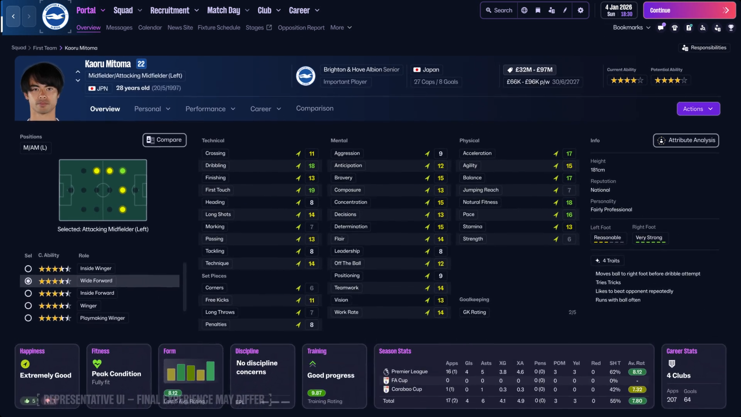
Player Profile Screen
Dynamics, playing time and plans are all missing from the FM26 player profile compared to the FM24 equivalent. Could this mean a reduction in these features or just hidden in another tab?
All three of these features can be exasperating at times with players getting constantly upset. But I really hope it hasn’t been removed completely.
Given their importance in FM24 i’m really surprised to see it’s not prominent at all on the profile screen.

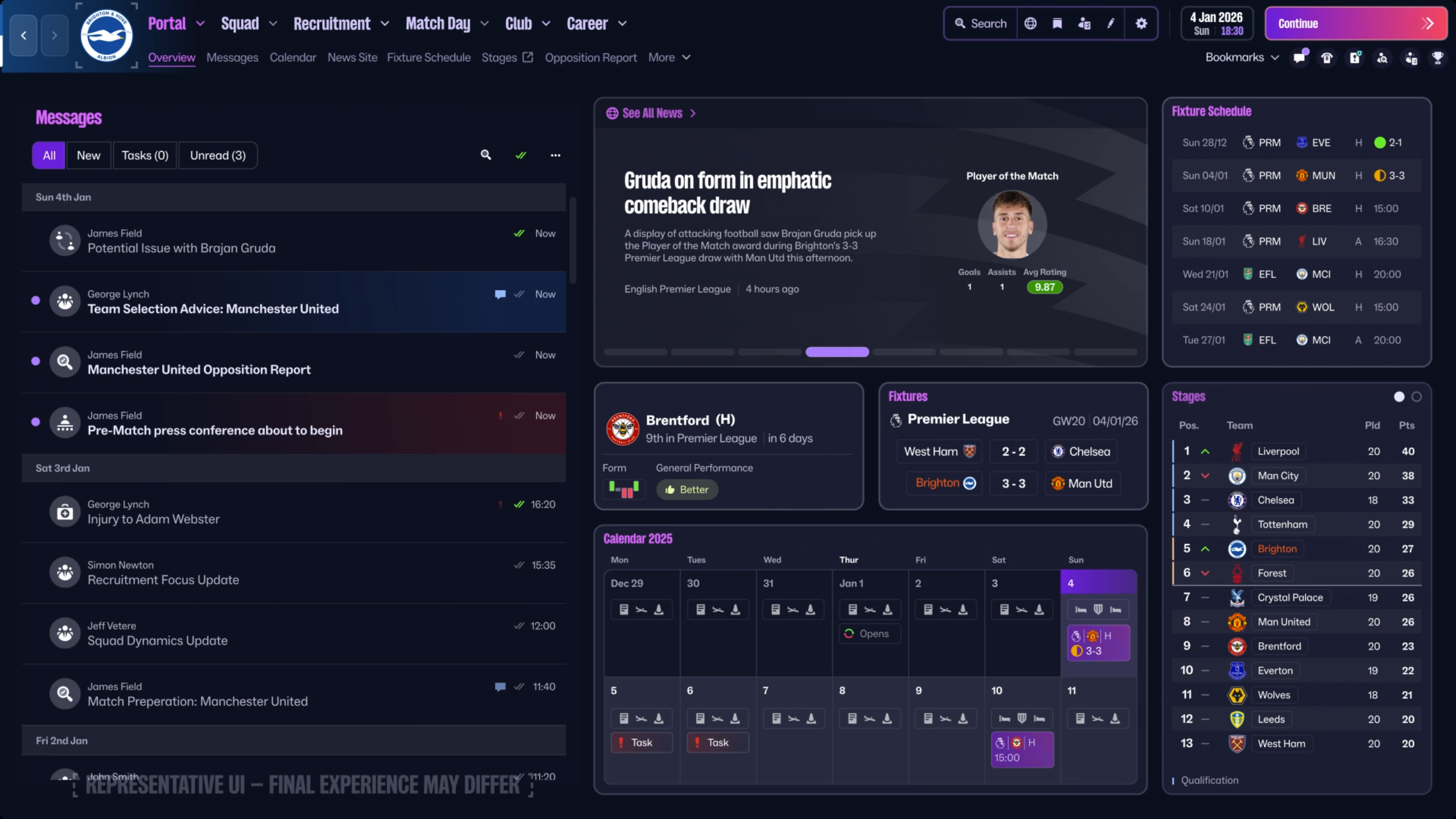
Portal
As with the last post the new “portal” is missing any references to “targets” which were key to keep an eye on in FM24. The finances overview has also been removed and the sub tabs don’t suggest this information is available anywhere in the “portal” although that's not necessarily something you need to keep an eye on everyday.
It makes sense to have a preview of the inbox alongside other key items so this is a good addition.
But what's baffling me is why fixtures are listed so many times? We’re informed that we just drew 3-3 with Man Utd and have Brentford up next in 3 different places on one screen??? While the news related to this upcoming opposition has been removed.
There’s definitely room for improvement and it seems an odd oversight when this is a key screen they are promoting to showcase the new UI.

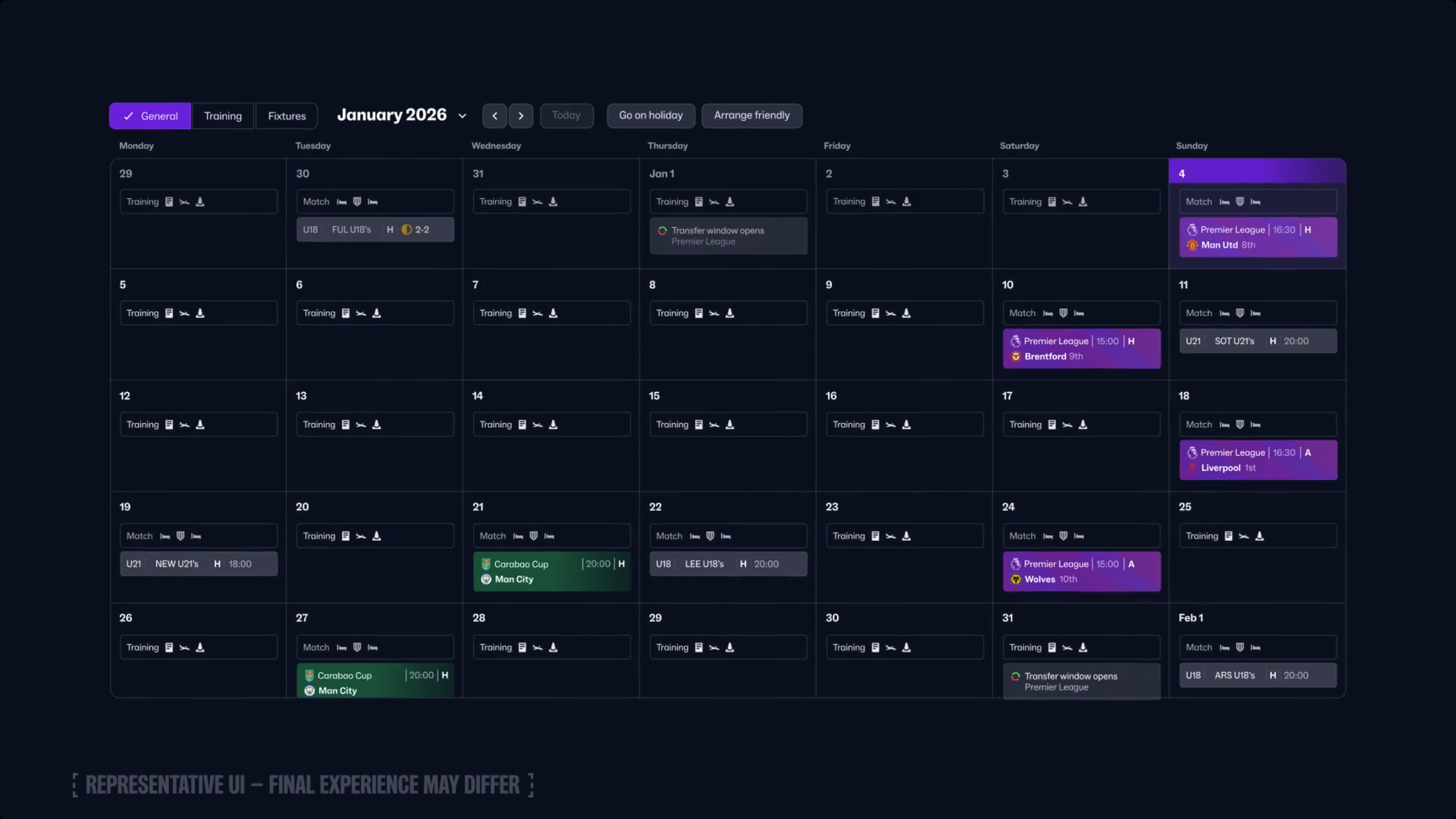
Calendar
FM24 has two calendars: general and training. In FM26 these have been combined into one calendar and tabs to separate them if you wish. This makes complete sense and is a simple but welcome improvement.


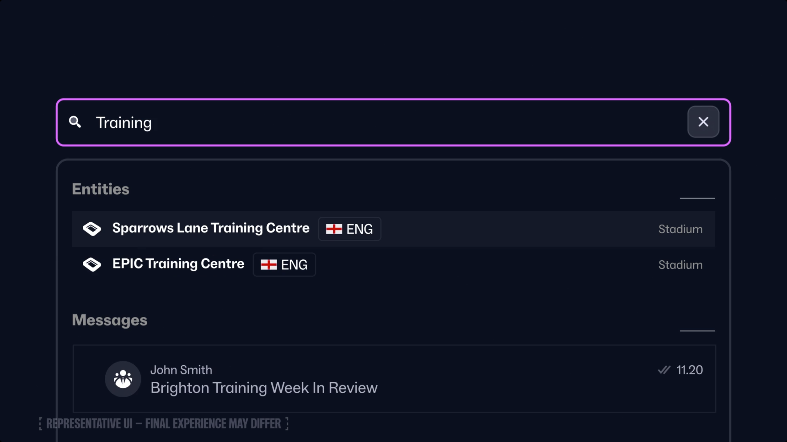
Search
The new search now searches more than just nations, competitions, clubs and players, it’s now a global search that will also search your inbox which is cool. That means if you were searching for a player, you’d also see results for items in your inbox about that player at the same time.
One thing that seems to be missing though is the ability to use it as a form of navigation. I would have thought we should be able to type “training” and be able to jump to the training section of the game, or “data hub”, “finances”, “squad”, “youth squad” etc, similar to how Spotlight works on Mac.
But the provided screenshot seems to show that that isn’t possible. Instead, searching “training” will take you to the training ground of Charlton Athletic’s Youth Team.
Another odd design decision from SI, even odder to showcase this limitation.

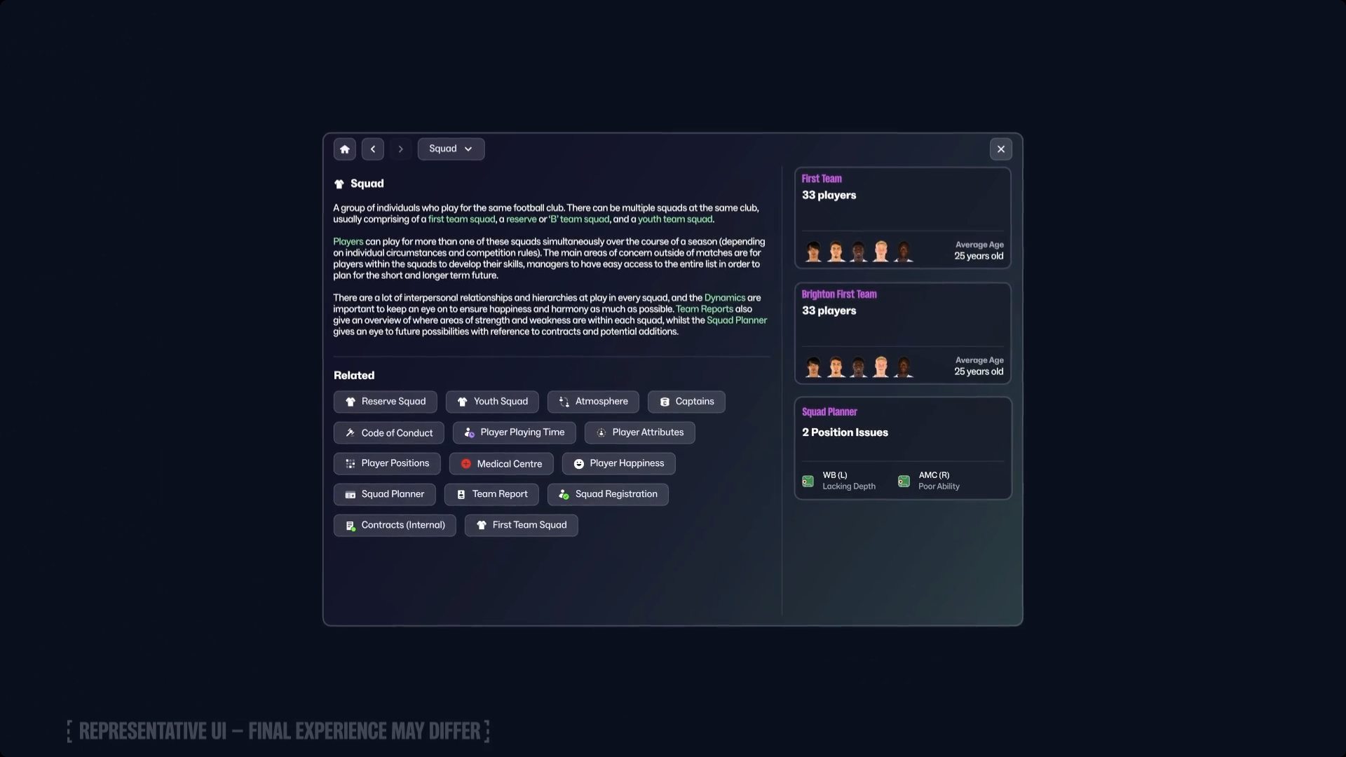
FM Pedia
The new FM Pedia just looks like a rebrand of the in game tutorials. Although to be honest I went to check what these looked like in FM24 and didn’t even realise they have been removed. Anyway, older versions of FM had an encyclopaedia style in game tutorial that you could browse or search and that seems to have returned, which will no doubt be welcomed by beginners.
It’s difficult to say how useful it is for non beginners, the example of “Squad: A group of individuals who play for the same football club" is so incredibly basic it may be useless to the majority of players. But you’d hope other areas like tactics and squad dynamics might have some more useful information.
Still it's better to have this ingame than the bland website we're linked to in FM24.

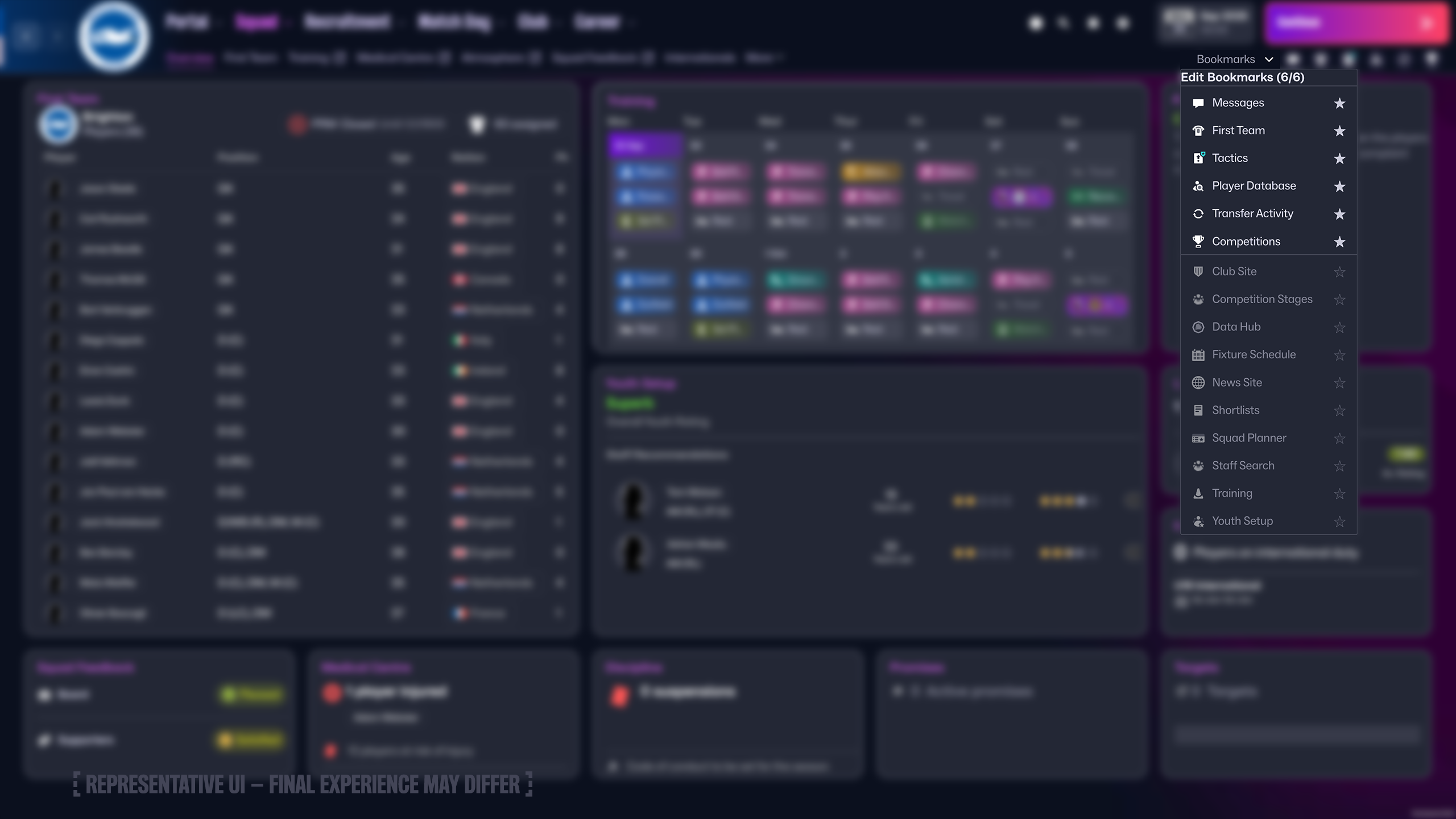
Bookmarks
The addition of bookmarks could have been great IF we could literally bookmark any screen or sub-screen similar to bookmarking a web page in a web browser.
However they’ve explicitly said “you’ve got 24 bookmark options in total to choose from”. That kinda sucks… It seems like it’s more a case of being able to change the sort order of the list, which we could already do in FM24 (even if most people didn’t realise you could drag and drop items in the left sidebar).
Different people manage in different ways and i’m sure some of us would have loved a more feature rich bookmark manager allowing us to bookmark any screen along with folders, tags and custom names.
Final Verdict
While alot of my posts reacting to the new screenshots have been a bit negative, I am still excited for FM26.
But it’s a shame that i’m already working on my FM27 wishlist:
- Improved Portal with less duplicate information and visibility on finances and tasks affecting player happiness.
- Add items related to player happiness back to the profile screen
- Spotlight style search to jump to any screen quickly
- Proper bookmarks

- Date Created
- 11 Sep 2025 02:40:48
- Date Updated
- 11 Sep 2025 02:40:48
- Last Comment
- 24 Sep 2025 08:06:03
Comments
You'll need to Login to comment
Davidbaratunk
Have to agree with this post. The quick-paced edit of the video made it impossible to tell just how ot would “feel” to actually interact with this system.
The player profile screen seems to have less information then some of the better skins for FM24.
They say that the “Portal” is costumisable, but then don't show that at all. Limiting what you can bookmark is really annoying too. I am also not sure about the magenta coloured impact font they're using. Oh, and it still looks like most of our time between matches will be spent clicking through our email inbox, but I know Miles said they tried to change that, but couldn't develop a better alternative.
In general this doesn't look like a huge revolution, more a new coat of paint, but I might change that opinion if I saw it in action, with actual in-game footage.
NorwayNoob
I know SI dropped the ball last year, and this page is testament to them not rushing to fix issues. However, I will give them the benefit of the doubt. Just because some of the features you rightly point out aren't shown, doesn't necessarily translate to it not being part of the final product. Fingers crossed we'll be able to configure every tile/card!
burrow
Looking forward to the release of the FM 25/26 after last years failure of the game,
any one listening at FM would be good if individual coaches can be put under each players so they can control the player stats to improve them,
in FM 24 I was sick and tired on player chats to improve the training level and they didn’t improve and listen to me
hope in the fm new game the financial situation is right for the new teams coming up from the championship with money still to spend on any new players
I am looking forward to this new game as FM 24 is a bit boring now
to FM management are you listening
Ian Farmer
McG84
Do you think skins, face pack and logos etc will work in FM26.
Stephen Rice Jnr
I really hope 🙏 🤞 🙏 🙏🤞 that this number one comes out ASAP 🫣 if Netflix lol or something like WW3 Happens! I play Mobile 📲 when I'm not with my 💻 but nothing comes close to the Windows version (never tried to play it on MAC) 💯🫵 sports interactive. They've got to make a great 👍 😃 game this year for such a cult of loyal religious even customers.
Stephen Rice Jnr
Lol believe me. It will not be long before there r all new skins etc my man 💯🤞👊
kingrobbo
nobody can say until the full game is released
some features especially graphics may be locked down to modding
The OG KiKo
FMPedia being used as a big showcase is a bit annoying as it's the most ‘meh’ feature for anyone who's played for years. Fair enough for the newcomers.
Still, very ready for this game now. Completely exhausted my save ideas to this point
bruh22
I assume the Portal is modular and you can select which screens you want in it as has been the case in the past with the Home screen, so I don't see much point in analyzing what information or how many times it's shown in these example photos.
At most it could be taken as a sign of how little the devs understand their own game if this is the example setup they're displaying, but not much more than that.
Flying Scotsman
Here is the brief breakdown on the SortitoutSI youtube page:
Patrick Agerde
I want Flut skin forever!possible in light version,I don't really like purple and dark colors!
olas nick
New UI in 3 words: Horrible, Primitive, Non-functional.
BigRedMnstr
I think it looks better and feels more modern, since websites are currently working in a similar fashion. For those who do not like it, there will be UI mods soon anyway, so it is not crucial.
My concern is about the newgen faces. I have not seen any information about them, and I was hoping for AI-generated realistic faces, maybe even with aging included, but I do not think we will get that. We all know how awful the newgen faces are, and not having them improved in 2025, when AI image models are everywhere, is kinda disappointing.