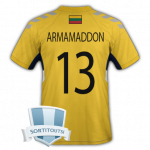
Armamaddon Activity
No, there is already a file for Landesliga Sachsen (23/24). My file here has every team from the state of Saxony below the Landesliga Sachsen. So there are various teams from Level 7 to 10 (in reality). They are not part of any league in the game.
@Mike wrong or bad template stylemissing sponsors on upper backside and each one on sleeves
@Fry85 try #d1f600 (citron) for home#0a1d4c (dark blue) for third
@Fry85 added lines on the wrong position, please see you have sleeve shadows, they are on the shirt part, not the “underwear”
to ask 71827431 times will not get a faster answer: there is a pack from Jroberts (not here) for FM24
@Fry85 home: wrong mapping, also this is not the home coloraway & third: slightly different color what I think is right: citron - white - blue
@Fry85 missing sponsors, clipping issues with this converted version, some wrong styles + colors
@Fry85 slightly better placing necessary → main sponsors slightly more up, please have an eye on spacing from manufacturer to sponsors etc. + main point for rejection: please put the lines (left sleeve) also on the longsleevealso there is a white ver...
@RicardoFss missing sponsors, slightly wrong styles
@RicardoFss missing patterns, sponsors & design elements
@jose julio maybe some better version of third kit pattern
@Fry85 main sponsor is bigger and more upward position
@Fry85 all: spacing and placement of logos/sponsors (sponsor is more near to the manufacturer logo + club-badge), backside font is slightly different third: different style socks easy to fix
@Fry85 stripes on arms on away are wrong, the long part is the upper part + try to have no conflict with the collar
@Fry85 home: different color, sizing, quality of graphicsaway: different template, sizing, color of manufacturer
@Fry85 home: missing second line of sponsor, too thick line on shorts, wrong font for backaway & third: wrong template (jako dots on shoulders missing + collar color), size of logos is different, wrong font on the back
Reichenbacher FC (Germany) - ID 91156790special thanks to @mustoe77
so we are here to get the best results, I don't care if SI does low quality, this should not be the standard or an excuse for lower effort
It is possible you saw these games in reality, but what I said still stands. I got my information straight from the official facebook page of the club - they took photos from your visited games. e.g. the main sponsor looks different, the bordeaux col...
@perso wrong colors, wrong styles, wrong sponsors … more accuracy!
@perso lack of quality + lack of accuracy in style, placement and correct sponsors
@Nino PC bad quality + wrong styles + missing sponsors + wrong sponsor on third kit
@Tunim a lot of mistakes (wrong placement, bad quality, wrong style)
@jose julio bottom front:left side (graphic view): letters say: producto oficial (with outline)right side (graphic view): logo is near to the edge in the white part
no 3D graphics, just one SS kit
TSC Neuendettelsau (Germany) - ID 2000460592
moved → see here
It is a part of the right pattern, but if you look how it is done, it is not what you made. I can understand the part you are not an expert in Photoshop, but you can collect data about the league you wish to have and offer this gem to our creators. As far...
away pattern …home colors … if you enlarge you see there is a different tone on colar + sleeve, more saturated No it is not, as you can see - I check all kits for quality of every part - right styles, patterns, colors, colars, sleeves, sponsors etc.&...
@Marek Molnár wrong styles, wrong colors, wrong patterns
@Marek Molnár bad lines, wrong styles, wrong colars, there is no club logo on the shorts, wrong sponsor style on the back
@Marek Molnár bad lineseco invest → eco investmentarmsponsor with color on the left sideno clubbadge on shorts, but slightly bigger eco investment
@jose julio try a better version of the “x” pattern on the third kit + keep it in the lines, maybe use it as stamp and stamp it manually
@jose julio everything fine but the buttsponsor - just adjust one side, maybe the right side a little more right, so that there is a little more gap (maybe you see what I mean)
@Marek Molnár home: missing pattern on blue lines, colar is "more yellow", shirt lighter yellow, missing letters on the backaway: wrong pattern, different style around colar, missing letters on the back
@Marek Molnár wrong size and placement of pattern, placement of sponsors, styles of shorts
@Marek Molnár lines don't match at home and away; bad lines at all; some placements of logos+ area under white part of the green shirt should be empty
@Stefano Salvatori different style at all
@joaqum jan buttsponsor placementcolarssponsors are not curvedsponsor placement
@jose julio Asturiana ← sponsor on the back is a bit too bigstill, take the red and white lines as hint
@Marek Molnárslightly wrong (or to dominant) colors, some “bad lines” + missing sponsors
Does anyone have Jako Champ 2?
@arthas88 lack of quality (e.g. manufacturer logos), accuracy of details (e.g. colars) and bad placement of sponsors
@arthas88 lack of accuracy in positioning of details + styles
@paya old kits
@Fry85 they have a different style of shorts
@Fry85 it still has clipping issues at the shoulders
@Sloogan unfortunately it is the same problem again