44,196
110
2,909
FM 2016 FLUT skin v2.3
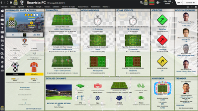
Skin for FM 2016 regular career mode and widescreens (1920x1080).
I'm pleased to present you the version 2.3 of FLUTSkin White for FM16.
This skin is compatible with DF11, Scope and Cutout Faces.
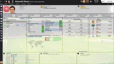
NOW this skin is a little bit transparent and compatible with backgrounds.
Released: 04 September, 2016
Thanks to all FM fans and especially to all of the fantastic FM skinners who made it possible to produce the FLUTSkin as it is today since FM 2013.
Resolution requirements
This skin was made to work properly in 1920x1080 full screen mode. As a result, some panels won’t work properly in other resolutions (and also in 1920x1080 windowed mode).
The changes (some of them are just minor changes) in this version are in the following panels:
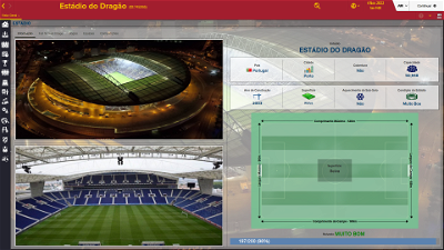
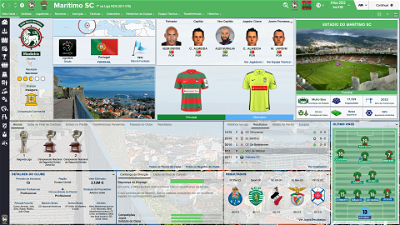
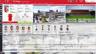
Stadium Overview Panel
Game Processing
Calendar Popup Panel
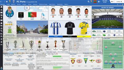
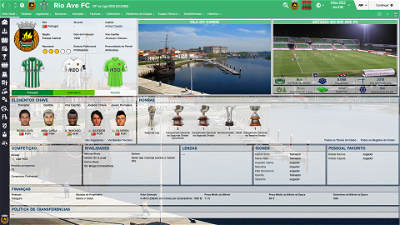
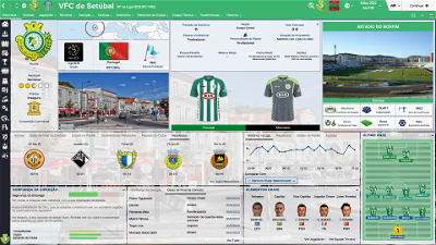
Club General Panel
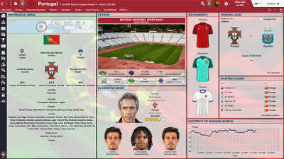
Nation General Panel
Team Report Panel
Manager Home Panel
IMPORTANT NOTES:
1. In this pack I included a TUTORIAL PDF with instructions regarding the structure of your Graphics folder in order to view the citypics, the kits and the competition logos in player details and in title bar.
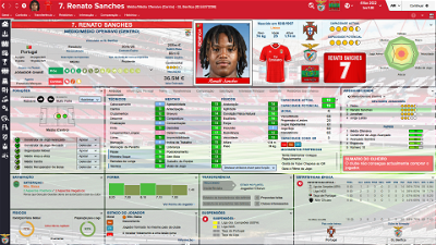
2. I also included a folder with the files you need to use in order to remove the attributes background boxes (you just have to place the files of that folder in the panels folder of the skin and overwrite the originals).
You can download the FOOTBALL MANAGER BACKGROUNDS SUPERPACK or the citypics MEGAPACK 4.0 HERE or HERE to further enhance the skin.
Installation Instructions
Download and extract the .rar file (using either 7-Zip for Windows or The Unarchiver for Mac).
Place the "fm2016flutskin" folder here:
Documents\Sports Interactive\Football Manager 2016\skins
Create the folder "skins" if it doesn't exist.
Place the “flags“ folder in documents/sports interactive/football manager 2016/graphics
Start FM16 and go to Preferences screen and then into the Interface tab.
You should see FM 2016 Flut Skin - v. 2.3 as option in the skin drop down of the Overview box.
Hit the Confirm button.
Credits
This skin was created by flut.
Comments
You'll need to Login to comment
flut
I think this problem will be solved in the next release (I'm workin on it and I already tried it in my game and it works well...).
However, try the following:
In the player overview panel fin and delete all the code like “default_item=”…”
Then, choose the panels you want see as default and insert the code default_for_everyone_else="true"
Example:
Change:
<widget class="player_bans_overview_panel" id="pbop" late_loading="true" >
<translation id="title" translation_id="247569" type="use" value="Bans" />
</widget>
by:
<widget class="player_bans_overview_panel" id="pbop" late_loading="true" default_for_everyone_else="true" >
<translation id="title" translation_id="247569" type="use" value="Bans" />
</widget>
cheers
matg56
Like the the new 1.3 version but i am having a problem with the team kits not showing on the club screen. My folder structure is similar to yours and 1.2 and previous versions didn't have that problem. Any thoughts or suggestions?
No worries, I figured it out ...the new version has different screen boxes with drop down menus but still prefer the club screen layout in 1.2. Cheers!
flut
Hi matg
Thanks. I noticed that in some games that panel doesn't work. So I made a "substitute"
Here is DOWNLOAD and put it in the panels folder of the skin
TH26
The National team badge underneath the players weight, age, height is too large and overlaps this info slightly. Is there a way for me to make the badge size smaller?
Thanks for all the hard work you put into making these skins.
flut
Hi TH
Thanks.
Go to player overview panel and search for the following code:
<!-- This is the nation logo -->
<container width="165" height="165" alignment="left,centre_y">
<layout class="stick_to_sides_attachment" alignment="left" inset="0"/>
<layout class="stick_to_sides_attachment" alignment="bottom" inset="0"/>
<widget class="editable_client_object_property_panel" id="pnat" scale_picture="true" keep_aspect_ratio="true" image_alignment="centre">
<layout class="stick_to_sides_attachment" alignment="top" inset="15"/>
<layout class="stick_to_sides_attachment" alignment="all" inset="0"/>
You can increase the last value inset=”0” (and make the logo smaller) and, after that you can adjust the place where is the logo, changing the value inset=”15”
TH26
rodrigo lo turco
queria agradecer, pois essa ultima atualização corrigiu perfeitamente aquele problema dos paineis dos jogadores.
obrigado.
Agora, só uma dúvida, qual a diferença entre a FLUTSkin e a DF11 1.3?
Desculpe se já estiver explicado no post, dei uma lida mas nao encontrei e quando coloco uma das skins não vejo a diferença. Talvez eu não tenha ido nos locais aonde as mesmas sejam diferentes haha
Desde já, agradeço
hilariaomatavitorino
flut
Hi hilariaomatavitorino: could you please put a screenshot?
hilariaomatavitorino
batiron
Hi Flut. Can I change the city graphic (photo) with my own?? If yes, what is the necessary format (JPEG?) and size???
Your Skin is simply amazing! Thank you!
flut
HI @batiron: Thanks. Yes, you can use your own pictures. You can use jpg (be carefully because if is JPG – with capitals – the game don’t read it) or png. The size could be, for instance 800x600 but you can try several sizes in order to find the best ratio (widthXheight).
batiron
[/quote]
Thx! But how and where can I locate the specific photo? It should come with a number in a file or something??
flut
Aljo24
http://prntscr.com/9e5ya3
You see that name and the number. Can i fix this somehow?
Thank you!
Love your work!
Menseguez95
My questio:, I'm using the Panini Portrait Pictures and they look a bit overloaded with your skin due to that white square and that sginature style name in the picture area. Is there a chance where I can get rid of these in the panels so that the Panini's fit smoothly? Thanks in advance!
Aljo24
http://prntscr.com/9ewks8
you can see apps number is not fitting in.
Any way to fix it?
Thank you!
I love that skin from 15
flut
I'm currently submerged in work and that's why I couldn't answer your questions. I will try to answer all the questions next weekend...sorry.
flut
@Menseguez95 : Thanks. Please try to use the DF11 version. I think your problem will be solved.
cheers
flut
gwentdragoon
flut
xtsh
If i list some screenshots would you mind telling me what panels i have to edit in order to get them to fit in a smaller resolution?
Thanks.
flut
Hi
It depends of the panels you want to adjust. If it will be easy to explain you, I can try, however if the panels you want require lots of changes...I have no time to do it....sorry.
xtsh
Hi Flut, thanks for the reply. I'll attach the pictures with a number and a black box next to the problem and then i'll explain.
1. I was wondering if it was possible to make this smaller so the substitutes appear on the right of the pitch?
2. For this i just need to make the side bar a little smaller so it doesn't overlap the logo at the bottom left
3. Pretty obvious but need too know what to edit in order to the logo, picture and other things from overlapping.
4. Again just want to make the info smaller so it fits in the boxes properly.
5. Just need to make the attributes smaller so they fit into the box without having to scroll.
6. And lastly just want the information to fit into the box properly.
I know some of these changes are pretty pointless but i would really appreciate if you take any of you spare time to help me with these as your skin just make the game a whole lot better in my opinion, and i have a weird obsession of needing things too look perfect.. If some of these are not possible or will take too much then no worries, thanks for even having a look for me.
flut
1. I was wondering if it was possible to make this smaller so the substitutes appear on the right of the pitch? – go to the tactics overview panel.xml and search for
<container class="vertical_adaptive_container" offset="0" inset="0" gap="8" width="470">
Change the value width by a smaller value
2. For this i just need to make the side bar a little smaller so it doesn't overlap the logo at the bottom left – I don’t know how to make a side bar smaller. Sorry.
3, 4, 5 and 6 – In fact your screen resolution doesn’t permit to show the information and graphics well. However, is a bit hard to explain you how to adjust it since you have to edit lots of code in various xml….Sorry.
xtsh
Hi,
No worries. Thanks for trying too help me anyway, much appreciated.
Vlastik14
Report Spam
Edit
Hi, I would like to beg added to the Skins for the Czech league
O2 Sport HD
CT Sport HD
Digi Sport HD 1/2 Slovakia
Nova Sport HD 1
Nova Sport HD 2
Eurosport 2 HD
Sports 2 HD
Arena Sport 1 Slovakia
STV 1 - Slovakia
STV 2 Slovakia
Dajto HD
These COMPANY WHEN would you like to complement was so willing to do the MAS, so famously zkust Skins do i do professional stadium SYNOT League Dik much for the men to calm the dog Write Send me an email response [email protected] IMMEDIATELY send it back dik those photos that make me a ...
«This comment has been edited»
gumbo66
thanks for best skin for the fm16!
In the fm15 skin you made a version of the 'player personal details panel1' without rotation, fixed on kit, chart and ability.
Could you do that for this version too?
flut
Hi Thanks
Place THIS in the panels folder of the skin.
cheers
flut