Ryan O'Reilly - Submissions - Cut-Out Player Faces Megapack
28068750
Submitted
18 Sep 2021 21:27:47
Timeline
This image is a response to
#226339
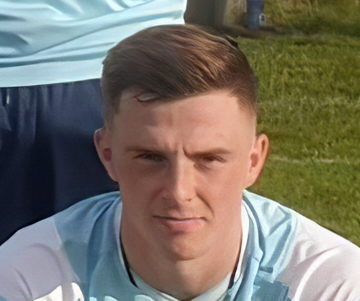
It's not the best picture, because his hair color has changed almost 1 to 1 with the night sky. Hopefully it still complies with the guidelines to get into the pack.
I'm afraid it's not an improvement in my book. Also, have a look at the guidelines in this thread on how much space to leave in cuts below the chin and above the hair, ideally it's no more than 2-3 pixels...
I'm afraid it's not an improvement in my book. Also, have a look at the guidelines in this thread on how much space to leave in cuts below the chin and above the hair, ideally it's no more than 2-3 pixels...
I have now, after intensive search, found another template. Could you let this pass?

Thank you very much. Can you maybe tell me where you got the template from? Because if one of him hadn't seen it.
Thank you very much. Can you maybe tell me where you got the template from? Because if one of him hadn't seen it.
Ballinamallard United Facebook page,photo from March,31.
Team photo
Heads are pretty small,but I'm using software called Topaz A.I. Gigapixel to enlarge images.It's the best on the market.
Ballinamallard United Facebook page,photo from March,31.
Team photo
Heads are pretty small,but I'm using software called Topaz A.I. Gigapixel to enlarge images.It's the best on the market.
Wow, thank you so much.
Do you have any idea how I can make this picture Glenn Law (kneeling down right) a good cut-out? There is no better template for him.
Wow, thank you so much.
Do you have any idea how I can make this picture Glenn Law (kneeling down right) a good cut-out? There is no better template for him.
Here you go,I think it's ok...

@bakizp Thank you very much.
@mons Would you let a picture like that go through? For me, it's all about the jersey after the picture, because when I cut it away, it looks very "fake".
It's not a bad cut at all. But when you compare it to baki's, you'll see that his cut contained shirt up to the left and right borders of the cut, which makes for a slightly more natural cut-out. I'm not a big fan of having shirts this high, but I know from experience it takes a bit of time to remove them and get a natural look.
One way to do so would be to follow the tips on how to avoid the chicken-neck collar effect here but in reverse, i.e. lowering the collars instead of raising them. Another would be to erase the upper parts of the shirt and leave only a small bit at the bottom. For the time both techniques take, I would much rather leave as is, tbh.
Edit: Just seen baki did the latter technique in the other thread - great minds think alike
This image is part of a pack:
Cliftonville

 Background and Stadium Packs


_daviie_