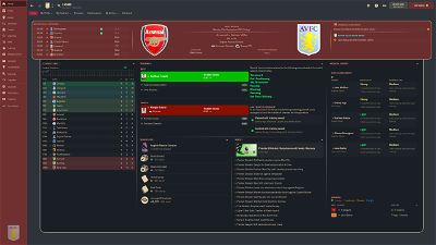
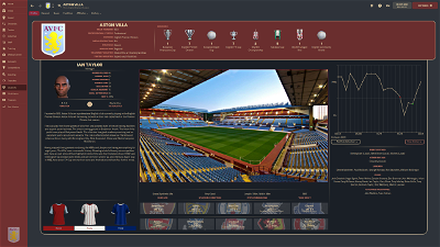
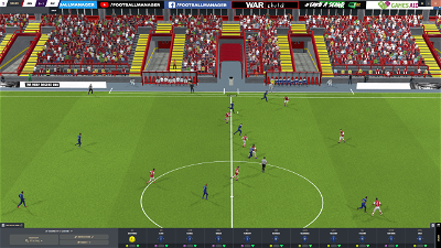
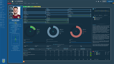
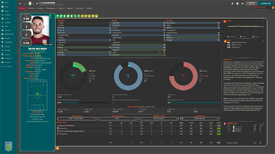
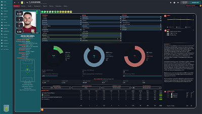
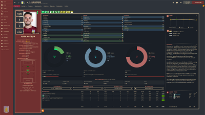
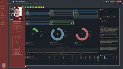
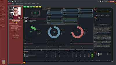
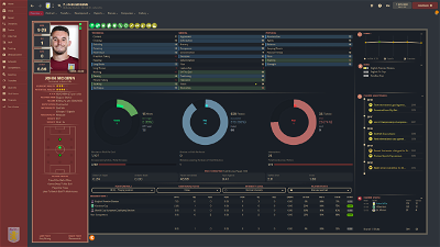
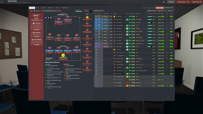
A simple, clean skin, ideal for those playing at higher resolutions who don't want to be bombarded with information they rarely (or never) use. QHD version for 2560x1440 (up to 110% zoom) and FHD version for 1920x1080 (up to 100% zoom)
TEAM COLOUR VERSION NOW AVAILABLE
Testimonials
"It's different, I'll give you that" -- anonymous
"You sure do like boxes and the colour grey" -- anonymous
"I don't play your stupid football spreadsheet game. Stop asking me for a quote!" -- anonymous
Features
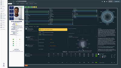
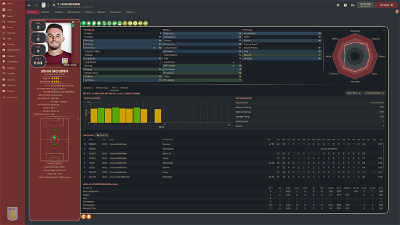
- Customisable colour scheme, frame style and player layout (instructions in zip file)
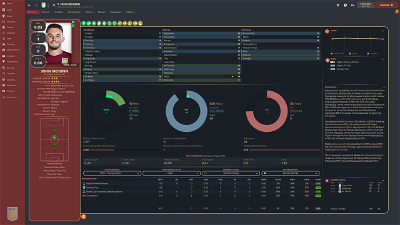
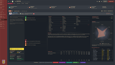
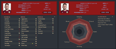
- Attributes shown in Scouting Card
- Inobtrusive Pros & Cons layout, minimizing unused blank space for non-scouted players.
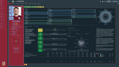
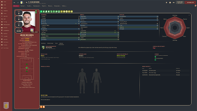
- Unique home and player profile panels, including combined Scouting Centre with Reports summary, full Medical Centre & Team injuries panel, Player Training Feedback
Patch Notes
v1.6 - Winter Update response
- Removed customised scout report views
- Edited visualisation on player overview
v1.5
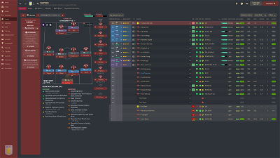
- Adjustments to pre-match tactics page on FHD version to prevent players at bottom of screen being inaccessible
- Translation fixes
v1.4
- Updated layout for FHD version
- Added Team Colour for FHD version
- Fixed: "Quit to Start Screen" not available - intro panel removed
v1.3
- Added Team Colour skin
- Fixed: Unable to pin data hub reports from Player -> Reports -> Player Performance
- Fixed: Deadline Day: text unreadable for selected row on sidebar
- Added alternative scorecard layouts
- Added tabbed player overview to allow greater focus on the areas that matter to you
- Removed alternative player overview folder, with functionality available from selectors on profile
v1.2
- Added Instant Result button
- Updated player pop-up to include preferred foot, personality, attribute analyser and traits
- Added alternative layouts with both footedness shown
- Added new frame type ("double border")
v1.1
- Fixed: Unable to leave inbox with unread messages when "icons only" on sidebar
- Fixed: Alternative colour schemes not working on FHD - fix expected on 29/11/21
- Fixed: Key stats not visible when using alternative role & duty overview on FHD - fix expected on 29/11/21
- Updated Attribute Analyser to fit colour scheme
Credits
sebastian_starttrbts & Tyburn - whose work on creating non-numeric attribute skins inspired me to learn myself
Michaeltmurrayuk - for his base skins, and assistance in various skinning queries
wkdsoul - for his assistance in various skinning queries
bluestillidie00 - scouring through the xmls for TCS taught me a lot about how half of this stuff works, as well as his assistance in various skinning queries
Wozzie - for fixtures and results panels for club overview
Heffem - for training selectors on player profile
Bugs/Future Requests
If you notice any bugs/issues, please do get in touch, and I will see if they can be resolved. Similarly, if you have any requests for future features, please let me know, although for full transparency I have no intention of adding any information pertaining to hidden information (CA/PA etc...)
Known Issues
- Club Info not showing for some users (still under investigation)
Future Plans
- Light version
- Graphical attribute version (non-numeric attributes)
Usage Rights
This skin is completely free for personal use, but may not be sold or placed behind a paywall. If you plan on using the skin publicly, or repurposing a unique element for own skin, please provide credit and a link to this post. If, for whatever reason, you are so enamoured with this skin you want to send me a coffee, feel free to donate via PayPal here
Comments
You'll need to Login to comment


gimn85
Oh dear, that's a pretty bad miss on my behalf. I'll take a look and get back to you as soon as I've worked it out - unfortunately it might not be until tomorrow, as I have some assignments I need to work on tonight.
gimn85
There should be a drop-down selector at the top right of the player picture. From here choose horizontal+ (with fitness indicators) or horizontal- (without fitness indicators)
gimn85
Okay. I should be finishing assignments…but I'm awful when it comes to procrastination. Put the attached file in the panels/match folder. Opposition team will now be the same colour as headings (so that salmon pink colour for the scheme in the screenshot)
Dropveter
What are you using to show this stadiums please?
gimn85
You need to download graphics. There's a background megapack on this site here, which includes stadiums.
ForeverAvicii
Problem solved, thanks again man!
I found a new one though, same as before but now when the game ends. Here is the picture:
cholski
Love this skin! need to find some smaller photos, at the bottom left is it possible for me to change the colour? with it being all white its difficult too see
gimn85
A sneaky additional panel. I've attached the fix again. This time you'll need to put it in panels/competitions - which means you'll also need to create the competitions folder!
gimn85
Just to make sure I understand - are you talking about the positions underneath the player details?
Firstly, I'd recommend using the FHD version - this is designed for 1920x1080 resolution at 100% zoom, and will work at 1600x900 at 85% zoom. By default the section under player details will be traits only, and the positions/roles is next to the attributes. If not, there are little “v” in the top right corner of some sections, which allow you to select appropriate information. I would recommend selecting “Traits” on the Player card (the bit on the left) and “Roles and Duties” next to attributes.
It should end up looking something like this (1600x900 at 85%):
ForeverAvicii
Is it possible is doesn't work? I still see the opponent in the same colour as before (I made sure to reload skin, twice)
gimn85
I thought I got it to work, but yeah, I'm having the same trouble again, too. Might take a little while, but I'll let you know once I've solved this!
Maximilian Strube
First of all. this skin is amazing and I'm absoulutely in love. That said I have two things I'm not a big fan of:
- First the Scorecards with the player faces: I know you put out another version where the scorecards are beneath but they are still to big. From your explanations I couldn't figure out yet to make them smaller.
- Second the Player Faces in general are to big, the cutoutfaces have a to small resolution and get blurry when scaled up. Can I make the whole container for the Player Picture smaller (Also for staff)?
Thank you in advance!
<3
gimn85
So…I'm stupid. The folder needs to be called competition not competitions
gimn85
So I've attatched two files below - these need to go into panels/player/mustermann folder. They will replace the “Horizontal+” and “Horizontal-” selections. After that you'll want to make the following edit to player overview panel.xml in panels/player folder. On line 7, you will see something similar to:
<layout class="vertical_arrange" vertical_layout="6,300,2,44,2,17,15,2,200,2,-1" offset="0" inset="0" gap="0" draw_horizontal_dividers="false"/>This might be slightly different, depending on the skin version you are using. Change the 300 to 180 (2nd number in vertical_layout). For the version above it should now look like this:
<layout class="vertical_arrange" vertical_layout="6,180,2,44,2,17,15,2,200,2,-1" offset="0" inset="0" gap="0" draw_horizontal_dividers="false"/>Maximilian Strube
This is fucking amazing. Wow damn thank you very much.
I've found a little bug (or maybe something easy to fix and I have another minor question:
1. Is there a way to place the transfervalue somewhere else? (Screenshot 1) (not important just a minor question)
2. I've changed the skin colors for attributes (Screenshot 2 | added green and orange) and this is working fine for the player cards. However for the staff and for custom views I still see the standard colors, this isn't a big deal either, but is kinda confusing especially when I'm playing with the version that doesn't has any attributes (Screenshot 3 & 4)
But again these are just minor details. Overall the skin is amazing and I'm gratefull for your help on my earlier question 🙂
gimn85
1. You could potentially move this to the top, by editing horizontal no fitness, line 27. Change it to:
<layout class="stick_to_sides_attachment" alignment="top" inset="1"/>2. How did you change the colours. Did you do this through the preferences menu, or by editing the Mustermann Graphical QHD Team Colours settings.xml? (I'm trying to guess the resolution from your screenshot - the actual settings file might be different, but it'll be the only one in the settings folder). You may need to edit the background colours, too - all profile attributes are lines 342-354. You want the colour names to be the same for the attribute and the respective background. It'll end up looking something like this:
<colour name="low attribute" value="bg"/><colour name="normal attribute" value="fg accent1"/><colour name="good attribute" value="orangergb" /><colour name="excellent attribute" value="greenrgb" /><colour name="unknown attribute background" value="bg darker"/><colour name="low attribute background" value="bg"/><colour name="normal attribute background" value="fg accent1"/><colour name="good attribute background" value="orangergb" /><colour name="excellent attribute background" value="greenrgb" />In place of “orangergb” and “greenrgb”, you'll need to put in the rgb values for the colours. For example, value="rgb(255,204,0)" would be a shade of orange. You can get this from the advanced settings in preferences when setting colours. Alternatively, you can use terms like “Orange 700” which refers to the MaterialUI colours here.
I hope that made sense!
Maximilian Strube
Sir you're a Football Manager Saint, I'm not just impressed I'm truly in love with that skin now.
Thank you for your help!
gimn85
No worries, dude - I'm glad you're enjoying it!!
SteeL*XP
Excellent skin! Is there a way to add a national flag to player profile? Or how can I do this? For example, between the name and abilities.
@gimn85 good Skin. Thanks! 👍
two Feature i like, and i hope you include that
= that would be fine, because it gave more Immersion
gimn85
I've not been able to get the flag on it's own; only with nationality as text next to it. So I can suggest doing that so, it will appear like below:
For this, you will need to edit panels/player/player personal details panel, line 62. Currently it should look like this:
<record id="widget_info" class="nation_button" icon_enabled="false" colour="fg" format="[%nation#1-nationality]"/>You need to change “false” to "true", so it should be:
<record id="widget_info" class="nation_button" icon_enabled="true" colour="fg" format="[%nation#1-nationality]"/>gimn85
I'm happy to look at including scoreboard changes, but it's not my current priority, so might be a few weeks until it is done. You can take a look at this thread on the SI Forums which should give instructions for doing it yourself.
Re: player faces in tactics menu, unfortunately this isn't something I plan to do on the release, but I've attached the file you need below. This goes in the panels/tactics folder. You may need to make some changes to get it to look how you like. Row 126 controls the positioning of the player pictures. The code is as below:
<layout class="stick_to_sides_attachment" alignment="all" inset="0,50,45,0" />To change the positioning, you'll want to play around with the inset numbers.
ForeverAvicii
Were you able to solve it? Just asking, no need to rush whatsoever! Thanks mate!
gimn85
Ah yes, I replied earlier ion the thread. The folder for the file I attached needs to be called competition (I incorrectly told you to name it competitions)
JoãoCarvalho92
Hey, its me again kkk.
Any chance to fix the phrase in the name of the player. When he is borrowed and i buy the player, the phrase stays behind the name of the play and seems a little confuse
gimn85
Hey, if you edit panels/player/player overview panel, line 7:
<layout class="vertical_arrange" vertical_layout="6,300,2,44,2,17,15,2,200,2,-1" offset="0" inset="0" gap="0" draw_horizontal_dividers="false"/>The “44” in vertical layout, controls the bit with the player name (the FHD version has some slightly different numbers, but it will still have the 44 and that's the only bit that matters) - I'd suggest changing it to 60 and see how that looks; you might want to play around with the number a little.
I'll look into updating the uploads soon, but it might be a few days before I get a chance to release.
JoãoCarvalho92
60 was perfect, thanks so much.
tommyvan
I just wanted to say a huge thank you for this skin. I played a lot of FM about 10 years ago and have recently picked up a copy of the new one. I've always enjoyed playing with skins and graphics and have got to say this is amazing work. It has reminded me of how much I love not only playing the game but also making it look great 👍
gimn85
Appreciate the kind words and, more importantly, glad to hear that you're jumping back on the FM wagon (although RIP to your free time!)
Daniil Satorin
Hello, great skin, but I don’t have enough backgrounds of cities and players, staff, is it possible to somehow make them appear?