231,864
587
21,063
FMC FLUT skin for FM 2014 v.2.0 [Updated 30.07.2014]
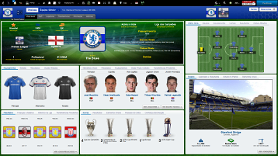
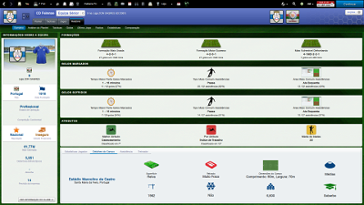
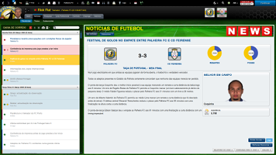
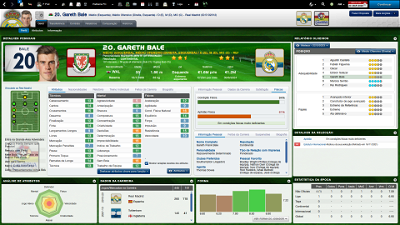
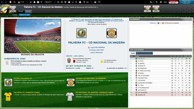
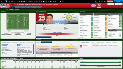
Skin style FMC for FM 2014 for FM 2014 career mode (1920x1080 and 1600x900).
I'm pleased to present you the new update of the version 2.0 of FMC FLUTSkin for FM 14 (white version) – 1920x1080
Thanks to all for your reported bugs. A special thanks to rune (from german Meistertrainerforum) and leo_crumb.
As always I would appreciate it if you could tell me when and in what circumstances (or panels) the bugs arise.
This FlutSkin version includes lots of changes in 1920x1080 version (not the 1600x900).
Note that although you can find the two versions of the skin, I only updated 1920x1080 version.
Besides lots of minor graphics changes here are the most important tweaks in this update for FlutSkin version 2.0:
- “New” attributes profile panel (status icons included)
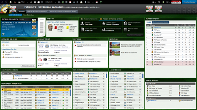
- “New” board room panel
- Fixed the club overview panel and inclusion of tabs and new information (board confidence panel)
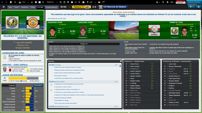
- “New” match titlebar score (stadium name, picture and conditions included; calendar and weather icon included)
- “New” team report summary panel
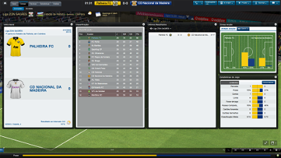
- Match inbetween highlights: 5 panels with fixed size
Installation Instructions
Step 1
Download the skin and extract the files (using either 7-Zip for Windows or The Unarchiver for Mac).
Step 2
Open the extracted folder “fmcFlutSkin2014v2.0update30july2014" and Move the two folders inside into your skins folder:
Win Vista/7/8: C:\Users\<username>\Documents\Sports Interactive\Football Manager 2014\skins
Win XP: C:\Documents and Settings\<username>\My Documents\Sports Interactive\Football Manager 2014\skins
Mac OS X: /Users/<username>/Documents/Sports Interactive/Football Manager 2014/skins
Create the folder "skins" if it doesn't exist.
Step 3
Start the game and go to Preferences screen and Interface tab.
You should see "FMC 2014 FLUT skin 2.0” and "FMC 2014 FLUT skin 2.0 1600x900” as options in the skin drop down of the Overview box.
Choose the version for the resolution you want.
Hit the Confirm button.
Credits
This skin was created by flut.
Comments
You'll need to Login to comment
vanh
flut
Hi xtsh
Concerning the first screenshot
Go to "tactics overview panel" in panels folder and search for:
<container class="bordered_box" minimum_width="550" default_width="660" priority="1" appearance="boxes/tactics pitch info/paper">
<layout class="stick_to_sides_attachment" alignment="left" layout_children="true" inset="1"/>
<layout class="stick_to_sides_attachment" alignment="horizontal" layout_children="true" inset="0"/>
<layout class="arrange_vertical_attachment" alignment="top,extend" offset="0" gap="5"/>
<container class="vertical_adaptive_container" offset="0" inset="0" gap="0">
<!-- Note that pitch and strategy bar are in a single container so that they are both always visible (see bug #70377) -->
<container priority="1" default_height="-1" minimum_height="620">
Change the values 550, 660, 620 (use try and error method)
In order to solve the second bug you reported...you have to edit "mini player scout report panel", changing the values of "height". Star by the first one (of the panel - line 2 of the xml) (use try and error method). I think it will be enough but if necessary, change the other values of the container eight in the xml
xtsh
Thanks buddy you've been a real help!
lmgc
Is it possible to put the pitch/split buttons in the match screen on the same row as the tactic selection row? They look out of place.
Same for the competition panel on match screen any way to put this on the same row as the scoreboard?
One other which file do i edit to remove the instant result button?
And another observation, i play on a 42" tv @1920, the 16x9 skin you have done looks so much better than this one on the large screen much easier on the eyes.
Nice, thanks.
Neochrome
I would like to change the background white in black and font in white please
Thanks
flut
Hi
Thanks for your comments. Could you please show me screenshots in order I can see exactly what are you talking about and what you suggest?
Concerning the instant result, go to "titlebar" search and delete the following instructions:
<!--instant match button-->
<widget class="button" id="INST" size="10" appearance="button/custom/instant/button" width="150" height="37" font="fonts/continue instant" colour="white" alignment="centre" disable_layout_attachments_when_embedded="true">
<translation id="text" translation_id="339740" type="use" value="Instant Result[COMMENT: text for a button that will generate an instant result for the upcoming match rather than having to go through and play it]" />
<record id="click_event" event_id="INST" event_target="glob" />
<layout class="stick_to_sides_attachment" alignment="top,right" inset="0" />
<attachment class="test_global_attachment" get_property="sect" mode="1" set_property="hidn">
<list id="value">
<integer value="phtc" />
<integer value="PhcT" />
<integer value="PhcP" />
<integer value="PhcS" />
<integer value="PhcN" />
<integer value="PhcC" />
<integer value="PhcF" />
<integer value="patc" />
<integer value="PacT" />
<integer value="PacP" />
<integer value="PacS" />
<integer value="PacN" />
<integer value="PacC" />
<integer value="PacF" />
</list>
</attachment>
</widget>
flut
Hi
In order to change those backgrounds you have to edit some graphics (for instance "subsection_box" graphics and other that I can't remember now). To change the colour of the font without look at the panels and xml responsible for those panels, I don't know what you should exactly do. I think it will be a hard work. So...I'm sorry but I can't help you (maybe in a few months I release the dark version...without compromise, however ;-) )
Neochrome
flut
I don't know if I will do it...but...maybe in a few months (maybe in the summer...).
lmgc
Thanks for your comments. Could you please show me screenshots in order I can see exactly what are you talking about and what you suggest?
Concerning the instant result, go to "titlebar" search and delete the following instructions:
<!--instant match button-->
<widget class="button" id="INST" size="10" appearance="button/custom/instant/button" width="150" height="37" font="fonts/continue instant" colour="white" alignment="centre" disable_layout_attachments_when_embedded="true">
<translation id="text" translation_id="339740" type="use" value="Instant Result[COMMENT: text for a button that will generate an instant result for the upcoming match rather than having to go through and play it]" />
<record id="click_event" event_id="INST" event_target="glob" />
<layout class="stick_to_sides_attachment" alignment="top,right" inset="0" />
<attachment class="test_global_attachment" get_property="sect" mode="1" set_property="hidn">
<list id="value">
<integer value="phtc" />
<integer value="PhcT" />
<integer value="PhcP" />
<integer value="PhcS" />
<integer value="PhcN" />
<integer value="PhcC" />
<integer value="PhcF" />
<integer value="patc" />
<integer value="PacT" />
<integer value="PacP" />
<integer value="PacS" />
<integer value="PacN" />
<integer value="PacC" />
<integer value="PacF" />
</list>
</attachment>
</widget>
[/quote]
Thanks for the reply, have attached an image. the radar is a niggle for me, the panel movement isnt too much but if you could point me to the ones to edit i will have a go myself.
Thanks in advance.
Edit, i just downloaded your latest skins pack 114mb, if you deleted the thumbnails you would save 30mb and 850+ files of unneeded space in the zip
great for those on low bandwidth.
flut
Thanks for the reply, have attached an image. the radar is a niggle for me, the panel movement isnt too much but if you could point me to the ones to edit i will have a go myself.
Thanks in advance.
Edit, i just downloaded your latest skins pack 114mb, if you deleted the thumbnails you would save 30mb and 850+ files of unneeded space in the zip
great for those on low bandwidth.
[/quote]
Hi
I don't know why it happens. However I think you know that in this skin you can resize all of the match floating panels with the mouse (in the original skin we can't do it). You can edit those floating panels in "match full window.xml".
Concerning the scoreboard, in fact in some previous versions of the skin all the information were on titlebar, however sometimes this information was covered by the tabs (in the right of the titlebar). However, if you prefer in that way, here is the link for the panels HERE.
Concerning the other issue - the tabs below the titlebar - I'm sorry but I don't know how to do it (and I don't know even if it is possible...).
Thanks for the information about the thumbnails ;-)
Neochrome
flut
Hi
The green background is by default in the skin pack.
Neochrome
flut
I don't know. Go to the graphics folder of the skin and inside the backgrounds folder, check if the green background have the name "default".
Neochrome
flut
Leave only the flut skin in the skin folder of the game, clean the cache and reload the game.
Neochrome
Neochrome
Neochrome
flut
I don't know. Maybe you was installed the backgrounds of Dasz......
Neochrome
kenshin2k
it is crashing on my system.. If i reinstall fm14 completly new and copy the files to skins.. then i can select it once. After loading the skin crashed back to the original fmc skin, and your skin will never be selectable until i reinstall the game..
Totally weird scenario.. anything i can do or help with the analysis? I used the current version 1.9
flut
Hi Kenshin2k
I really don't know what happens. You try to use this skin only in career mode, right? This skin don't work in FMC mode.
kenshin2k
flut
You're right but (in this case) FMC for FM means "style FMC but for FM career". Sorry....
Flut
brunners
Love the skin, just downloaded it. I'm having some issues with the sizing due to playing in windowed, but the 1.9 download doesn't appear to have a copy of your FAQ in it (that I can see anyway).
Is there any chance you could upload that again so I can fix the problem with out needing to bother you to much?
I can just play full screen till then ^_^
flut
Hi brunners
Thanks ;-)
Here is the link for "Read me first". This is for 1.8 (I didn't a file for 1.9). Cheers.
Flut
Your text to link here...
brunners
kenshin2k