229,875
587
21,056
FMC FLUT skin for FM 2014 v.2.0 [Updated 30.07.2014]
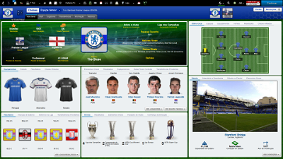
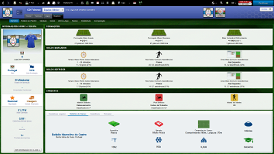
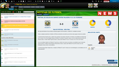
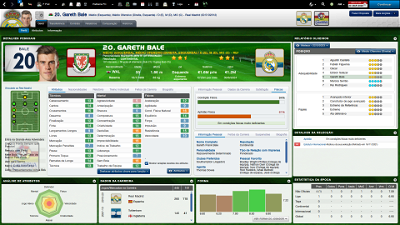
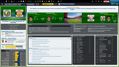
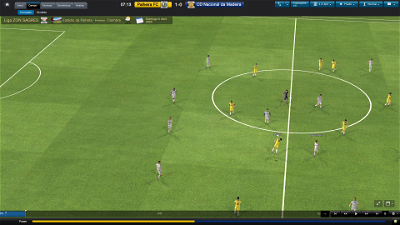
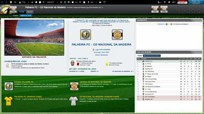
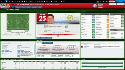
Skin style FMC for FM 2014 for FM 2014 career mode (1920x1080 and 1600x900).
I'm pleased to present you the new update of the version 2.0 of FMC FLUTSkin for FM 14 (white version) – 1920x1080
Thanks to all for your reported bugs. A special thanks to rune (from german Meistertrainerforum) and leo_crumb.
As always I would appreciate it if you could tell me when and in what circumstances (or panels) the bugs arise.
This FlutSkin version includes lots of changes in 1920x1080 version (not the 1600x900).
Note that although you can find the two versions of the skin, I only updated 1920x1080 version.
Besides lots of minor graphics changes here are the most important tweaks in this update for FlutSkin version 2.0:
- “New” attributes profile panel (status icons included)
- “New” board room panel
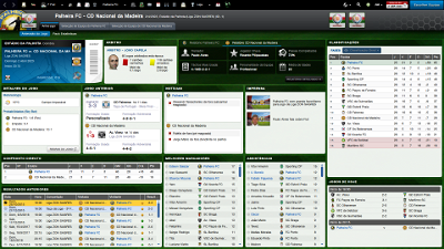
- Fixed the club overview panel and inclusion of tabs and new information (board confidence panel)
- “New” match titlebar score (stadium name, picture and conditions included; calendar and weather icon included)
- “New” team report summary panel
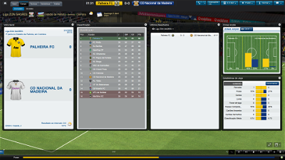
- Match inbetween highlights: 5 panels with fixed size
Installation Instructions
Step 1
Download the skin and extract the files (using either 7-Zip for Windows or The Unarchiver for Mac).
Step 2
Open the extracted folder “fmcFlutSkin2014v2.0update30july2014" and Move the two folders inside into your skins folder:
Win Vista/7/8: C:\Users\<username>\Documents\Sports Interactive\Football Manager 2014\skins
Win XP: C:\Documents and Settings\<username>\My Documents\Sports Interactive\Football Manager 2014\skins
Mac OS X: /Users/<username>/Documents/Sports Interactive/Football Manager 2014/skins
Create the folder "skins" if it doesn't exist.
Step 3
Start the game and go to Preferences screen and Interface tab.
You should see "FMC 2014 FLUT skin 2.0” and "FMC 2014 FLUT skin 2.0 1600x900” as options in the skin drop down of the Overview box.
Choose the version for the resolution you want.
Hit the Confirm button.
Credits
This skin was created by flut.
Comments
You'll need to Login to comment
RetroKid1966
really want to use this skin though because it's the best i've seen so far,
had last years on FM13 and it worked just fine and I loved it!
if anyone could help me getting it to work on my current resolution i'd really appreciate it?
or if FLUT is planning to do one for smaller screen resolutions like mine?
Fruit Joy
I tried to change it manually but nothing, always comes back as it is now.
Thank you for that amazing skin!!!
flut
Hi
sorry but I don't understand what problem is....could you please explain a little bit more?
flut
Hi retrokid
In fact the skin works fine only in 1920x1080 and 1600x900..Sorry but I'm not planning to make a version for smaller screen resolutions.....
Social Straddle
First of all - really amazing work.
This skin and its predecessor really make my gaming so much more intense.
Nevertheless i have some minor 'buggy' things to report:
1. In the team postmatch screen (not from the game you just played) from any game you can observe by clicking on the results - i cant see any goal or disciplinary info for the teams. So you can't see who scored the goals etc. and two of the lower info panels cannot be used (greyed out). Maybe a resolution problem, but i use the normal 1920x1080.
2. when using the player instruction settings the white (or grey) fonts colour makes it a little tricky to find the player you want to change instructions for.
Just wanted to let you know. Hope this helps making your incredible work even better.
And thanks for putting so much time into this for all of us.
flut
Hi Social Straddle
Thanks ;-)
1. You're right. I already noticed that bug and it is fixed now the panel with goals and disciplinary info. As soon as possible I will release an update folder with this fix and with some other tweaks. The other panels (report and last events) I looked in the original FM skin and in that view they are empty too. So, I think is not a bug.
2. Concerning this reported bug, could you please put a screenshot?
Thanks again!!
flut
Social Straddle
that's what i mean:
https://sortitoutsi.net/uploads/mirrored_images/eXNF3AJB5tkOslGLKVi6yWlpy0gq96Bs4Z8XczXP.jpg
in this case (before a game) everything's ok
but in game the left dark panel/box is white so it looks like this:
https://sortitoutsi.net/uploads/mirrored_images/iiPw8NWuKgiHQwiImMYI1SPnDXUUzDwvyJL2SBBm.jpg
just a minor thing i know...
while taking the screenshots i noticed another prob, in game preview when the team names appear to be too long, they get messed up:
https://sortitoutsi.net/uploads/mirrored_images/VVcVqVWiD4K0lCFyfEgujgnYv421UpnvyDhB5FK2.jpg
and just a suggestion (because i really like your fresh greeny style) in the line up screen i was reducing the grass colour intensity so that it fits with the pitch colours. But like i said only a suggestion.
https://sortitoutsi.net/uploads/mirrored_images/BOFCcxBqNh5iiFFANe8wGrW97yruR8nft7fNM7ua.jpg
And finally of course i didn't meant to be beating someone but to congratulate (thumb up) you to your great work.
So better use icons
Social Straddle
Here's another picture:
https://sortitoutsi.net/uploads/mirrored_images/MjBbnQJcHT8ifoRu2uqeoVQN1mGr8gKbw72080Ve.jpg
however it looks somewhat weird with the two grey boxes...
brunners
Is this supposed to be the case?
flut
Hi Social Straddle
I already updated the skin. The problems you reported are fixed (as I said in the overview panel I think is not a bug...).
Thanks for your cooperation.
cheers
flut
flut
No. I think that problem is due to your screen resolution.
Social Straddle
I was just wondering if in your previous versions (the old dark one or the first white ones) in the team postmatch screen the PoM (player of the match) was also diplayed?
Anyway, great skin - everythings working for me - thanks again for fixing this.
Keep up the good work!
flut
Hi
Thanks ;-)
Regarding your question, I don't know if I understood. You asked me if the PoM was displayed in Match Post Match panel? If that was indeed your question, the answer is yes.
cheers
flut
Social Straddle
Hej Flut,
that's the screen i was talking about again... The player team game following screen is absolutely fabulous
And in my game the competition logo position (on any competition screen) CL or World Cup for example are too much right in the header.
Another thing any idea how i can fix certain in game boxes because they repeatedly change to any size after i always try to keep them in a certain way.
I mean the boxes that pop up when the game sequences aren't shown due to 'comprehensive' or 'extended' settings for a match and the infos come up.
Thanks for any advice,
Straddle
flut
Hi Straddle
Sorry but could you please put the screenshots? It's always much easy for me to understand the problems...
cheers
flut
Social Straddle
For the Competition (referring to all logos which are bigger/differently sized from Club logos) thats my screenshot:
http://imgur.com/2VL6kTu
And for these much too eager motivated screenboxes - here you go:
http://imgur.com/qdy2LF4
thats how they keep coming back...
And that's how i want them to be:
http://imgur.com/epCdk86
--> any suggestion how i can fixate them in this particular size?
and for the post of Fruit Joy - i suppose he's having the problem that in the player profile the personal player details are set for multiple info boxes...
I also noticed that when coming to the 'club overview' by clicking some link sometimes the: key player, manager, etc and the last fixures are blank on the page but by clicking something in the header and returning to club overview make them reappear. Just FYI.
See u around,
Straddle.
flut
Hi Straddle
1. Regarding the competition logo you just have to do the following (however, remember that the place you put the competition logo is the same where appear the player/picture in the player titlebar):
Go to titlebar.xml and search for
<widget class="picture" id="ppic" image_alignment="top, left" height="80" width="80" scale_picture="true" keep_aspect_ratio="true" priority="1">
<layout class="stick_to_sides_attachment" alignment="top" inset="20"/>
<layout class="stick_to_sides_attachment" alignment="left" inset="85"/>
<boolean id="scale_picture" value="true" />
<boolean id="keep_aspect_ratio" value="true" />
<flags id="image_alignment" value="left"/>
Change the value "85" for a small value.
2. Concerning the panels of match inbetween highlight, sometimes the same happens in my game but, in general, if I adjust the size and after I save the game, the panels maintain the size. I included in all panels the instructions save_current_state="true" but I don't know why the size tend to change itself....
3. The "empty" box in club overview start to happen after one of the SI patches (that one responsible for "n" bugs in the skins made by the gamers...) and in spite of my effort in order to completely solve all the problems, that one has remained (we have to go out of the panel and return, in order to work fine).
4. Thanks for your help concerning the understanding of the Fruit Joy. In fact I also thought that that is a problem with the default container. However I don't know why it happens because all the boxes include the "default" instructions in order to show a different panel in each box....and also the "save_current_sate" instruction.....maybe there are a conflict with other skins...I really don't know...
cheers
flut
flut
I released a FMC Stadium Pack of Portuguese Stadiums (168 different stadiums)
If you are interested on it, go to Misc Football Manager 2014 Graphics page.
cheers
flut
laucribella
I have a little problem: my titlebar for - "Inbox, Squad Status, Team Injuries, Team Competitions, Next match, League Table etc" are all white and the text are also white. How can i change the colour? Sorry for my bad english.
Greetings from Cristi
flut
Hi laucribella
Thanks.
Could you please put a screenshot with your problems?
laucribella
OK. Look at those screenshots:
flut
This happens because your subsection graphics are not the correct. These graphics are from older versions of the skin. What is the version you use?
laucribella
flut
Hi
It's weird if you are using the current version. I looked in your screenshots and various graphics and font colour don't match with the 2.0 updated. Try to keep on skins folder only this skin, clean the cache and reload the game. Let me know if your problem persists.
laucribella
I tried everything you said to do, but nothing changed. I uploaded three new screenshots. I think that is the latest version 2.0, yesterday I downloaded it from the site. In the skins folder I have no other folders. I tried to change the colors in "personal information Bergkamp person" file, but in vain. Any help is welcome. Thanks in advance.
flut
Okay. it's weird what happens however you could solve it. Put this xml in the fonts folder of the skin (overwrite the other one with the same name). Plaese let me know if it is okay now.
cheers
Your text to link here...
laucribella
It has been solved. Thank you very much for your patience and for early help. Very nice skin.
Muito obrigado.
flut
De nada ;-)
Social Straddle
1. Regarding the competition logo you just have to do the following (however, remember that the place you put the competition logo is the same where appear the player/picture in the player titlebar):
Go to titlebar.xml and search for
<widget class="picture" id="ppic" image_alignment="top, left" height="80" width="80" scale_picture="true" keep_aspect_ratio="true" priority="1">
<layout class="stick_to_sides_attachment" alignment="top" inset="20"/>
<layout class="stick_to_sides_attachment" alignment="left" inset="85"/>
<boolean id="scale_picture" value="true" />
<boolean id="keep_aspect_ratio" value="true" />
<flags id="image_alignment" value="left"/>
Change the value "85" for a small value.
2. Concerning the panels of match inbetween highlight, sometimes the same happens in my game but, in general, if I adjust the size and after I save the game, the panels maintain the size. I included in all panels the instructions save_current_state="true" but I don't know why the size tend to change itself....
3. The "empty" box in club overview start to happen after one of the SI patches (that one responsible for "n" bugs in the skins made by the gamers...) and in spite of my effort in order to completely solve all the problems, that one has remained (we have to go out of the panel and return, in order to work fine).
4. Thanks for your help concerning the understanding of the Fruit Joy. In fact I also thought that that is a problem with the default container. However I don't know why it happens because all the boxes include the "default" instructions in order to show a different panel in each box....and also the "save_current_sate" instruction.....maybe there are a conflict with other skins...I really don't know...
cheers
flut
[/quote]
Howdy flut,
however I was a little busy. THX again for your fast reply.
Just wanted to let you know that thanks to you the competition logos are now lovely centered in my game.
flut
Howdy flut,
however I was a little busy. THX again for your fast reply.
Just wanted to let you know that thanks to you the competition logos are now lovely centered in my game.
[/quote]
You're welcome ;-)
flut