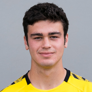
Giovanni Reyna - Submissions - Cut-Out Player Faces Megapack
72051281
Submitted
29 Oct 2024 13:18:16
Timeline
This image is a response to
#235106
This image is part of a pack:
youngfacepack [Old Request]
In Progress
by bastien andreu
on 31 Mar 2021 18:01:59
Pending
by mons
on 29 Apr 2021 15:43:41
Completed
by mons
on 29 Apr 2021 15:43:42
@Razanor Cut here already https://sortitoutsi.net/graphics/request/53390
Also, please look for the best quality sources in the future, the one you posted is too small
Also, please look for the best quality sources in the future, the one you posted is too small
Thanks for the link, where can i find the smaller version of the cut out for the iconfaces?
Thanks for the link, where can i find the smaller version of the cut out for the iconfaces?
When the cut is included in the upcoming 12.01 update pack (out in the next couple of days), an icon will also be generated
This image is a response to
#251195
It may be of a large size, but I don't think the quality is very good.
I think the below, while smaller, is of better quality and may provide a better cut
I think the below, while smaller, is of better quality and may provide a better cut

Most recent:


This image is a response to
#256906
He was cut in 12.08 from a very good source. There's no real reason to request him. Let's try and focus on genuine improvements please 
He was cut in 12.08 from a very good source. There's no real reason to request him. Let's try and focus on genuine improvements please
In my opinion the current image is not the best his neck it too long
Uploaded the cut I use but it's no more than an alternative to the MP image really
In my opinion the current image is not the best his neck it too long
How so? Where should it be then?
And the neck in your source is shorter? Man, that's confusing me
In my opinion the current image is not the best his neck it too long
Do you mean that you think the cutout could be cropped closer to the chin to remove a few pixels from the bottom of the neck?
Do you mean that you think the cutout could be cropped closer to the chin to remove a few pixels from the bottom of the neck?
Yeah just meant it wasn’t cut close to the chin like the guidelines state, fairly obvious to me, didn’t think what I said was hard to understand. Cheers
Yeah just meant it wasn’t cut close to the chin like the guidelines state, fairly obvious to me, didn’t think what I said was hard to understand. Cheers
I'm sad enough to have gone to check it, and that area is 4-5 pixels high. Hardly a lot
I've corrected the green hue in his chin, though.
Let's be honest,all Daniel requests are more alternative than real improvements.We can have most recent and quality cut,but that won't be good enough for him.I really don't know how to say this on English since that not my mother language,closest word I can say is "a stickler",in my language I would say "Traži dlaku u jajetu" or "Hoće hleba preko pogače".
Daniel,maybe you could try to cut by yourself,we're gladly gonna give you tips and feedback or any other help with that.
Daniel,maybe you could try to cut by yourself,we're gladly gonna give you tips and feedback or any other help with that.
Let's be honest,all Daniel requests are more alternative than real improvements.We can have most recent and quality cut,but that won't be good enough for him.I really don't know how to say this on English since that not my mother language,closest word I can say is "a stickler",in my language I would say "Traži dlaku u jajetu" or "Hoće hleba preko pogače".
Daniel,maybe you could try to cut by yourself,we're gladly gonna give you tips and feedback or any other help with that.
Relax pal a few requests isn’t the end of the world
This image is part of a pack:
Bundesliga Leaguepack 2019/20 [Old Request Response]
This image is part of a pack:
TO DELETE [Old Pack Submission]
This image is part of a pack:
PACKLFS1 [Old Pack Submission]

 Background and Stadium Packs






katalonczyk22