150,088
251
18,122
FM 2020 FLUT skin dark - Version 2.2
Skin for FM 2020 regular career mode and widescreen (1920x1080).
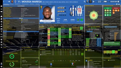
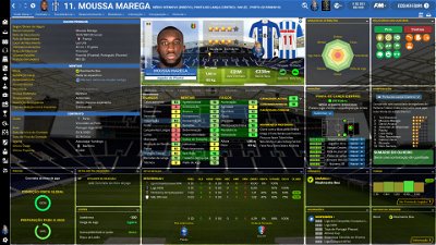
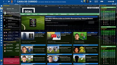
This is the FLUT Skin ("dark" version) for FM20. As usual, the Flut skin is completely full of changes when you compare with the default skin.
For many years I keep trying to edit a skin who can help FM Fans to better enjoy our game.
With the direct or indirect help of many FM players and FM skinners (thank you all) I created many stuff (such as the citypics, the rotating images of stadiums in club overview panel or the back and front kits displayed in player overview panel, just to mention some of the ones I consider most relevant).
Therefore, now, in FLUT Skin you can find the instant result option, the background/opacity selector, compatibility of player picture (in player overview panel) with DF11 and Scope facepacks styles, the animated intro match, front and back kits displaying in player overview panel, compatibilty with citypics and much…much more!!!
And now you can personalize FlutSkin more than ever!!
I included 14 alt folders in this pack. You just need to read the read me file in order to know how you can use them:
1. Alt. for sidebar - alt FM20 FlutSkin sidebar matching club colour (works only with the no hidden sidebar)
This folder is for those who want to use a coloured sidebar according each club colour.
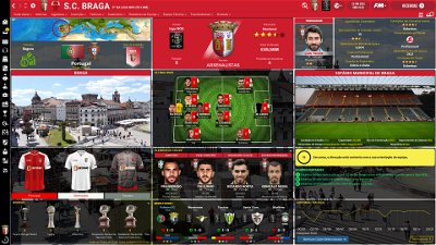
2. Seven alts. for club overview panel - club overview alt1, 2, 3, 4, 5, 6 and 7
Seven different layout for the club overview panel
3. Alt. for player overview panel layout - player overview alt - flutskin 18
Files for return to the player overview layout I used in FlusSkin 1.8
4. Alt for attributes panel - alt for player overview without background boxes as default and for player profile and player popup without background boxes
Contain files for those who prefer playing with player attributes panel without background boxes
5. Alt for player overview panel without CA and PA values
6. Skin without background pictures
An alt client object browser.xml file for those who prefer playing the game with a solid background instead of pictures backgrounds (stadiums, cities, players, etc)
7. Alts for No Hidden Sidebar (the default sidebar) - for light and dark skin
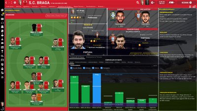
8. Alt for playing with the tactics panel as in the 2.1 version (only displaying the back kit)
The Skin pack also includes:
1. “Round country flags”, “round continents logos” and default logos specially made in metallic style by @Qvordrup from sourtitoutsi. Those graphics will be displayed in the title bar.
2. Background maps for confederations, also made by @Qvordrup . Thank you @Qvordrup by your great work and for your collaboration!!!
You can download the 2D packs prepared for Flutskin (titlebar and player overview panel) here in sourtitoutsi. HERE
However, if you prefer edit your own kits, I also included in the pack a .pdf file explaining how you can edit the kits for Flutskin.
The logos in country locators are now updated by @Qvordrup according the last version of metallic logos.
You also can download the stadiums megapack and the citypics released by @DazS8 (thank you, my friend) HERE and HERE
And @geordie1981 has made a pack for inside "small" stadiums HERE
As always FlutSkin is completely free[/b] to download and I hope you enjoy it. However, if you want, you can reward my work donating whatever amount you wish. Any small amount is really appreciated.
You can do so by clicking the button down below:
Main changes in 2.2 version
- Tactics overview panel (front kits included; position colours changed)
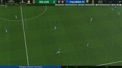
- Instant result in match included
- Text font
- Hidden sidebar
- New alts.
- Tweaks here and there
Once again I would like to thank you to all FM Fans who support my work and also to all skin makers. A special thank you to PATRES10 from fmslovakia for the 2D default kits (especially tailor-made for FlutSkin).
Resolution requirements:
This skin was made to work properly in 1920x1080 (1080p) full screen mode, sidebar icons only. As a result, some panels won’t work properly in other resolutions (and also in 1920x1080 windowed mode).
How to add Flut Skin in FM20
Download and extract the .rar file (using either 7-Zip for Windows or The Unarchiver for Mac).
Place the "fm2020flutskin_dark" folder here:
Documents\Sports Interactive\Football Manager 2020\skins
Create the folder "skins" if it doesn't exist. Start FM20 and go to Preferences screen and then into the Interface tab. You should see FM 2020 Flut Skin dark - Version 2.2 as an option in the skin drop down of the Overview box. Hit the Confirm button.
Please note this skin is provided as is. It has nothing to do with Sports Interactive or SEGA and won't be supported by them.
Skin for FM 2020 regular career mode and widescreen (1920x1080).
This is the FLUT Skin ("dark" version) for FM20. As usual, the Flut skin is completely full of changes when you compare with the default skin.
For many years I keep trying to edit a skin who can help FM Fans to better enjoy our game.
With the direct or indirect help of many FM players and FM skinners (thank you all) I created many stuff (such as the citypics, the rotating images of stadiums in club overview panel or the back and front kits displayed in player overview panel, just to mention some of the ones I consider most relevant).
Therefore, now, in FLUT Skin you can find the instant result option, the background/opacity selector, compatibility of player picture (in player overview panel) with DF11 and Scope facepacks styles, the animated intro match, front and back kits displaying in player overview panel, compatibilty with citypics and much…much more!!!
And now you can personalize FlutSkin more than ever!!
I included 14 alt folders in this pack. You just need to read the read me file in order to know how you can use them:
1. Alt. for sidebar - alt FM20 FlutSkin sidebar matching club colour (works only with the no hidden sidebar)
This folder is for those who want to use a coloured sidebar according each club colour.
2. Seven alts. for club overview panel - club overview alt1, 2, 3, 4, 5, 6 and 7
Seven different layout for the club overview panel
3. Alt. for player overview panel layout - player overview alt - flutskin 18
Files for return to the player overview layout I used in FlusSkin 1.8
4. Alt for attributes panel - alt for player overview without background boxes as default and for player profile and player popup without background boxes
Contain files for those who prefer playing with player attributes panel without background boxes
5. Alt for player overview panel without CA and PA values
6. Skin without background pictures
An alt client object browser.xml file for those who prefer playing the game with a solid background instead of pictures backgrounds (stadiums, cities, players, etc)
7. Alts for No Hidden Sidebar (the default sidebar) - for light and dark skin
8. Alt for playing with the tactics panel as in the 2.1 version (only displaying the back kit)
The Skin pack also includes:
1. “Round country flags”, “round continents logos” and default logos specially made in metallic style by @Qvordrup from sourtitoutsi. Those graphics will be displayed in the title bar.
2. Background maps for confederations, also made by @Qvordrup . Thank you @Qvordrup by your great work and for your collaboration!!!
You can download the 2D packs prepared for Flutskin (titlebar and player overview panel) here in sourtitoutsi. HERE
However, if you prefer edit your own kits, I also included in the pack a .pdf file explaining how you can edit the kits for Flutskin.
The logos in country locators are now updated by @Qvordrup according the last version of metallic logos.
You also can download the stadiums megapack and the citypics released by @DazS8 (thank you, my friend) HERE and HERE
And @geordie1981 has made a pack for inside "small" stadiums HERE
As always FlutSkin is completely free[/b] to download and I hope you enjoy it. However, if you want, you can reward my work donating whatever amount you wish. Any small amount is really appreciated.
You can do so by clicking the button down below:
Main changes in 2.2 version
- Tactics overview panel (front kits included; position colours changed)
- Instant result in match included
- Text font
- Hidden sidebar
- New alts.
- Tweaks here and there
Once again I would like to thank you to all FM Fans who support my work and also to all skin makers. A special thank you to PATRES10 from fmslovakia for the 2D default kits (especially tailor-made for FlutSkin).
Resolution requirements:
This skin was made to work properly in 1920x1080 (1080p) full screen mode, sidebar icons only. As a result, some panels won’t work properly in other resolutions (and also in 1920x1080 windowed mode).
How to add Flut Skin in FM20
Download and extract the .rar file (using either 7-Zip for Windows or The Unarchiver for Mac).
Place the "fm2020flutskin_dark" folder here:
Documents\Sports Interactive\Football Manager 2020\skins
Please note this skin is provided as is. It has nothing to do with Sports Interactive or SEGA and won't be supported by them.
Comments
You'll need to Login to comment

LunaLR
Safmon
great job with this skin @flut ! Do you know how to fix this "problem"? I cannot see the player name and the other info just below it since it is black on black (and this happens with Inter Milan too)
cheers!
Safmon
PS. Atalanta has the same problem
DazS8
Looks ok to me maybe look into your colour settings of your monitor/tv
Safmon
I "played" with the settings and it is like the pics you posted now... a bit better though
[email protected]
Chrissy10970
Is someone know why I cant'I see the time during the match ?
Thanks
flut
<container class="bordered_box" red_replacement="primary for <container class="bordered_box" red_replacement="grey 300""
Hi Townender and fascinoso: thanks!!!
Hi LunaLR:
regarding the panel unreadable please place this files in the game folder of the skin (reload the game)
http://www.mediafire.com/file/ct9hdlt5kdraute/new_game_settings.xml/file
http://www.mediafire.com/file/gw2e2ku7wjrne9g/new_game_settings_panel_header.xml/file
Regarding the white papers, thanks but in fact I don't want to use an opaque white papers since I'm interested to see the background pictures. But thanks anyway.
Hi Chrissy: The time is there but now on the right bottom of the match panel.
Chrissy10970
Thanks for your message but not for me. And all seems OK in the settings.
Have a good day.
avecerno
I wanted to know if it is possible to change font size in specific places like:
and if it is possible to fix:
Thanks for your hard work.
gary wynn
vonHolzminden
Try this. It is from Flut:
Go to match team stats ibh bottom3.xml and change the value of row_height in the following code (you also can try to change the row_spacing value).
<widget class="match_player_list_table" id="pltb" database_table_type="1" mode="fill_rows, stripe_rows, fill_columns" row_height="23" row_spacing="-1" column_spacing="0" use_super_headings="true">
Chrissy10970
Any solution for my problem.
Thanks a lot.
rorystewart
Only slight problem I have:
I don't have the time appear on the match screen (as show in the attached image). Am I doing something wrong?
I am currently managing both club and country (not sure if that matters).
Many thanks again.
avecerno
Hi, I solved the 2nd problem by adjusting the value of the row_height.
Which one should I edit for decreasing the font size of the match commentary?
flut
avecerno: go to match commentary.xml and change the value in line 23 (<integer id="size" value="20" /> )
Rorystewart: Thanks. The timer now is on the right bottom of the screen (next to the commentary bar)
gary wynn :
That logo is too big but is the logo for the kit (I had to do that trick because, as you know the default kits don't have the logo kit - the exception is the kits showed in the kits panel). Thus, for adjust it you should go to kit icon16.xml and adjust (by trial and error) the place and the dimension of the logo, in the following code:
<layout class="stick_to_sides_attachment" alignment="top" inset="-43"/>
<layout class="stick_to_sides_attachment" alignment="left" inset="110"/>
<layout class="stick_to_sides_attachment" alignment="vertical" inset="0" />
<layout class="stick_to_sides_attachment" alignment="all" inset="86" />
Regarding the 2D kits front already adapted for flutskin, you can find it here in sourtitoutsi
https://sortitoutsi.net/downloads/view/49904/2d-kits-1920-for-flutskin-titlebarplayer-overview-v10
Chrissy10970
Fot the third time since 10th of april, the timer doesn't appear during the match and, yes, i've bee looking on the right bottom of the screen (next to the commentary bar). It's not there.
flut
Please put a screenshot.
Tommy Hughes
Hi flut and thanks for the great skin!
I would hope to be able to change one small thing, though: when I move my mouse pointer over a player's name, it shows a mini profile box. I remember that box used to contain the height of the player, but now that I use the flut skin it doesn't. Being able to quickly see a player's height would be really nice, because it saves me the trouble of clicking into each player's profile to find out whether they should be positioned to defend a set piece or whether they're a dangerous opponent in crossed ball situations etc.
I'd appreciate any help, because I've been searching through the files, but am still out of ideas.
Chrissy10970
I don't know how to put a screenshot but rorystewart did. It's exactly the same problem.
flut
Rory just put a small piece of the panel (the top....where the match time will not displayed in this version of the skin). Thus we can't look at the bottom of the panel. Without a whole screenshot I can't help you, since in my game everything goes well.
What is the resolution of your screen?
flut
Please put a screenshot.
Tommy Hughes
flut
Hi
Use this filçe. Put it in the panels folder of the skin (the weight and height will be displayed in the attributes panel).
https://www.mediafire.com/file/e8n6hww5xc5yw6i/player_attributes_panel3.xml/file
Tommy Hughes
It works! Thank you so much!
Chrissy10970
I hope this will help.
flut
Ah...you are talking about the clock and not the time bar....
This happen due your screen resolution. As I said in the skin description, the skin works well in 1920x1080.
However, you can try the following
Go to match title bar.xml
and change line 309
<container width="140">
for
<container width="140" priority="1">
let me know if it worked.
Chrissy10970
Thanks for you help but it doesn't work. Do you know how to change resolution to 1920x1080 ?
Have a good day.
flut
I believe your computer is not able to do that.
You can try other solution. Remove the information regarding the fixture, stadium, city and date. For that, remove the following piece of code
<container width="251">
<layout class="arrange_vertical_attachment" layout="-1,-1,-1,-1" offset="0" gap="0" />
<layout class="stick_to_sides_attachment" alignment="horizontal" apply_to_children="true" inset="0" />
<!--fixture name-->
<widget class="fixture_name_text" id="Name" style="bold" alignment="centre,can_scale" colour="text" size="9">
<record id="object_property">
<integer id="get_property" value="FxNm" />
</record>
</widget>
<!-- stadium -->
<widget class="client_object_label" id="namV" style="bold" alignment="centre,can_scale" colour="text" size="9">
<record id="object_property">
<integer id="get_property" value="stad" />
</record>
</widget>
<!-- city -->
<widget class="city_label" id="namL" alignment="centre;can_scale" colour="text" size="9">
<record id="object_property">
<integer id="get_property" value="SctI" />
</record>
</widget>
<!--date-->
<widget class="date_cell" id="date" alignment="centre,can_scale" auto_size="vertical" size="9" colour="text">
<translation id="format" translation_id="447557" type="use" value="[%date#1-time] kick off on [%date#1-short][COMMENT: string to show the kick off time and date of a fixture]" />
<record id="object_property">
<integer id="get_property" value="fxdt" />
</record>
</widget>
</container>
fascinoso73
I wanted to ask you if it is possible, in the tactics panel, to display for example with Juventus..the front front of the first jersey.
Thanks .. a warm greeting