3D Kits
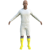
3D Kits are special kits designed to make the match engine look even better, with the players wearing customised and improved kits on the pitch.
- 850 Downloadable Packs

73,814
103
29,699
Spain - La Liga 3D'2020/21 for FM20/21 by chris New! (15/10/20)
1. Extract folder to Documents/Sport Interactive/Football Manager 20##/graphics/kits/put in here!
( If there is no graphics folder there, create "graphics" )
2. FMXX - click 'Preferences' > 'Interface' > unticked 'Use caching to decrease page loading times & tick 'Reload skin when confirming changes' > click 'Reload Skin' for first your time.
THEN ALWAYS when you download other packs, DO Click 'Preferences'>'Interface'>'CLEAR CACHE then again click 'RELOAD SKIN' AS ALWAYS after downloading to folders.
Enjoy 🙂
Comments
You'll need to Login to comment

ostkiz
Thanks!!
wfm18
- Alaves home color a bit off, all have issues with the collar (some pixels too high), logos too big on third kit (too much on the sides)
- Atletico: move collar home and away down by some px, move atletico logo bit more to the left on away and third
- Barcelona: move away and third logo's on the exact same spot as home (barca and nike), move collars few px down
- Betis: neck/shoulders should move a bit down, logos a bit more to the center, collar down
- Bilbao: white stripes should be smaller, move logos way more to the center (they are almost not visible anymore on the kit), move collar a bit down
- cadiz: perfect.
- celta: all move collar down few px
- eibar: away and third move collar down few px
- elche all move collar few px down
- granada center logos more, granada logo should be bigger, collar down few px
- getafe all move collar down few px
- huesca perfect
- levante all move collar few px down
- osasuna perfect
- real madrid: logos bit more to the center, collar few px down
- real sociedad: away make logo's consistent position and size compared to home
- sevilla logo's a bit smaller and a bit more down (few px)
- valencia: away and third logo move a bit more to the left (center)
- valladolid: perfect
- villareal logo to the center (move to left), third make collar nice (consistent).
If you have .psd files, I'd love to help you out > just send them as a PM to me. Regarding the collars: that seems a template issue (that the collar is a few pixels too high compared to SI ones), which template are you currently using?
franciscoj
K1ngSlay
chris
What's not working?
chris
What kit converter you are saying aout?
wfm18
https://sortitoutsi.net/content/57188/template-2d-fm2021-standard-kits
There you go. We used original SI kits to map them on top of the SS 2D kits, so they are like 90% accurate (see posts in that thread with comparison). The issues on some kits (for example Barca away and third) that I found were that the Barca and Nike logo were too far to the left and right and that they should be in the same place as the home kit (centered). On the other hand, for example the Cadiz one looks perfect (you can see the preview of that one also in the thread above). Tonight I'll export them all again and edit this post to add the attachment. I'd love to help you out correcting some stuff.
chris
Now to the “problems” with the 3D kits:
- You are saying that: “the kits need fixing because they are not correct ingame as 3D kits”. Did you checked them ingame? Doesn’t seem so...
Let’s see some examples :
- Bilbao: "white stripes should be smaller, move logos way more to the center (they are almost not visible anymore on the kit), move collar a bit down"
Is there something wrong to the kit (ingame pic)? no stripe need to be smaller and the badge is there visible as well
- Elche : "all move collar few px down"
The collar is just in place I think (ingame pic) so why should be fixed?
- Villareal : "logo to the center (move to left), third make collar nice (consistent)."
Whats wrong with that collar to make it nice? (ingame pic)
- Sevilla : "logo's a bit smaller and a bit more down (few px)"
Is there something wrong to this kit to alter it?
- Sociedad: "away make logo's consistent position and size compared to home"
who says that all the real life kits have the badges in the exact point ?
- Alaves : "home color a bit off"
- As for the collars generally every collar is been seen in the game (ingame pics)
So with all the respect I totally disagree when you are accusing my kits as "wrong"
When I made 3D kits are suposed to look nice in matches and that’s all .
I understand that they have some minor issues when are used with your converter but that’s not a reason to “fix” them cause are not made for that.
Every 3d kit I make, I always ckeck it ingame and that’s what matters for a 3d kit.
PS. the 3d Barcelona kit you are using in your example is mine too....
priority76
The kits look great mate, I'm not sure what the nitpicking is about.
chris
That's exactly my point my friend. I made the kits and test them all, dont think there is a problem
wfm18
I think when you open the zip you will hopefully understand my concerns, for example the Bilbao kit below, these are exactly mapped on the original kits and the logo's are located a bit too far to the sides in my opinion (compared to this)
I'm btw sorry, I referenced hammer9 instead of you for the creation of the Barca kit, I will fix that.
chris
The kits are made for the ingame, and I am satisfied as long as they look ok ingame.
Calan10
Great work as always Chris, btw any chance of getting spanish second division? youre the best, thanks for your hard work
chris
Maybe I will but not so soon I am afraid....
wfm18
Yeah that is definitely true. I’m sorry if you feel attacked/accused or anything, it’s definitely not what I’m aiming for. I love your work and dedication, I mean you create so many kits and I know how much time goes into each of them.
Could you share the psd files with me so I can make small corrections for the 2d versions? (I wont publish the 3d ones of course)
Edit: I suggest using the tool in the link below for future creation of kits, since this is the exact 3D model that SI uses in the game engine. In my opinion still same results (however I won't bother you with that anymore :face_with_tongue: )
https://sortitoutsi.net/content/57284/fm21-3d-kits-viewer
franciscoj
Thank you.
chris
https://www.mediafire.com/file/57ukleswsfsnucs/Primera+3D+kits.rar/file
An update fixing all bugs, with the help of 3d kit viewer.
wfm18
Hajdučki sin
mate can you make segunda?
hammer9
(Updated - fixing all bugs, with the help of 3d kit viewer by chris)
franciscoj
hammer9
we haven't get Segunda B yet tho...better if you post in 3D official ask for Salamanca CF kits with a picture if possible, im sure anyone will make it for you 🙂
danielrere
Please would be very nice to have spanish second division
dediegoj
The First Division is a great job, thanks a lot 😉
Here are the three kits from UD Las Palmas, my team. 🙂
Hajdučki sin
Can you make others?
dediegoj
Sure
what team do you want?
Hajdučki sin
What ever you want. If you know making 3d can you make pack or some clubs.
franciscoj
Increíble dediegoj a ver si tenemos pronto la segunda división.
Un saludo crack! Pio Pio
Hajdučki sin
Is it possible that you make pack or some teams
ostkiz