416,159
2,066
27,202
FM 2021 FLUT skin dark - Version 16.0
Dear all
This FLUTSKIN version 16 is the final version of FLUTSKIN for FM21!!
A great thank you to all FM fans who choose to play with FLUTSKIN and always keep me motivated to still improving the skin and gave me new ideas!!!
A special thank you to all players who decided to distinguish my work with a donation!! Although just a small part of FM Players who use the skin made a donation (I edited the skin as a hobby and, as you know, completely free), I always feel honoured and happy when people recognize the work done and decide to contribute. So, I reinforce, I have to give a special thank you to that friends of FlutsKin!!!!!!
Also a recognized thank you to those one who help me answering the questions and requests and adapted the FlutSkin (namely and specially Rosek for the help to answering questions and the adapted version for 2560x1440, and Richbell, for the adapted version with hidden attributes!!!!! And, of course I don't forget the skinners community who also indirectly contributed to FlutSkin with their creativity.
Also a special thank you to PATRES10, from fmslovakia for the 2D default kits (especially tailor-made for FlutSkin) anf to Michael Murray since I started editing the match inbetween highlights panel based on his amazing work!!
Now is time to stop editing the skin for this season. I wish to return for FM22. Lets wait and see since no one is able to predict the future.
MAIN CHANGES IN v16.0
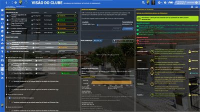
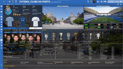
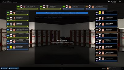
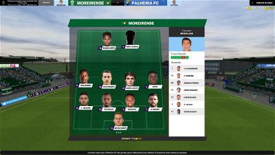
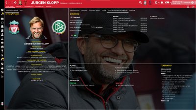
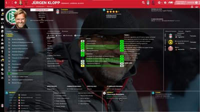
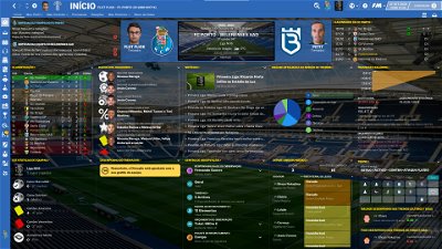
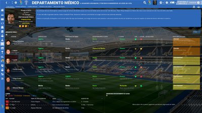
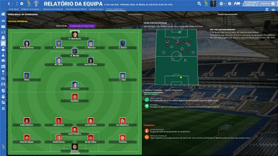
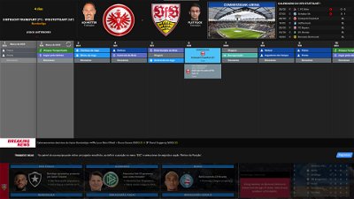
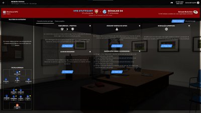
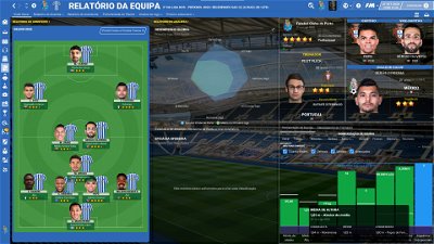
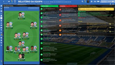
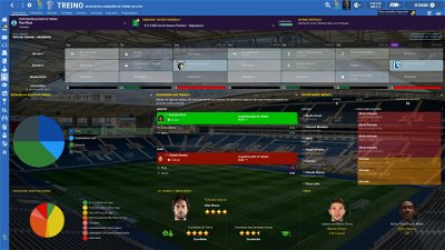
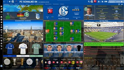
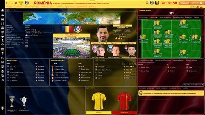
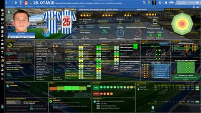
- Following the great idea of majesticeternity, Tyburn and a31632 (from Sports Interactive community) I included in several xmls a code for personalize the background in specific panels, namely club overview, player overview, board room, human profile and team training. These codes are not “activated” by default but if you want to have a different (customized) background in each one of that panels you just have to activate the codes. In the read me file I explain how you can do it.
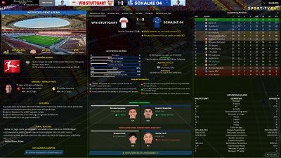
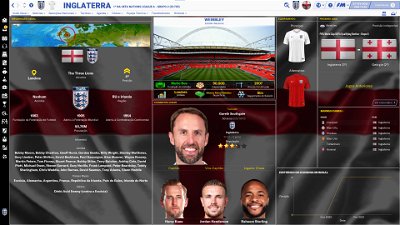
- Nation overall panel
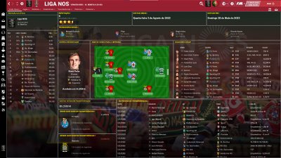
- Nation overview panel
- Human profile panel
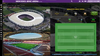
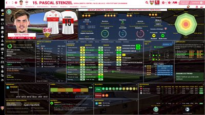
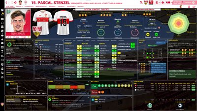
- Player profile stadium option in player overview panel
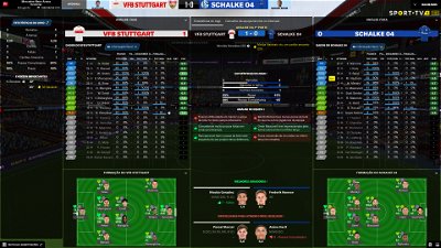
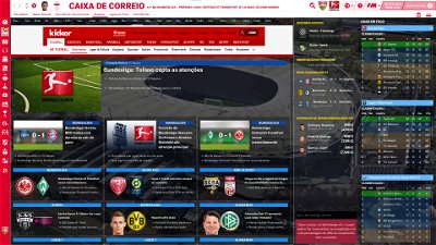
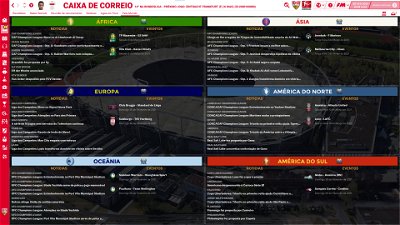
- News panel
The Skin pack also includes:
1. “Round country flags”, “round continents logos” and default logos specially made in metallic style by @Qvordrup from sourtitoutsi. Those graphics will be displayed in the title bar.
Thank you @Qvordrup by your great work and for your collaboration!!!
You can download the 2D packs prepared for Flutskin (titlebar and player overview panel) here in sourtitoutsi. FC style kits HERE; SS Kits style HERE
However, if you prefer edit your own kits, I also included in the pack a .pdf file explaining how you can edit the kits for Flutskin.
If you prefer SS'kits you can download this and replace the kits folder located here:
Documents\Sports Interactive\Football Manager 2021\skins\fm2021flutskin_dark\graphics\pictures\kits
HERE
The logos in country locators are now updated by @Qvordrup according the last version of metallic logos.
You can also download the stadiums background megapack and the citypics released by @DazS8 (thank you, my friend) HERE and HERE
And @geordie1981 has made a pack for inside "small" stadiums HERE
You can also download the sortitoutsi Backgrounds Megapack HERE
As always FlutSkin is completely free to download and I hope you enjoy it. However, if you want, you can reward my work donating whatever amount you wish. Any small amount is really appreciated.
You can do so by clicking the button down below:
SOME ADITTIONAL NOTES:
PLEASE NOTE THAT MANY SCREENSHOTS ARE FROM PREVIOUS VERSIONS OF THE SKIN
FOR THOSE WHO WANT TO MAKE THE GAME MORE DIFFICULT, YOU ALSO CAN DOWNLOAD AN ADAPTED VERSION OF THE SKIN (V. 15) WITH THE ATTRIBUTES VALUES HIDDEN. THIS ADAPTED VERSION WAS AN IDEA OF RICHBELL AND, ALTHOUGH WITH MY HELP, IT WAS RICHBELL WHO ALSO DID THE MAJORITY OF THE CHANGES. THANK YOU MY FRIEND!
Please note that for this version working well (with hidden attributes) you should remove the original version of the skin.
FOR THOSE WHO USE 2560x1440 RESOLUTION YOU ALSO CAN DOWNLOAD THE ADAPTED VERSION (v. 16.0) EDITED BY ROSEK
THE SKIN IS TOTALLY COMPATIBLE WITH 1920x1080 SCREEN RESOLUTION AND 4k (windows display settings 200%; game 100%).
YOU SHOULD USE IT IN FULL WINDOWS, ICONS ONLY
Important note regarding TV LOGOS:
Although the default tv logo is the one I use, of course you can easily change it; for that you just have to go to skin/graphics/icons/tv logos. In that folder there is a alt folder with many TV logos. You just have to replace the tv logo.png and the tv [email protected] for that one you want. Of course you should rename the new logos as tv logo and tv logo@2x. You also can use other logos made by you. The procedure to use them is exactly the same. However, I should remember that yo should use logos with the right height. For tv logo you should use 25px and for the @2x you should use 50px.
Resolution requirements:
This skin was made to work properly in 3840x2160 (4K with windows display settings 200%) and also 1920x1080 (1080p) full screen mode, sidebar icons only. As a result, some panels won’t work properly in other resolutions.
How to add Flut Skin in FM21
Download and extract the .rar file (using either 7-Zip for Windows or The Unarchiver for Mac).
Place the "fm2021flutskin_dark" folder here:
Documents\Sports Interactive\Football Manager 2021\skins
Create the folder "skins" if it doesn't exist. Start FM21 and go to Preferences screen and then into the Interface tab. You should see FM 2021 Flut Skin dark - Version 16.0 as an option in the skin drop down of the Overview box. Hit the Confirm button.
Please note this skin is provided as is. It has nothing to do with Sports Interactive or SEGA and won't be supported by them.
Dear all
This FLUTSKIN version 16 is the final version of FLUTSKIN for FM21!!
A great thank you to all FM fans who choose to play with FLUTSKIN and always keep me motivated to still improving the skin and gave me new ideas!!!
A special thank you to all players who decided to distinguish my work with a donation!! Although just a small part of FM Players who use the skin made a donation (I edited the skin as a hobby and, as you know, completely free), I always feel honoured and happy when people recognize the work done and decide to contribute. So, I reinforce, I have to give a special thank you to that friends of FlutsKin!!!!!!
Also a recognized thank you to those one who help me answering the questions and requests and adapted the FlutSkin (namely and specially Rosek for the help to answering questions and the adapted version for 2560x1440, and Richbell, for the adapted version with hidden attributes!!!!! And, of course I don't forget the skinners community who also indirectly contributed to FlutSkin with their creativity.
Also a special thank you to PATRES10, from fmslovakia for the 2D default kits (especially tailor-made for FlutSkin) anf to Michael Murray since I started editing the match inbetween highlights panel based on his amazing work!!
Now is time to stop editing the skin for this season. I wish to return for FM22. Lets wait and see since no one is able to predict the future.
MAIN CHANGES IN v16.0
- Following the great idea of majesticeternity, Tyburn and a31632 (from Sports Interactive community) I included in several xmls a code for personalize the background in specific panels, namely club overview, player overview, board room, human profile and team training. These codes are not “activated” by default but if you want to have a different (customized) background in each one of that panels you just have to activate the codes. In the read me file I explain how you can do it.
- Nation overall panel
- Nation overview panel
- Human profile panel
- Player profile stadium option in player overview panel
- News panel
The Skin pack also includes:
1. “Round country flags”, “round continents logos” and default logos specially made in metallic style by @Qvordrup from sourtitoutsi. Those graphics will be displayed in the title bar.
Thank you @Qvordrup by your great work and for your collaboration!!!
You can download the 2D packs prepared for Flutskin (titlebar and player overview panel) here in sourtitoutsi. FC style kits HERE; SS Kits style HERE
However, if you prefer edit your own kits, I also included in the pack a .pdf file explaining how you can edit the kits for Flutskin.
If you prefer SS'kits you can download this and replace the kits folder located here:
Documents\Sports Interactive\Football Manager 2021\skins\fm2021flutskin_dark\graphics\pictures\kits
HERE
The logos in country locators are now updated by @Qvordrup according the last version of metallic logos.
You can also download the stadiums background megapack and the citypics released by @DazS8 (thank you, my friend) HERE and HERE
And @geordie1981 has made a pack for inside "small" stadiums HERE
You can also download the sortitoutsi Backgrounds Megapack HERE
As always FlutSkin is completely free to download and I hope you enjoy it. However, if you want, you can reward my work donating whatever amount you wish. Any small amount is really appreciated.
You can do so by clicking the button down below:
SOME ADITTIONAL NOTES:
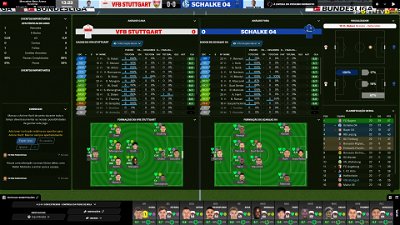
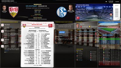
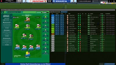
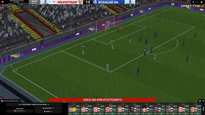
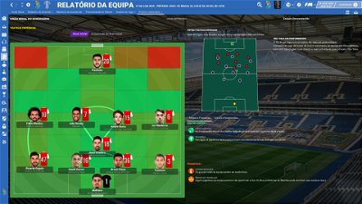
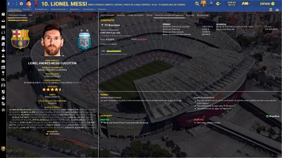
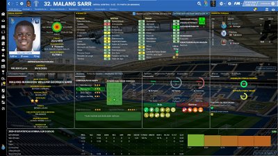
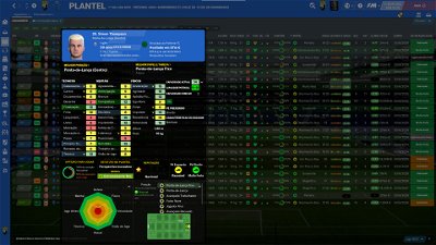
PLEASE NOTE THAT MANY SCREENSHOTS ARE FROM PREVIOUS VERSIONS OF THE SKIN
FOR THOSE WHO WANT TO MAKE THE GAME MORE DIFFICULT, YOU ALSO CAN DOWNLOAD AN ADAPTED VERSION OF THE SKIN (V. 15) WITH THE ATTRIBUTES VALUES HIDDEN. THIS ADAPTED VERSION WAS AN IDEA OF RICHBELL AND, ALTHOUGH WITH MY HELP, IT WAS RICHBELL WHO ALSO DID THE MAJORITY OF THE CHANGES. THANK YOU MY FRIEND!
Please note that for this version working well (with hidden attributes) you should remove the original version of the skin.
FOR THOSE WHO USE 2560x1440 RESOLUTION YOU ALSO CAN DOWNLOAD THE ADAPTED VERSION (v. 16.0) EDITED BY ROSEK
THE SKIN IS TOTALLY COMPATIBLE WITH 1920x1080 SCREEN RESOLUTION AND 4k (windows display settings 200%; game 100%).
YOU SHOULD USE IT IN FULL WINDOWS, ICONS ONLY
Important note regarding TV LOGOS:
Although the default tv logo is the one I use, of course you can easily change it; for that you just have to go to skin/graphics/icons/tv logos. In that folder there is a alt folder with many TV logos. You just have to replace the tv logo.png and the tv [email protected] for that one you want. Of course you should rename the new logos as tv logo and tv logo@2x. You also can use other logos made by you. The procedure to use them is exactly the same. However, I should remember that yo should use logos with the right height. For tv logo you should use 25px and for the @2x you should use 50px.
Resolution requirements:
This skin was made to work properly in 3840x2160 (4K with windows display settings 200%) and also 1920x1080 (1080p) full screen mode, sidebar icons only. As a result, some panels won’t work properly in other resolutions.
How to add Flut Skin in FM21
Download and extract the .rar file (using either 7-Zip for Windows or The Unarchiver for Mac).
Place the "fm2021flutskin_dark" folder here:
Documents\Sports Interactive\Football Manager 2021\skins
Please note this skin is provided as is. It has nothing to do with Sports Interactive or SEGA and won't be supported by them.
Comments
You'll need to Login to comment

Rosek
Hello.
To move the name and the color bar, you need: Open, using Notepad if you have it, the file "person snapshot club overwiew16" and modify the values of the following lines:
good game and have a nice day.
Day Tripper
Hello, what do I need to modify them to?
Rosek
Sorry for my English, it's not my native language.
Your logo is in the right place, just a little too small.
Do you have the Notepad ++ application ?
If so, do what I explained to you previously.
Edit :If you wish to change the size of your logo, in the same file that I am indicating to you, these the first lines of code under "object_portrait_picture". Modify the value of the "all" alignment
Nicolas Sigloch
Hello, since the winter update I can´t see the level of exhaustion anymore - it says I have to hire an Sports scientist even though I have already hired 2. It suddenly doesnt´t show it anymore while working perfectly before.
Any ideas?
Thanks
Rosek
Hello.
Known problem.
Research in progress. For my part, I have already managed to make some problems disappear but I still search on the line corresponding to "fatigue" ...
I have no doubt that the boss will look into this ...
Have a good day
Day Tripper
Hello @Rosek - was this in reply to me?
Do you have a screenshot of how the manager profile should look?
Yes I have Notepad++.
I was asking what I need to change the values to?
Rosek
Hello.
yes that was the answer for you.
This is what it looks like on my game
Day Tripper
Hi @Rosek
So you say I need to correct this by doing this:
But, what do I change the values to? What numbers should I use?
Rosek
Oups, Sorry !!!
I forgot to send you the attachment
flut
Hi all
Sorry for my absence but my professional life leave me overworking.
In spite of that I was trying to solve the major problems reported.
Therefore, now I believe I have the solution for the stars (I also bieleve Rosek solved that problem, however I place here also the file I changed) and also for the fitness/sharpnes (icons missing) and the fatigue popup showing the message realted to the sport scientist when we already have a sport scientist.
Here are the files.
The first one you should place directly in the panels folder of the skin (is the fix for stars)
The second one you should place in the properties folder of the skin.
http://www.mediafire.com/file/e6q29b7c7ly550t/player_positions_indicator_small_horizontal2.xml/file
http://www.mediafire.com/file/jwbmubpzgfm26cs/person_properties.xml/file
I also will take a look on the reported bug about the crash of the game in calendar. However, for trying to know if there is a problem (I couldn't find it in my game yet,..) I much appreciate if someone put a screenshot showing exacty the problem (in what panel and when it happens).
Sorry If I don't answer now other questions but I tried to work on those one I believe were the major problems caused by the last SI update.
Please let me know if is working now.
Thanks
Finally, thank you Rosek for your excellent support to the skin. You are great!!
Rosek
As already explained, if I can help someone, like you did with me, that's no problem for me.
And then we have, me the first, a life next to FM. I didn't worry without more because I remember your message at the end of your vacation. 😉😉
I also know that sometimes, my explanations are not very understandable, it is because I use a French / English translator who often distorts the sentences.. 🤬🤬
And finally, I am not a computer programmer, when I see the bugs (like those encountered after the recent update), I try to solve them by informing myself on the websites.
I have been just an FM player for years and used, at each edition in my possession, your skin ( largely the best of my point of view) 😋😋
But I thank you for your words which touch me. Take care of yourself and your loved ones.
Cordial greetings.
Rosek
@flut
I came across this message on the SI site.
I remember it was my first message that I sent you 😉😉
https://community.sigames.com/forums/topic/539723-fm21-player-comparison-widget-doesnt-change-to-reflect-different-positions/
And I also sent them a message for the word shift in the "fatigue" box. Awaiting a response from them.
Day Tripper
Hi @Rosek - changed the numbers that you highlighted in your attachment, but now I get this?
The manager's name section has gone?
McG84
Keep up the great work Flut and to the other people who help him. You guys/girls do a fantastic job, this skin is epic and makes the game far more enjoyable and playable.
I don't understand why SI don't approach Flut and ask if they can use his skin in the game. This skin is a far superior to the skin that's in the game to start with.
Anyway everyone keep safe and hopefully sooner rather than later we'll all get back to some sort of normality again.
flut
Day Tripper: you just have to change those code lines that Rosek told you.
In line 53, change <layout class="stick_to_sides_attachment" alignment="top" inset="100"/> for <layout class="stick_to_sides_attachment" alignment="top" inset="75"/>
in line 68, change <layout class="stick_to_sides_attachment" alignment="top" inset="101"/> for <layout class="stick_to_sides_attachment" alignment="top" inset="76"/>
Save the file without changing anything more.
flut
Hi Rosek
yes that was your first message 🙂 🙂
And it seems that problem was not fixed by SI yet 😢 😢
However I just finished to incude a “new” box in player overview (that one on the middle right with condition status, including fatigue)
In meantime, regarding the changes you did about the processing panel, if you want to change the colour for calendar day/month/year you can do it in:
game processing panel.xml
<!-- Month and year -->
<widget class="date_cell" id="toda" format="[%date#1-month_year]" size="small" colour="text" style="semi_bold" alignment="left,centre_y">
<layout class="stick_to_sides_attachment" alignment="all" inset="0,37,0,54" />
</widget>
and in
processing calendar day panel.xml
<widget class="text" id="datN" style="bold" size="large" auto_size="vertical" alignment="centre" colour="text"/>
<widget class="text" id="datD" font="title" alignment="centre_x,top" colour="text"/>
</container>
<widget class="date_cell" id="tdAt" format="[%date#1-month_year]" size="small" colour="text" style="semi_bold" alignment="left,centre_y" />
flut
Thanks for your kind words 🙂 🙂
Cheers and keep safe!!
Day Tripper
Hi @flut - Rosek's file had the insets at 175 and 176, I have now changed this to what you have said (75 and 76).
This is how it looks now, perhaps a little too high? I can play around with this though - what makes the position in the panel lower, putting the numbers higher or lower?
flut
Hi
Use 80 and 81 or 79 and 80
Rosek
Thanks for the info about the colors.
I tried your directions but it changes the colors on every day.
My question is slightly different..
On the example I am sending you, Strasbourg has its primary color "blue" and the secondary color "white". So the cursor will be "white" like the writing of the date while the month and year are working.
Hoping to be clear enough in my explanations ...
flut
Hi Rosek
You can change the colour of the circular cursor (I don't know if this is your question but I believe is that question) in
game processing panel.xml
<widget class="picture" id="anmG" auto_size="all" file="progress/circular/spinner" red_replacement="white">
Rosek
Not quite, but I hadn't seen it. 😂😂
On my example the cursor is on Tuesday March 30th. And the name of the day and the number have the same color as the cursor.
flut
Yes. I believe you can't use a specific colour for the day. If you change the number and day colour, all days date and name will be with that new colour…
Rosek
That's what I thought.
Because I have, with my modest knowledge, to try several solutions.
But without success. Too bad but hey, it's a temporary sign. It does not bother too much.
Thanks anyway.
flut
You can try to use a background colour for the day name and number.
For that you just have to change
<widget class="text" id="datN" style="bold" size="large" auto_size="vertical" alignment="centre" colour="text" />
<widget class="text" id="datD" font="title" alignment="centre_x,top" colour="text" />
for (for example)
<widget class="text" id="datN" style="bold" size="large" autosize="vertical" alignment="centre" colour="secondary" background_colour="primary"/>
<widget class="text" id="datD" font="title" alignment="centre_x,top" colour="secondary" background_colour="primary" />
Rosek
Excellent. They appear.
YOU are really the boss !!!
Rosek
Good evening everyone.
For those who have downloaded my "processing" file, it is now up to date.
Thanks in particular to the help of the Grand Flut.
The way access :
http://www.mediafire.com/file/40t6o1wbjaumpp5/processing.rar/file
Good game everyone.
Edit 27/02/21 23:35 : I transferred the wrong file. IT IS NOW UPDATED. Sorry.
Bielsa is a Legend
Cheers @rosek, where do I place the processing folder
Rosek
First of all, reread my comment above.
The "processing" files get to : C:\Users\xxxx\Documents\Sports Interactive\Football Manager 2021\skins\fm2021flutskin_dark\graphics\boxes\custom
The "game" files get to : C:\Users\xxx\Documents\Sports Interactive\Football Manager 2021\skins\fm2021flutskin_dark\panels
Good game
Bielsa is a Legend
I did, but wasn’t clear.
worked it out now using correct file
cheers