418,156
2,066
27,229
FM 2021 FLUT skin dark - Version 16.0
Dear all
This FLUTSKIN version 16 is the final version of FLUTSKIN for FM21!!
A great thank you to all FM fans who choose to play with FLUTSKIN and always keep me motivated to still improving the skin and gave me new ideas!!!
A special thank you to all players who decided to distinguish my work with a donation!! Although just a small part of FM Players who use the skin made a donation (I edited the skin as a hobby and, as you know, completely free), I always feel honoured and happy when people recognize the work done and decide to contribute. So, I reinforce, I have to give a special thank you to that friends of FlutsKin!!!!!!
Also a recognized thank you to those one who help me answering the questions and requests and adapted the FlutSkin (namely and specially Rosek for the help to answering questions and the adapted version for 2560x1440, and Richbell, for the adapted version with hidden attributes!!!!! And, of course I don't forget the skinners community who also indirectly contributed to FlutSkin with their creativity.
Also a special thank you to PATRES10, from fmslovakia for the 2D default kits (especially tailor-made for FlutSkin) anf to Michael Murray since I started editing the match inbetween highlights panel based on his amazing work!!
Now is time to stop editing the skin for this season. I wish to return for FM22. Lets wait and see since no one is able to predict the future.
MAIN CHANGES IN v16.0
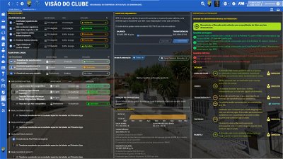
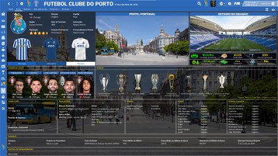
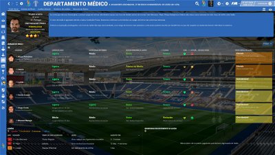
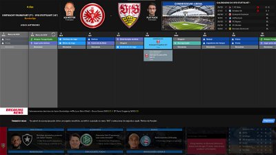
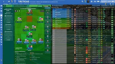
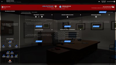
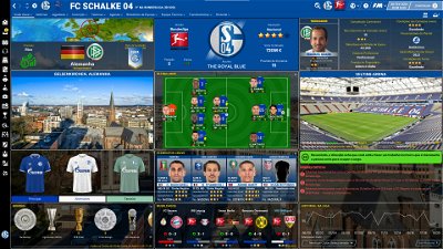
- Following the great idea of majesticeternity, Tyburn and a31632 (from Sports Interactive community) I included in several xmls a code for personalize the background in specific panels, namely club overview, player overview, board room, human profile and team training. These codes are not “activated” by default but if you want to have a different (customized) background in each one of that panels you just have to activate the codes. In the read me file I explain how you can do it.
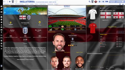
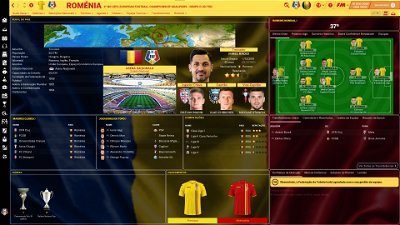
- Nation overall panel
- Nation overview panel
- Human profile panel
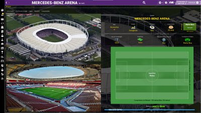
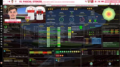
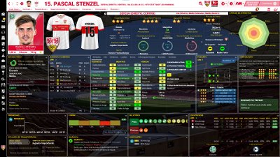
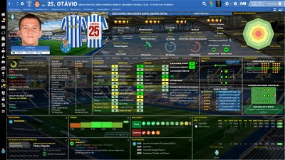
- Player profile stadium option in player overview panel
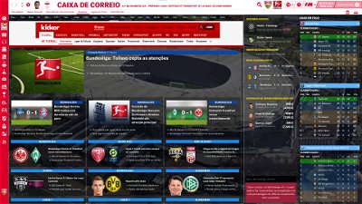
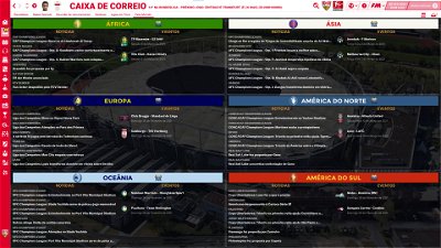
- News panel
The Skin pack also includes:
1. “Round country flags”, “round continents logos” and default logos specially made in metallic style by @Qvordrup from sourtitoutsi. Those graphics will be displayed in the title bar.
Thank you @Qvordrup by your great work and for your collaboration!!!
You can download the 2D packs prepared for Flutskin (titlebar and player overview panel) here in sourtitoutsi. FC style kits HERE; SS Kits style HERE
However, if you prefer edit your own kits, I also included in the pack a .pdf file explaining how you can edit the kits for Flutskin.
If you prefer SS'kits you can download this and replace the kits folder located here:
Documents\Sports Interactive\Football Manager 2021\skins\fm2021flutskin_dark\graphics\pictures\kits
HERE
The logos in country locators are now updated by @Qvordrup according the last version of metallic logos.
You can also download the stadiums background megapack and the citypics released by @DazS8 (thank you, my friend) HERE and HERE
And @geordie1981 has made a pack for inside "small" stadiums HERE
You can also download the sortitoutsi Backgrounds Megapack HERE
As always FlutSkin is completely free to download and I hope you enjoy it. However, if you want, you can reward my work donating whatever amount you wish. Any small amount is really appreciated.
You can do so by clicking the button down below:
SOME ADITTIONAL NOTES:
PLEASE NOTE THAT MANY SCREENSHOTS ARE FROM PREVIOUS VERSIONS OF THE SKIN
FOR THOSE WHO WANT TO MAKE THE GAME MORE DIFFICULT, YOU ALSO CAN DOWNLOAD AN ADAPTED VERSION OF THE SKIN (V. 15) WITH THE ATTRIBUTES VALUES HIDDEN. THIS ADAPTED VERSION WAS AN IDEA OF RICHBELL AND, ALTHOUGH WITH MY HELP, IT WAS RICHBELL WHO ALSO DID THE MAJORITY OF THE CHANGES. THANK YOU MY FRIEND!
Please note that for this version working well (with hidden attributes) you should remove the original version of the skin.
FOR THOSE WHO USE 2560x1440 RESOLUTION YOU ALSO CAN DOWNLOAD THE ADAPTED VERSION (v. 16.0) EDITED BY ROSEK
THE SKIN IS TOTALLY COMPATIBLE WITH 1920x1080 SCREEN RESOLUTION AND 4k (windows display settings 200%; game 100%).
YOU SHOULD USE IT IN FULL WINDOWS, ICONS ONLY
Important note regarding TV LOGOS:
Although the default tv logo is the one I use, of course you can easily change it; for that you just have to go to skin/graphics/icons/tv logos. In that folder there is a alt folder with many TV logos. You just have to replace the tv logo.png and the tv [email protected] for that one you want. Of course you should rename the new logos as tv logo and tv logo@2x. You also can use other logos made by you. The procedure to use them is exactly the same. However, I should remember that yo should use logos with the right height. For tv logo you should use 25px and for the @2x you should use 50px.
Resolution requirements:
This skin was made to work properly in 3840x2160 (4K with windows display settings 200%) and also 1920x1080 (1080p) full screen mode, sidebar icons only. As a result, some panels won’t work properly in other resolutions.
How to add Flut Skin in FM21
Download and extract the .rar file (using either 7-Zip for Windows or The Unarchiver for Mac).
Place the "fm2021flutskin_dark" folder here:
Documents\Sports Interactive\Football Manager 2021\skins
Create the folder "skins" if it doesn't exist. Start FM21 and go to Preferences screen and then into the Interface tab. You should see FM 2021 Flut Skin dark - Version 16.0 as an option in the skin drop down of the Overview box. Hit the Confirm button.
Please note this skin is provided as is. It has nothing to do with Sports Interactive or SEGA and won't be supported by them.
Dear all
This FLUTSKIN version 16 is the final version of FLUTSKIN for FM21!!
A great thank you to all FM fans who choose to play with FLUTSKIN and always keep me motivated to still improving the skin and gave me new ideas!!!
A special thank you to all players who decided to distinguish my work with a donation!! Although just a small part of FM Players who use the skin made a donation (I edited the skin as a hobby and, as you know, completely free), I always feel honoured and happy when people recognize the work done and decide to contribute. So, I reinforce, I have to give a special thank you to that friends of FlutsKin!!!!!!
Also a recognized thank you to those one who help me answering the questions and requests and adapted the FlutSkin (namely and specially Rosek for the help to answering questions and the adapted version for 2560x1440, and Richbell, for the adapted version with hidden attributes!!!!! And, of course I don't forget the skinners community who also indirectly contributed to FlutSkin with their creativity.
Also a special thank you to PATRES10, from fmslovakia for the 2D default kits (especially tailor-made for FlutSkin) anf to Michael Murray since I started editing the match inbetween highlights panel based on his amazing work!!
Now is time to stop editing the skin for this season. I wish to return for FM22. Lets wait and see since no one is able to predict the future.
MAIN CHANGES IN v16.0
- Following the great idea of majesticeternity, Tyburn and a31632 (from Sports Interactive community) I included in several xmls a code for personalize the background in specific panels, namely club overview, player overview, board room, human profile and team training. These codes are not “activated” by default but if you want to have a different (customized) background in each one of that panels you just have to activate the codes. In the read me file I explain how you can do it.
- Nation overall panel
- Nation overview panel
- Human profile panel
- Player profile stadium option in player overview panel
- News panel
The Skin pack also includes:
1. “Round country flags”, “round continents logos” and default logos specially made in metallic style by @Qvordrup from sourtitoutsi. Those graphics will be displayed in the title bar.
Thank you @Qvordrup by your great work and for your collaboration!!!
You can download the 2D packs prepared for Flutskin (titlebar and player overview panel) here in sourtitoutsi. FC style kits HERE; SS Kits style HERE
However, if you prefer edit your own kits, I also included in the pack a .pdf file explaining how you can edit the kits for Flutskin.
If you prefer SS'kits you can download this and replace the kits folder located here:
Documents\Sports Interactive\Football Manager 2021\skins\fm2021flutskin_dark\graphics\pictures\kits
HERE
The logos in country locators are now updated by @Qvordrup according the last version of metallic logos.
You can also download the stadiums background megapack and the citypics released by @DazS8 (thank you, my friend) HERE and HERE
And @geordie1981 has made a pack for inside "small" stadiums HERE
You can also download the sortitoutsi Backgrounds Megapack HERE
As always FlutSkin is completely free to download and I hope you enjoy it. However, if you want, you can reward my work donating whatever amount you wish. Any small amount is really appreciated.
You can do so by clicking the button down below:
SOME ADITTIONAL NOTES:
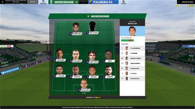
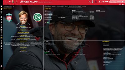
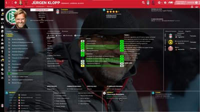
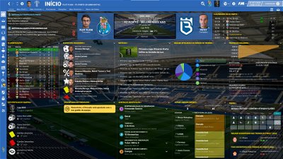
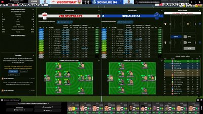
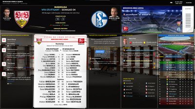
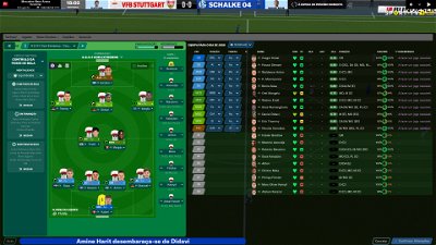
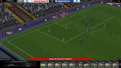
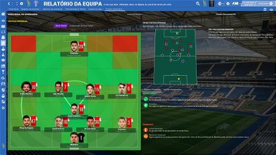
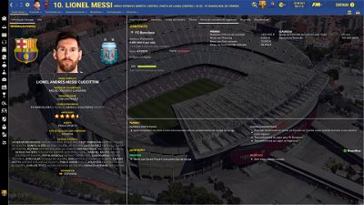
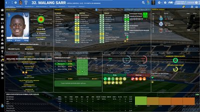
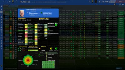
PLEASE NOTE THAT MANY SCREENSHOTS ARE FROM PREVIOUS VERSIONS OF THE SKIN
FOR THOSE WHO WANT TO MAKE THE GAME MORE DIFFICULT, YOU ALSO CAN DOWNLOAD AN ADAPTED VERSION OF THE SKIN (V. 15) WITH THE ATTRIBUTES VALUES HIDDEN. THIS ADAPTED VERSION WAS AN IDEA OF RICHBELL AND, ALTHOUGH WITH MY HELP, IT WAS RICHBELL WHO ALSO DID THE MAJORITY OF THE CHANGES. THANK YOU MY FRIEND!
Please note that for this version working well (with hidden attributes) you should remove the original version of the skin.
FOR THOSE WHO USE 2560x1440 RESOLUTION YOU ALSO CAN DOWNLOAD THE ADAPTED VERSION (v. 16.0) EDITED BY ROSEK
THE SKIN IS TOTALLY COMPATIBLE WITH 1920x1080 SCREEN RESOLUTION AND 4k (windows display settings 200%; game 100%).
YOU SHOULD USE IT IN FULL WINDOWS, ICONS ONLY
Important note regarding TV LOGOS:
Although the default tv logo is the one I use, of course you can easily change it; for that you just have to go to skin/graphics/icons/tv logos. In that folder there is a alt folder with many TV logos. You just have to replace the tv logo.png and the tv [email protected] for that one you want. Of course you should rename the new logos as tv logo and tv logo@2x. You also can use other logos made by you. The procedure to use them is exactly the same. However, I should remember that yo should use logos with the right height. For tv logo you should use 25px and for the @2x you should use 50px.
Resolution requirements:
This skin was made to work properly in 3840x2160 (4K with windows display settings 200%) and also 1920x1080 (1080p) full screen mode, sidebar icons only. As a result, some panels won’t work properly in other resolutions.
How to add Flut Skin in FM21
Download and extract the .rar file (using either 7-Zip for Windows or The Unarchiver for Mac).
Place the "fm2021flutskin_dark" folder here:
Documents\Sports Interactive\Football Manager 2021\skins
Please note this skin is provided as is. It has nothing to do with Sports Interactive or SEGA and won't be supported by them.
Comments
You'll need to Login to comment

flut
Hi Rosek
This is normal. If you remember, in V9 the stars also were not shown as in the default skin. Now you notice this because the flag are there 🙂
cheers
Rosek
🤦♂️🤦♂️🤦♂️. Indeed...
Thank's. t didn't stop me from winning 1-0 against them 😉😉😂😂😂
@flut Hi.
🙂
Player Page: https://www.bilder-upload.eu/bild-b0d0a3-1617040584.png.html
= Player Page
- i want to see the Players History much more - so i change something: (right Side)
how can i use right side both boxes for Career Statistic ? ( so that the Box: Player Status is also for Players History
- so, from two Box, to only one big Box
because i want to see, all Steps in his Career and in best Case, the box is little bit bigger, so you can see:
(Example)
Year / Team / Played Games / Goals / Yellow Cards / Red Cads ( something like that)
or: to make right on top, from two Boxes to one Box - so you can include more Details:
Year / Team / Played Games / Goals / Yellow Cards / Red Cads ( something like that)
https://www.bilder-upload.eu/bild-335d52-1617040606.png.html
Thanks for help
🙂
Rosek
@flut
It's in the same principle as the Mr.old_school question but without changing the locations and sizes of the panels.
I personally thought you should just make the following sign:
It looks like this one:
or this one:
But that's up to you. Cordially
flut
hi. Sorry but I didn't understand what changes are you asking for. Could you please place a screenshot with all the panel, showing exactly what you are asking to change?
@flut i explained that in Post before, with Screenshot.
First Screenshot my actually Skin Version
Second Screenshot: the Idea, but the Boxes are to small - so the Question is to combinate two boxes to one box, for having the Players Career History in little bit more details - that i like so much
Example with these Stats: Year / Team / Played Games / Goals / Yellow Cards / Red Cards
🙂
flut
Yes I saw the screenshots but I didn't understand. Do you want to change the box with attributes analyser and the other one in the right to only one box (with the width of those two boxes)?
Rosek
This is it. When you open the large panel at the bottom :
And I would have liked the information inside to look something like this :
It's true that the thumbnails are not very explicit... Sorry
🙂
first Screenshot - the Stand, what i used at the moment.
second Screenshot: my Ideas - and there are two Options.
first Options: to combinate the two Box top right to use for detail Career Statistiques
(attributes analyser + Career Statistiques = only big Career Statistiques)
or
second Option: to combinate the two Box bottom right to use for detail Career Statistiques
(Career Statistiques + Player Status = only big Career Statistiques)
Rosek
Hello.
Your problem is that it's white on white...
I tried for a while today to change the colours of the panels and the writing...
Indeed, in the lines of code which manages all that, I tried to modify each colour for each writing, wallpaper...
Unfortunately the only thing I didn't manage to change is the writing of the scorer's name which remains black and the white writing of the small sign located just below... I've looked on the news feed where I got this panel from, apparently they have the same problem...
Corinthians31
Thats ok and thanks! Can you tell me what are the files to edit de player overview layout and the match screen (that screen that is prompt in between the highlights) so i can try to edit my self as this two are the most problematic screens for me.
Daz10N
I can't change stuff on the skin, I have to use as is?? I can't ask for assistance from someone with clearly more knowledge on the subject? One person helped and one person sneered.
Daz10N
Thank you for your help
Rosek
I wasn't sneering.... It was just an observation.
It is you who mark that you have fiddled, without success ... After that you come to ask if Flut can help. I did the opposite, simply...
I didn't want to be derogatory but I already had the case where it was the opposite while wanting to help…
Daz10N
What had my comment to do with you???
Rosek
Well, according to your message where I am mentioned, "one who helped the other who laughed"... So it's me you're talking to, right?
But well, I don't want to eternalize this false polemic...
Real life is hard enough to take the head on this forum... I'm glad your problem is solved.
Have a nice evening.
flut
Well. Merging the two boxes in the top right is easy. However, the information you want (more information in career stats) I tried a lot to find that information in the career stats panel but without success (the xml is player history stats or player history stats panel but I couldn't find that xml). I tried with the xmls from FM20 Skin (since last year I don't remember when and how, but I could find that xmls) but that xmls don't work. Thus, I can't include more than the information we açlready have and, therefore for me, the two boxes are better than only one box. In spite of that here is the screenshot.
flut
Hi. The main are the player overview panel.xml and match in between highlights panel.xml. However that xmls are only the “master” and points to several other xmls that also point to other….If you want to edit them you should go through these xmls and find what are the other xmls required. is not easy to do it but with patience of course you can do it.
flut
Hi
now, for lineups the code (is in match preview lineups panel.xml) is (there are two pieces of code, one for home team and other for away team)
<widget class="picture" file="icons/tv logos/tv logo" height="16" auto_size="horizontal" scale_picture="true" >
<animation class="fade_animation" start_value="0" end_value="1" duration="0.5" delay="1" end_mode="hold_auto_reverse" trigger_id="hidden" trigger_start="false" trigger_end="true" />
</widget>
Imagine you create a new tv logo, placed it in the same folder of the current, but the name is tv logo1. You just have to change the code for
<widget class="picture" file="icons/tv logos/tv logo1" height="16" auto_size="horizontal" scale_picture="true" >
<animation class="fade_animation" start_value="0" end_value="1" duration="0.5" delay="1" end_mode="hold_auto_reverse" trigger_id="hidden" trigger_start="false" trigger_end="true" />
</widget>
You can do it in this way for all the tv logos you want.
The codes are in
match preview lineups panel.xml (for lineups)
match title bar.xml (for tv logo during the match)
match league table panel cutscene.xml (for Tv Logo in league table)
match caption panel small.xml (for match caption small - the popup panel when you score a goal)
2. the answer 1 serves for this
3. Yes, you're right. I tested a TV Logo in that other situations (for example penalty) but it doesn't work well. That's why I didn't include TV logo in that other kind of goals.
Leeds1919
@Rosek keep up the good work, we know you and Flut are busy, I for one appreciate you stepping in with helpful advice
@flut : i hope you or @Rosek find the Issue, to include for Information in career stats, like Red and Yellow Cars…
🙂 that would be fine, because i think, the bigger box looks great! then i want to use that 100 % in my Game. 🙂
…
@flut or @Rosek can you show us a Screenshot for the new Option, that we can have two TV Logos in the 3d Match? (Screenshot in the Game) that would be fantastic, when it looks like real Game. 🙂 then i want to use that 100 % in my Game. 🙂 example: Germany - with the Sky Bundesliga Logo + the Result/Time Logo
here Example of older Version of German Scoreboard: Link: https://www.bilder-upload.eu/bild-4c8728-1617100458.png.html
flut
Hi Mr old_school: sorry but maybe I didn’t explain myself well. The option "ingame" for choose a TV Logo (tV logo selector) doesn't work. When I said that we can use the tv Logo we want (different tv logos) I want to say that we can use one logo in the match, one different for lineups panel, one different for league table, etc.
In meantime I did an alt for player overview panel with the player on the left
Rosek
Greetings to all.
M. old_school :
Je ne comprends pas très bien votre question ... Désolé mon niveau d'anglais en est probablement la cause et avec le traducteur Google, oubliez ça, c'est pire !!! @D'après ce que j'ai compris (enfin ça je pense avoir compris), oui vous pouvez très bien avoir 2 logos différents sur les enseignes. Il suffit de trouver la ligne <widget class = "picture" file = "icons / tv logos / tv logo1" height = "16" auto_size = "horizontal" scale_picture = "true"> dans les codes des logos situés dans le panneaux mentionnés par Flut, et il vous suffit de modifier le dernier numéro pour qu'il corresponde aux logos que vous avez préparés pour votre peau ici: Documents \ Sports Interactive \ Football Manager 2021 \ skins \ fm2021flutskin_dark2560x1440 \ graphics \ icons \ tv logos.
Some logos are already in the "TV logos" and "alts" folders and if I'm not mistaken, you have one for the Bundesliga. Copy this one and put it in the previous channel. Then rename it, for example "Tv logo 6". Once you have done this you do the manipulation in the panel code line. Normally you should have your logo displayed during the game.
About the clock, I see what you are thinking. But here, Flut will have to look. Because it is integrated in the "tittlebar".
Corinthiens31
I saw that you will try to do it yourself. I wish you every success in your adventure... Because yes it is one... I was like you, 3 months ago when I started to modify the skin for the resolution I use... Making all the necessary adjustments, sometimes several times to be sure of the placement of certain images, logo, flags, ... You'll spend hours on it, but the happiness it brings at the end... 😁😁
But don't worry, you will have a "boss" to help you... Of course I mean Flut, not me 😉😉.
But if for some of your requests I can help, no worries I will do it...
Last point, if you want help, make screenshots (the complete screen with the writing in English) with your message, there are so many panels in this game. But this way, the boss already knows which panel you are talking about... Because it happened to me again last night 😂😂
For all those who play with 2560x1440 resolution:
I send you a small update of the skin.
No major changes, mostly graphical adjustments. Good game to all...
https://www.mediafire.com/file/bmyqdwks9ekcl0t/fm2021flutskin_dark2560x1440V10.1.rar/file
Rosek
Ok. Thank's for the pictures.
Let's try to see where it can come from... Have you tried the same procedure with the original settings? ( I know the original skin is ugly). Do you have the same problem? If yes, it is not from the skin...
If not, try to set the visual settings of the game like this:
If you still have the same problem, finally try to re-download the skin for your resolution, delete the one you have and replace it with the new one and see what happens...
Unfortunately I can't help you more... Sorry
Leeds1919
Since v.10 my preview player profile pop up doesn’t work, I need to physically click on it
anybody else have this?
Rosek
Greetings. Could you take a screenshot of the problem please ?
Leeds1919
I would but very difficult to show something not happening.
normally if you hover the mouse over the player, the pop up screen of the player appears
not now
sorry I don’t know how to show this on a screenshot
Rosek
Ok no worries, I understand that it's hard to show something that doesn't show... but let's try anyway.
We won't leave you in this situation... 😉😉
The interactions that don't work are the ones, for example, when you pass on the little icon next to the player or on the heart icon?
If not, take a screenshot and normally you have tools (ruler or compact). Take the compact and make a circle where you have the problem. This will guide us a bit...
Leeds1919
with my limited art skills, i cant hover over the preview now
Rosek
Okay. Those are the ones I thought. So, we'll start simple. Go to the "preferences" menu. At the very bottom left you have a "reset" button. Click on it and clear the cache.
Personally, in my settings, I don't use it. I just keep the option to reload the skin (normal, since I modify the skin graphically) 😉😉.
Let's hope it's just that... 🙏🙏