420,420
2,066
27,241
FM 2021 FLUT skin dark - Version 16.0
Dear all
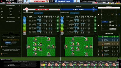
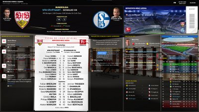
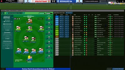
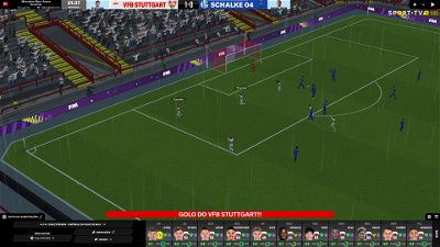
This FLUTSKIN version 16 is the final version of FLUTSKIN for FM21!!
A great thank you to all FM fans who choose to play with FLUTSKIN and always keep me motivated to still improving the skin and gave me new ideas!!!
A special thank you to all players who decided to distinguish my work with a donation!! Although just a small part of FM Players who use the skin made a donation (I edited the skin as a hobby and, as you know, completely free), I always feel honoured and happy when people recognize the work done and decide to contribute. So, I reinforce, I have to give a special thank you to that friends of FlutsKin!!!!!!
Also a recognized thank you to those one who help me answering the questions and requests and adapted the FlutSkin (namely and specially Rosek for the help to answering questions and the adapted version for 2560x1440, and Richbell, for the adapted version with hidden attributes!!!!! And, of course I don't forget the skinners community who also indirectly contributed to FlutSkin with their creativity.
Also a special thank you to PATRES10, from fmslovakia for the 2D default kits (especially tailor-made for FlutSkin) anf to Michael Murray since I started editing the match inbetween highlights panel based on his amazing work!!
Now is time to stop editing the skin for this season. I wish to return for FM22. Lets wait and see since no one is able to predict the future.
MAIN CHANGES IN v16.0
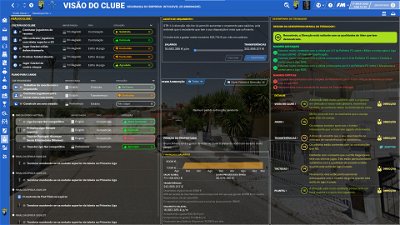
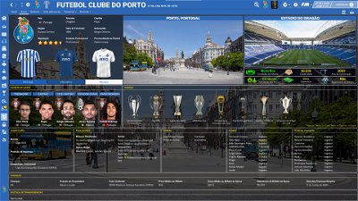
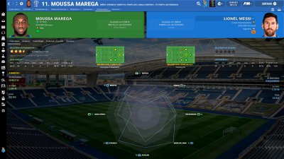
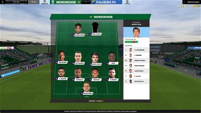
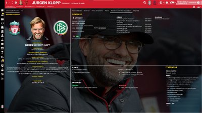
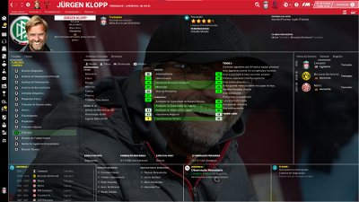
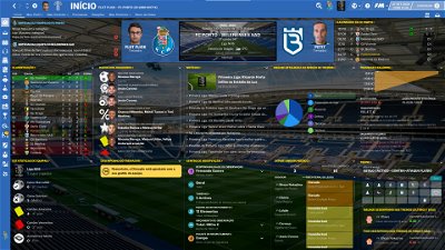
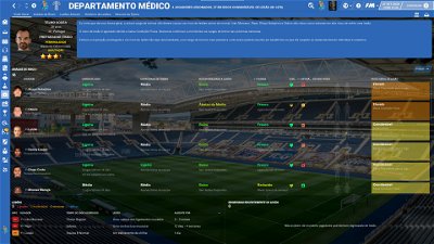
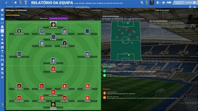
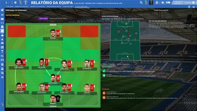
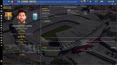
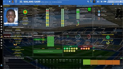
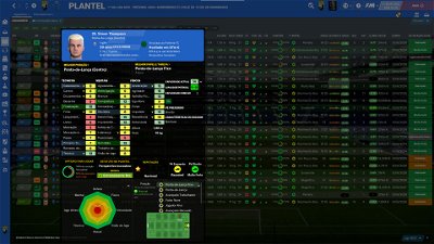
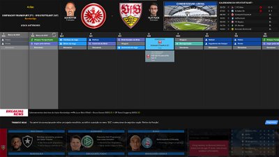
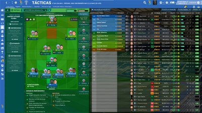
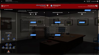
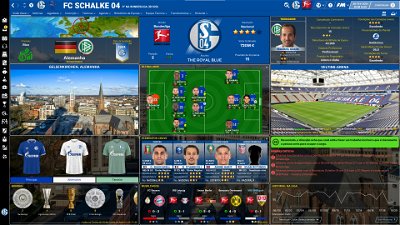
- Following the great idea of majesticeternity, Tyburn and a31632 (from Sports Interactive community) I included in several xmls a code for personalize the background in specific panels, namely club overview, player overview, board room, human profile and team training. These codes are not “activated” by default but if you want to have a different (customized) background in each one of that panels you just have to activate the codes. In the read me file I explain how you can do it.
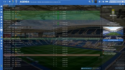
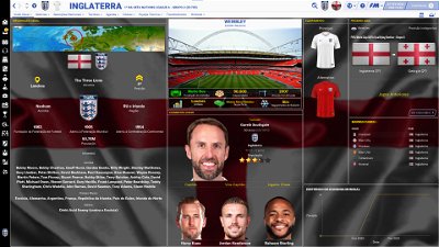
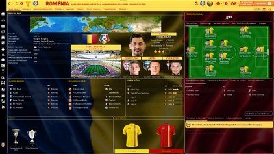
- Nation overall panel
- Nation overview panel
- Human profile panel
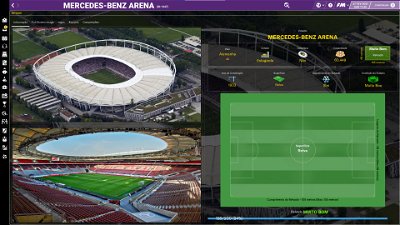
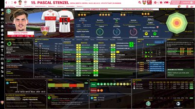
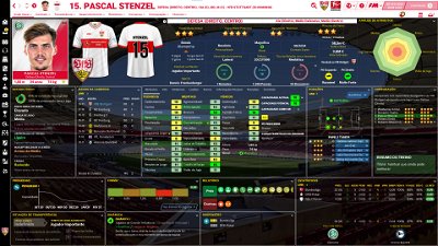
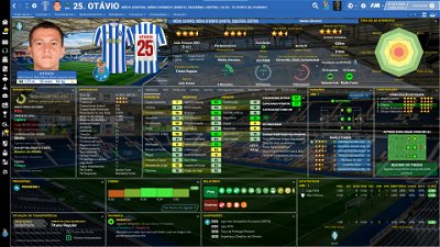
- Player profile stadium option in player overview panel
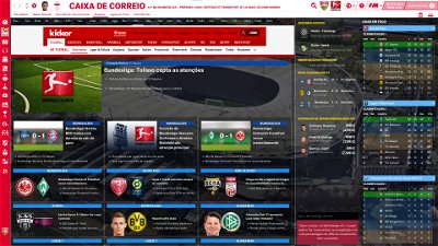
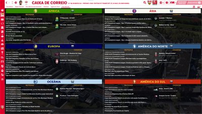
- News panel
The Skin pack also includes:
1. “Round country flags”, “round continents logos” and default logos specially made in metallic style by @Qvordrup from sourtitoutsi. Those graphics will be displayed in the title bar.
Thank you @Qvordrup by your great work and for your collaboration!!!
You can download the 2D packs prepared for Flutskin (titlebar and player overview panel) here in sourtitoutsi. FC style kits HERE; SS Kits style HERE
However, if you prefer edit your own kits, I also included in the pack a .pdf file explaining how you can edit the kits for Flutskin.
If you prefer SS'kits you can download this and replace the kits folder located here:
Documents\Sports Interactive\Football Manager 2021\skins\fm2021flutskin_dark\graphics\pictures\kits
HERE
The logos in country locators are now updated by @Qvordrup according the last version of metallic logos.
You can also download the stadiums background megapack and the citypics released by @DazS8 (thank you, my friend) HERE and HERE
And @geordie1981 has made a pack for inside "small" stadiums HERE
You can also download the sortitoutsi Backgrounds Megapack HERE
As always FlutSkin is completely free to download and I hope you enjoy it. However, if you want, you can reward my work donating whatever amount you wish. Any small amount is really appreciated.
You can do so by clicking the button down below:
SOME ADITTIONAL NOTES:
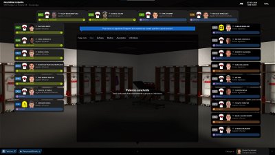
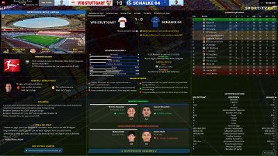
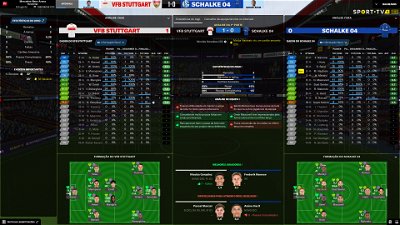
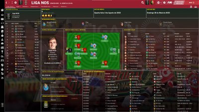
PLEASE NOTE THAT MANY SCREENSHOTS ARE FROM PREVIOUS VERSIONS OF THE SKIN
FOR THOSE WHO WANT TO MAKE THE GAME MORE DIFFICULT, YOU ALSO CAN DOWNLOAD AN ADAPTED VERSION OF THE SKIN (V. 15) WITH THE ATTRIBUTES VALUES HIDDEN. THIS ADAPTED VERSION WAS AN IDEA OF RICHBELL AND, ALTHOUGH WITH MY HELP, IT WAS RICHBELL WHO ALSO DID THE MAJORITY OF THE CHANGES. THANK YOU MY FRIEND!
Please note that for this version working well (with hidden attributes) you should remove the original version of the skin.
FOR THOSE WHO USE 2560x1440 RESOLUTION YOU ALSO CAN DOWNLOAD THE ADAPTED VERSION (v. 16.0) EDITED BY ROSEK
THE SKIN IS TOTALLY COMPATIBLE WITH 1920x1080 SCREEN RESOLUTION AND 4k (windows display settings 200%; game 100%).
YOU SHOULD USE IT IN FULL WINDOWS, ICONS ONLY
Important note regarding TV LOGOS:
Although the default tv logo is the one I use, of course you can easily change it; for that you just have to go to skin/graphics/icons/tv logos. In that folder there is a alt folder with many TV logos. You just have to replace the tv logo.png and the tv [email protected] for that one you want. Of course you should rename the new logos as tv logo and tv logo@2x. You also can use other logos made by you. The procedure to use them is exactly the same. However, I should remember that yo should use logos with the right height. For tv logo you should use 25px and for the @2x you should use 50px.
Resolution requirements:
This skin was made to work properly in 3840x2160 (4K with windows display settings 200%) and also 1920x1080 (1080p) full screen mode, sidebar icons only. As a result, some panels won’t work properly in other resolutions.
How to add Flut Skin in FM21
Download and extract the .rar file (using either 7-Zip for Windows or The Unarchiver for Mac).
Place the "fm2021flutskin_dark" folder here:
Documents\Sports Interactive\Football Manager 2021\skins
Create the folder "skins" if it doesn't exist. Start FM21 and go to Preferences screen and then into the Interface tab. You should see FM 2021 Flut Skin dark - Version 16.0 as an option in the skin drop down of the Overview box. Hit the Confirm button.
Please note this skin is provided as is. It has nothing to do with Sports Interactive or SEGA and won't be supported by them.
Dear all
This FLUTSKIN version 16 is the final version of FLUTSKIN for FM21!!
A great thank you to all FM fans who choose to play with FLUTSKIN and always keep me motivated to still improving the skin and gave me new ideas!!!
A special thank you to all players who decided to distinguish my work with a donation!! Although just a small part of FM Players who use the skin made a donation (I edited the skin as a hobby and, as you know, completely free), I always feel honoured and happy when people recognize the work done and decide to contribute. So, I reinforce, I have to give a special thank you to that friends of FlutsKin!!!!!!
Also a recognized thank you to those one who help me answering the questions and requests and adapted the FlutSkin (namely and specially Rosek for the help to answering questions and the adapted version for 2560x1440, and Richbell, for the adapted version with hidden attributes!!!!! And, of course I don't forget the skinners community who also indirectly contributed to FlutSkin with their creativity.
Also a special thank you to PATRES10, from fmslovakia for the 2D default kits (especially tailor-made for FlutSkin) anf to Michael Murray since I started editing the match inbetween highlights panel based on his amazing work!!
Now is time to stop editing the skin for this season. I wish to return for FM22. Lets wait and see since no one is able to predict the future.
MAIN CHANGES IN v16.0
- Following the great idea of majesticeternity, Tyburn and a31632 (from Sports Interactive community) I included in several xmls a code for personalize the background in specific panels, namely club overview, player overview, board room, human profile and team training. These codes are not “activated” by default but if you want to have a different (customized) background in each one of that panels you just have to activate the codes. In the read me file I explain how you can do it.
- Nation overall panel
- Nation overview panel
- Human profile panel
- Player profile stadium option in player overview panel
- News panel
The Skin pack also includes:
1. “Round country flags”, “round continents logos” and default logos specially made in metallic style by @Qvordrup from sourtitoutsi. Those graphics will be displayed in the title bar.
Thank you @Qvordrup by your great work and for your collaboration!!!
You can download the 2D packs prepared for Flutskin (titlebar and player overview panel) here in sourtitoutsi. FC style kits HERE; SS Kits style HERE
However, if you prefer edit your own kits, I also included in the pack a .pdf file explaining how you can edit the kits for Flutskin.
If you prefer SS'kits you can download this and replace the kits folder located here:
Documents\Sports Interactive\Football Manager 2021\skins\fm2021flutskin_dark\graphics\pictures\kits
HERE
The logos in country locators are now updated by @Qvordrup according the last version of metallic logos.
You can also download the stadiums background megapack and the citypics released by @DazS8 (thank you, my friend) HERE and HERE
And @geordie1981 has made a pack for inside "small" stadiums HERE
You can also download the sortitoutsi Backgrounds Megapack HERE
As always FlutSkin is completely free to download and I hope you enjoy it. However, if you want, you can reward my work donating whatever amount you wish. Any small amount is really appreciated.
You can do so by clicking the button down below:
SOME ADITTIONAL NOTES:
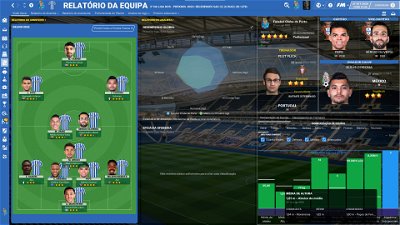
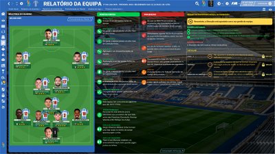
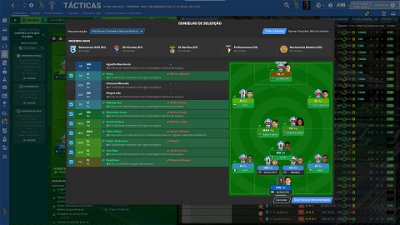
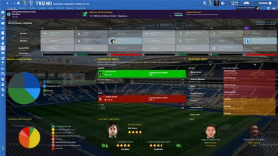
PLEASE NOTE THAT MANY SCREENSHOTS ARE FROM PREVIOUS VERSIONS OF THE SKIN
FOR THOSE WHO WANT TO MAKE THE GAME MORE DIFFICULT, YOU ALSO CAN DOWNLOAD AN ADAPTED VERSION OF THE SKIN (V. 15) WITH THE ATTRIBUTES VALUES HIDDEN. THIS ADAPTED VERSION WAS AN IDEA OF RICHBELL AND, ALTHOUGH WITH MY HELP, IT WAS RICHBELL WHO ALSO DID THE MAJORITY OF THE CHANGES. THANK YOU MY FRIEND!
Please note that for this version working well (with hidden attributes) you should remove the original version of the skin.
FOR THOSE WHO USE 2560x1440 RESOLUTION YOU ALSO CAN DOWNLOAD THE ADAPTED VERSION (v. 16.0) EDITED BY ROSEK
THE SKIN IS TOTALLY COMPATIBLE WITH 1920x1080 SCREEN RESOLUTION AND 4k (windows display settings 200%; game 100%).
YOU SHOULD USE IT IN FULL WINDOWS, ICONS ONLY
Important note regarding TV LOGOS:
Although the default tv logo is the one I use, of course you can easily change it; for that you just have to go to skin/graphics/icons/tv logos. In that folder there is a alt folder with many TV logos. You just have to replace the tv logo.png and the tv [email protected] for that one you want. Of course you should rename the new logos as tv logo and tv logo@2x. You also can use other logos made by you. The procedure to use them is exactly the same. However, I should remember that yo should use logos with the right height. For tv logo you should use 25px and for the @2x you should use 50px.
Resolution requirements:
This skin was made to work properly in 3840x2160 (4K with windows display settings 200%) and also 1920x1080 (1080p) full screen mode, sidebar icons only. As a result, some panels won’t work properly in other resolutions.
How to add Flut Skin in FM21
Download and extract the .rar file (using either 7-Zip for Windows or The Unarchiver for Mac).
Place the "fm2021flutskin_dark" folder here:
Documents\Sports Interactive\Football Manager 2021\skins
Please note this skin is provided as is. It has nothing to do with Sports Interactive or SEGA and won't be supported by them.
Comments
You'll need to Login to comment

ΧΑΡΑΛΑΜΠΟΣ ΧΑΡΑΛΑΜΠΟΥΣ
ΧΑΡΑΛΑΜΠΟΣ ΧΑΡΑΛΑΜΠΟΥΣ
ΧΑΡΑΛΑΜΠΟΣ ΧΑΡΑΛΑΜΠΟΥΣ
Mag1lc2
Looks very nice, mate! 👍
Rosek
As soon as it's online, I'll modify it for our resolution, no worries. 😉😉
Thank you for your support. 😊😊
PS : I hope you like the last update ?
Rosek
The various problems have been corrected. 😉😉
Here are some images of the game currently running on my hp27q screen with the game and the screen zoomed to 100% :
And from memory, you play with fc kits. Remember to change the back of the jerseys with the "alt" provided for that...
Kind regards.
flut
Hi all
Now you can play with V12. This version only have two main changes: the new player overview panel, recovering the FlutSkin for FM18 style (but with a few updates 🙂 ) and the club overview panel tweaked.
As I said in the skin presentation I had doubts to release this version, since I don't like to release versions with only a few changes. However, since the player overview panel is New and many people wait for that new panel, I decided to open an exception!!
I hope you enjoy this version and thank you all for your support!!!
Mag1lc2
Many thanks for the new version, perfect work!
Now I'm still looking forward to the Rosek version, then it's great!
Flut, one question please in regarding to my post: https://sortitoutsi.net/content/57136/fm-2021-flut-skin-dark-version-10?page=36#comment_625419 and your answer: https://sortitoutsi.net/content/57136/fm-2021-flut-skin-dark-version-10?page=36#comment_625423
Do I need for the v12 a new “yacs information.xml” File?
Mag1lc2
Wonderful work Rosek, I'm looking forward to playing the v12 in our resolution! 😊
PlutoMars
I've been using flut skin since i started playing back in 12 til 16, just came back and still using this legendary skin from flut! thanks again for this amazing work!👏🙂
Leeds1919
Hi Flut, in 1980 x 1080/1200 we are back to SS kits sleeves being cut, this happens on most of the 6 options
flut
Hi
You can adjust it in player overview panel.xml changing the values of left inset in following lines of code (use try and error method and don't forget that the second and third lines of each option should have the same value)
There are 6 options and, then, 18 lines you should change (3 for each option). The values in parenthesis are the current values
Profile Flut Card and Stadium
243 (70)
259 and 276 (-70)
Profile Flut Stadium
533 (90)
550 and 566 (-50)
Profile
841 (83)
856 and 872 (-65)
Profile Flut Team Colours
1181 (83)
1196 and 1212 (-65)
Profile Flut Card Background colour
1509 (110)
1524 and 1540 (-89)
Profile Flut Card
1838 (110)
1853 and 1869 (-89)
flut
Hi
No. I included that option (ability, and the other 3, from the info - mentals. personal details and contract) as an individual panel in eacj one of the 4 boxes in the left and the right of the middle panel. Thus, you only can choose ability. 🙂
flut
Thanks!! This means that you used my first skin for FM13 when I started this great adventure!!! Thanks!!!
Paumate
First of all, great work. I have a problem with the size of the number on the jersey (see screenshot) Before I modified the lines in ki14. Now it doesn't work anymore, can you help me .svp
<!-- player number -->
<widget class="picture" id="bNUM" image_alignment="centre" scale_picture="true">
<layout class="stick_to_sides_attachment" alignment="top" inset="2"/>
<layout class="stick_to_sides_attachment" alignment="left" inset="134"/>
<layout class="stick_to_sides_attachment" alignment="vertical" inset="0" />
<layout class="stick_to_sides_attachment" alignment="all" inset="135" />
flut
Hi. You forgot the screenshot 🙂
Qvordrup
It would really help me edit if you told me the name of each 6 (just add the name above each). witch one is “profile” and “profile flut card” and so on.
flut
Hi
Is done. I included that in the post (editing the post) 🙂
Paumate
flut
You can edit it in kit icon34.xml in the following code
<widget class="picture" id="bNUM" image_alignment="centre" scale_picture="true">
<layout class="stick_to_sides_attachment" alignment="top" inset="2"/>
<layout class="stick_to_sides_attachment" alignment="left" inset="97"/>
<layout class="stick_to_sides_attachment" alignment="vertical" inset="0" />
<layout class="stick_to_sides_attachment" alignment="all" inset="100" />
</widget>
Qvordrup
Attached is a edited “player overview panel” for SS'kits. It works with 1920x1080 (100% zoom). Not all of the options look that great because the two kits overlap, but they are no longer cut by the sleves. @flut perhaps you can add this to the “alternative” folder of the skin?
Paumate
flut
Done!! Thanks 🙂
Mag1lc2
@ Rosek and/or Flut
I think I´ve foud a little Bug (I still play with the v11 from Rosek, but maybe that's the case in the v12 too!)
Picture 1
I would like to replace Gnabry and Pavard in the game, both have the round circle like all other players (see arrows).
Picture 2
I now drag and drop Musiala and Sarr onto the positions to be replaced, and these players no longer have this round circle in the display (see arrows).
How can you fix that?
flut
Hi
In fact I noticed that. However, I don't know how to fix it. Sorry.
Mag1lc2
It's a pitty, but it's not that bad either! Maybe at some point you will come up with a solution! 😉
Mag1lc2
Regarding 2D packs prepared for Flutskin (titlebar and player overview panel).
I can't really decide whether to use the SS kits from here https://sortitoutsi.net/content/57825/ss-kits-as-logo-left-for-flut-skin, or the FC 12 style kits from here https://sortitoutsi.net/content/44727/2d-kits-1819-for-flutskin-titlebarplayer-overview-v10
I actually like the SS kits more, but the range of kits available with the FC 12 Style Kits is larger (at least there are more folders in the download) and maybe more up-to-date?
For the normal club overview I use the SS kits from here https://sortitoutsi.net/forums/14/ss-kits-forum?game=12&type=download
So a question to Flut and Rosek, but also to the other users: Which kits do you use for the skin and why?
And do the two variants only differ in appearance, or are there other advantages and disadvantages?
And maybe someone has a larger and more up-to-date SS kit pack?
flut
I also noticed in your screenshot, that for your resolution the nation button and the condition icon are out of the place. For the option you use (Profile Flut Stadium) you can adjust it in player overview panel.xml in the following code
<!-- bandeira pequena -->
<widget class="nation_button" id="natH" icon_alignment="left,top" dspf="4">
<layout class="stick_to_sides_attachment" alignment="top" inset="268.5" />
<layout class="stick_to_sides_attachment" alignment="centre" inset="0"/>
<layout class="stick_to_sides_attachment" alignment="vertical" inset="0" />
<layout class="stick_to_sides_attachment" alignment="left" inset="28"/>
<record id="object_property">
<integer id="get_property" value="Pnat" />
<integer id="set_property" value="valu" />
</record>
</widget>
<!-- condition -->
<widget class="editable_client_object_property_panel" id="conv" alignment="left" icon_alignment="left">
<layout class="stick_to_sides_attachment" alignment="top" inset="128" />
<layout class="stick_to_sides_attachment" alignment="centre" inset="0"/>
<layout class="stick_to_sides_attachment" alignment="vertical" inset="0" />
<layout class="stick_to_sides_attachment" alignment="left" inset="7"/>
<record id="widget_info" class="player_condition_icon_widget" appearance="" label_disabled="true" scale_picture="false" icon_alignment="right"/>
<record id="widget_properties" alignment="right,centre_y"/>
<record id="object_property" get_property="PcOI"/>
</widget>
flut
Hi
I use FC kits, because I prefer this style and also because I am a contributor, namely regarding the kits of portuguese leagues. Thus, since I use FC Style, I edit the skin using them. The advantage is the fact that using FC Style you can be sure that all kits displayed in the skin are in the right place and without be cut. However, as we know, there are many players who use the SS Kits and they also work, in overall, well, in spite of, sometimes, some tweaks are required. To sum up, I believe is mainly a question of personal taste and a little patience to do de adjustments if you use SS Kits.
Paumate