424,189
2,066
27,276
FM 2021 FLUT skin dark - Version 16.0
Dear all
This FLUTSKIN version 16 is the final version of FLUTSKIN for FM21!!
A great thank you to all FM fans who choose to play with FLUTSKIN and always keep me motivated to still improving the skin and gave me new ideas!!!
A special thank you to all players who decided to distinguish my work with a donation!! Although just a small part of FM Players who use the skin made a donation (I edited the skin as a hobby and, as you know, completely free), I always feel honoured and happy when people recognize the work done and decide to contribute. So, I reinforce, I have to give a special thank you to that friends of FlutsKin!!!!!!
Also a recognized thank you to those one who help me answering the questions and requests and adapted the FlutSkin (namely and specially Rosek for the help to answering questions and the adapted version for 2560x1440, and Richbell, for the adapted version with hidden attributes!!!!! And, of course I don't forget the skinners community who also indirectly contributed to FlutSkin with their creativity.
Also a special thank you to PATRES10, from fmslovakia for the 2D default kits (especially tailor-made for FlutSkin) anf to Michael Murray since I started editing the match inbetween highlights panel based on his amazing work!!
Now is time to stop editing the skin for this season. I wish to return for FM22. Lets wait and see since no one is able to predict the future.
MAIN CHANGES IN v16.0
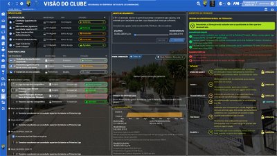
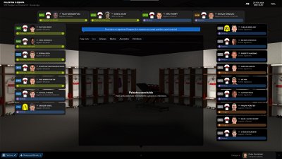
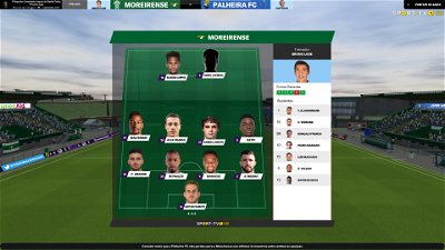
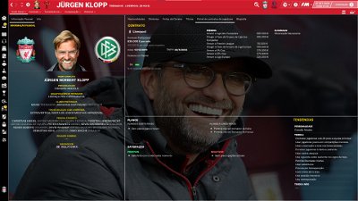
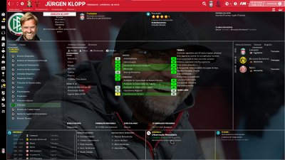
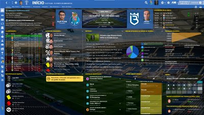
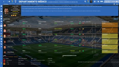
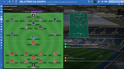
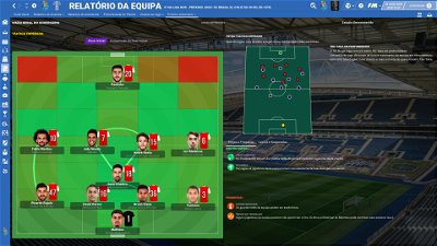
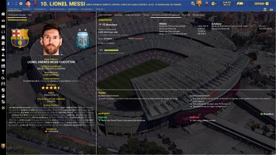
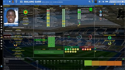
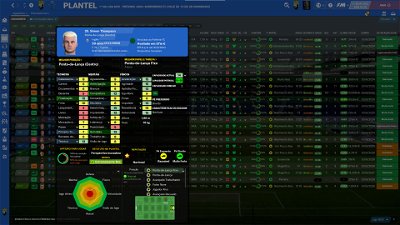
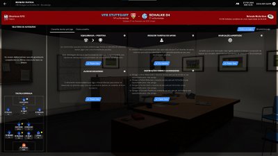
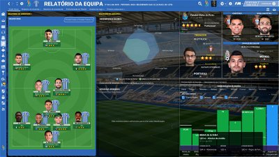
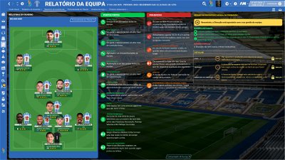
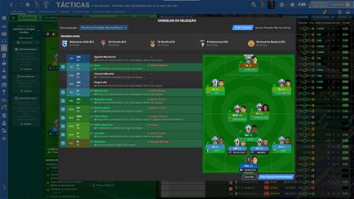
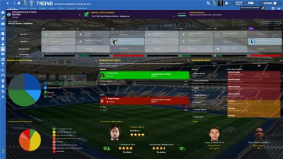
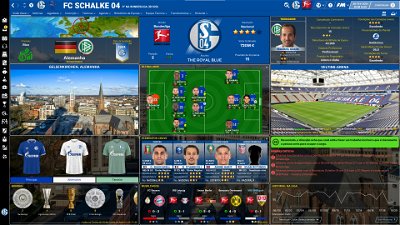
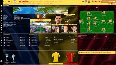
- Following the great idea of majesticeternity, Tyburn and a31632 (from Sports Interactive community) I included in several xmls a code for personalize the background in specific panels, namely club overview, player overview, board room, human profile and team training. These codes are not “activated” by default but if you want to have a different (customized) background in each one of that panels you just have to activate the codes. In the read me file I explain how you can do it.
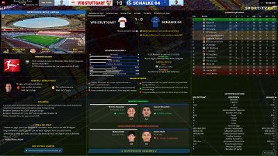
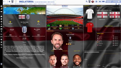
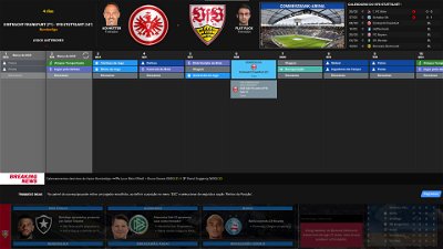
- Nation overall panel
- Nation overview panel
- Human profile panel
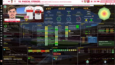
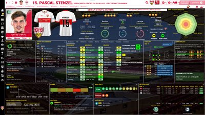
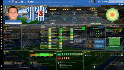
- Player profile stadium option in player overview panel
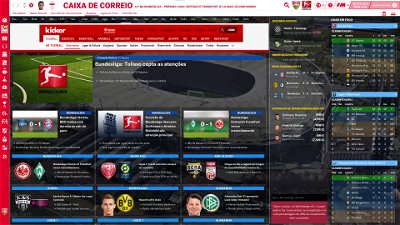
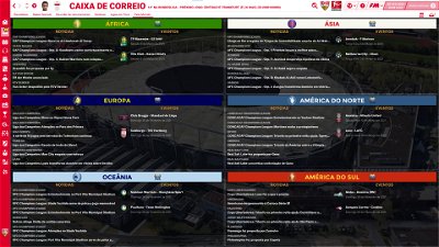
- News panel
The Skin pack also includes:
1. “Round country flags”, “round continents logos” and default logos specially made in metallic style by @Qvordrup from sourtitoutsi. Those graphics will be displayed in the title bar.
Thank you @Qvordrup by your great work and for your collaboration!!!
You can download the 2D packs prepared for Flutskin (titlebar and player overview panel) here in sourtitoutsi. FC style kits HERE; SS Kits style HERE
However, if you prefer edit your own kits, I also included in the pack a .pdf file explaining how you can edit the kits for Flutskin.
If you prefer SS'kits you can download this and replace the kits folder located here:
Documents\Sports Interactive\Football Manager 2021\skins\fm2021flutskin_dark\graphics\pictures\kits
HERE
The logos in country locators are now updated by @Qvordrup according the last version of metallic logos.
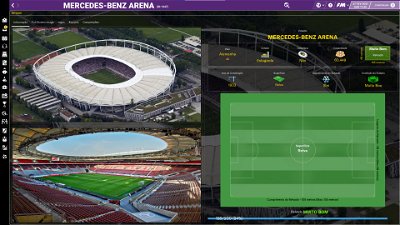
You can also download the stadiums background megapack and the citypics released by @DazS8 (thank you, my friend) HERE and HERE
And @geordie1981 has made a pack for inside "small" stadiums HERE
You can also download the sortitoutsi Backgrounds Megapack HERE
As always FlutSkin is completely free to download and I hope you enjoy it. However, if you want, you can reward my work donating whatever amount you wish. Any small amount is really appreciated.
You can do so by clicking the button down below:
SOME ADITTIONAL NOTES:
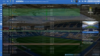
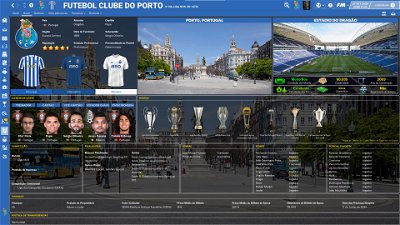
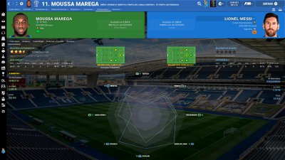
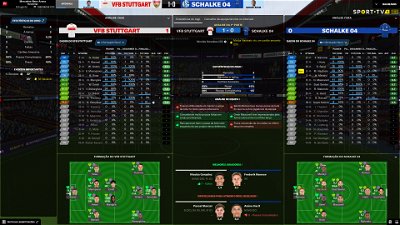
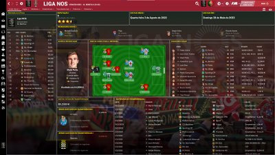
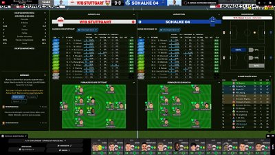
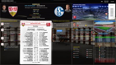
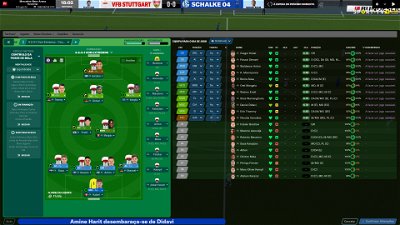
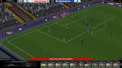
PLEASE NOTE THAT MANY SCREENSHOTS ARE FROM PREVIOUS VERSIONS OF THE SKIN
FOR THOSE WHO WANT TO MAKE THE GAME MORE DIFFICULT, YOU ALSO CAN DOWNLOAD AN ADAPTED VERSION OF THE SKIN (V. 15) WITH THE ATTRIBUTES VALUES HIDDEN. THIS ADAPTED VERSION WAS AN IDEA OF RICHBELL AND, ALTHOUGH WITH MY HELP, IT WAS RICHBELL WHO ALSO DID THE MAJORITY OF THE CHANGES. THANK YOU MY FRIEND!
Please note that for this version working well (with hidden attributes) you should remove the original version of the skin.
FOR THOSE WHO USE 2560x1440 RESOLUTION YOU ALSO CAN DOWNLOAD THE ADAPTED VERSION (v. 16.0) EDITED BY ROSEK
THE SKIN IS TOTALLY COMPATIBLE WITH 1920x1080 SCREEN RESOLUTION AND 4k (windows display settings 200%; game 100%).
YOU SHOULD USE IT IN FULL WINDOWS, ICONS ONLY
Important note regarding TV LOGOS:
Although the default tv logo is the one I use, of course you can easily change it; for that you just have to go to skin/graphics/icons/tv logos. In that folder there is a alt folder with many TV logos. You just have to replace the tv logo.png and the tv [email protected] for that one you want. Of course you should rename the new logos as tv logo and tv logo@2x. You also can use other logos made by you. The procedure to use them is exactly the same. However, I should remember that yo should use logos with the right height. For tv logo you should use 25px and for the @2x you should use 50px.
Resolution requirements:
This skin was made to work properly in 3840x2160 (4K with windows display settings 200%) and also 1920x1080 (1080p) full screen mode, sidebar icons only. As a result, some panels won’t work properly in other resolutions.
How to add Flut Skin in FM21
Download and extract the .rar file (using either 7-Zip for Windows or The Unarchiver for Mac).
Place the "fm2021flutskin_dark" folder here:
Documents\Sports Interactive\Football Manager 2021\skins
Create the folder "skins" if it doesn't exist. Start FM21 and go to Preferences screen and then into the Interface tab. You should see FM 2021 Flut Skin dark - Version 16.0 as an option in the skin drop down of the Overview box. Hit the Confirm button.
Please note this skin is provided as is. It has nothing to do with Sports Interactive or SEGA and won't be supported by them.
Dear all
This FLUTSKIN version 16 is the final version of FLUTSKIN for FM21!!
A great thank you to all FM fans who choose to play with FLUTSKIN and always keep me motivated to still improving the skin and gave me new ideas!!!
A special thank you to all players who decided to distinguish my work with a donation!! Although just a small part of FM Players who use the skin made a donation (I edited the skin as a hobby and, as you know, completely free), I always feel honoured and happy when people recognize the work done and decide to contribute. So, I reinforce, I have to give a special thank you to that friends of FlutsKin!!!!!!
Also a recognized thank you to those one who help me answering the questions and requests and adapted the FlutSkin (namely and specially Rosek for the help to answering questions and the adapted version for 2560x1440, and Richbell, for the adapted version with hidden attributes!!!!! And, of course I don't forget the skinners community who also indirectly contributed to FlutSkin with their creativity.
Also a special thank you to PATRES10, from fmslovakia for the 2D default kits (especially tailor-made for FlutSkin) anf to Michael Murray since I started editing the match inbetween highlights panel based on his amazing work!!
Now is time to stop editing the skin for this season. I wish to return for FM22. Lets wait and see since no one is able to predict the future.
MAIN CHANGES IN v16.0
- Following the great idea of majesticeternity, Tyburn and a31632 (from Sports Interactive community) I included in several xmls a code for personalize the background in specific panels, namely club overview, player overview, board room, human profile and team training. These codes are not “activated” by default but if you want to have a different (customized) background in each one of that panels you just have to activate the codes. In the read me file I explain how you can do it.
- Nation overall panel
- Nation overview panel
- Human profile panel
- Player profile stadium option in player overview panel
- News panel
The Skin pack also includes:
1. “Round country flags”, “round continents logos” and default logos specially made in metallic style by @Qvordrup from sourtitoutsi. Those graphics will be displayed in the title bar.
Thank you @Qvordrup by your great work and for your collaboration!!!
You can download the 2D packs prepared for Flutskin (titlebar and player overview panel) here in sourtitoutsi. FC style kits HERE; SS Kits style HERE
However, if you prefer edit your own kits, I also included in the pack a .pdf file explaining how you can edit the kits for Flutskin.
If you prefer SS'kits you can download this and replace the kits folder located here:
Documents\Sports Interactive\Football Manager 2021\skins\fm2021flutskin_dark\graphics\pictures\kits
HERE
The logos in country locators are now updated by @Qvordrup according the last version of metallic logos.
You can also download the stadiums background megapack and the citypics released by @DazS8 (thank you, my friend) HERE and HERE
And @geordie1981 has made a pack for inside "small" stadiums HERE
You can also download the sortitoutsi Backgrounds Megapack HERE
As always FlutSkin is completely free to download and I hope you enjoy it. However, if you want, you can reward my work donating whatever amount you wish. Any small amount is really appreciated.
You can do so by clicking the button down below:
SOME ADITTIONAL NOTES:
PLEASE NOTE THAT MANY SCREENSHOTS ARE FROM PREVIOUS VERSIONS OF THE SKIN
FOR THOSE WHO WANT TO MAKE THE GAME MORE DIFFICULT, YOU ALSO CAN DOWNLOAD AN ADAPTED VERSION OF THE SKIN (V. 15) WITH THE ATTRIBUTES VALUES HIDDEN. THIS ADAPTED VERSION WAS AN IDEA OF RICHBELL AND, ALTHOUGH WITH MY HELP, IT WAS RICHBELL WHO ALSO DID THE MAJORITY OF THE CHANGES. THANK YOU MY FRIEND!
Please note that for this version working well (with hidden attributes) you should remove the original version of the skin.
FOR THOSE WHO USE 2560x1440 RESOLUTION YOU ALSO CAN DOWNLOAD THE ADAPTED VERSION (v. 16.0) EDITED BY ROSEK
THE SKIN IS TOTALLY COMPATIBLE WITH 1920x1080 SCREEN RESOLUTION AND 4k (windows display settings 200%; game 100%).
YOU SHOULD USE IT IN FULL WINDOWS, ICONS ONLY
Important note regarding TV LOGOS:
Although the default tv logo is the one I use, of course you can easily change it; for that you just have to go to skin/graphics/icons/tv logos. In that folder there is a alt folder with many TV logos. You just have to replace the tv logo.png and the tv [email protected] for that one you want. Of course you should rename the new logos as tv logo and tv logo@2x. You also can use other logos made by you. The procedure to use them is exactly the same. However, I should remember that yo should use logos with the right height. For tv logo you should use 25px and for the @2x you should use 50px.
Resolution requirements:
This skin was made to work properly in 3840x2160 (4K with windows display settings 200%) and also 1920x1080 (1080p) full screen mode, sidebar icons only. As a result, some panels won’t work properly in other resolutions.
How to add Flut Skin in FM21
Download and extract the .rar file (using either 7-Zip for Windows or The Unarchiver for Mac).
Place the "fm2021flutskin_dark" folder here:
Documents\Sports Interactive\Football Manager 2021\skins
Please note this skin is provided as is. It has nothing to do with Sports Interactive or SEGA and won't be supported by them.
Comments
You'll need to Login to comment

flut
For working well you have to play with the sidebar icons only (the small left bar only with icons displayed)
bromi8819
i did bud still the same effect
flut
Please show me a screenshot in order I can guide you to solve your problem.
bromi8819
flut
Since the weight units you use requires lots of space, my advice is to delete the condition icon and move the weight to the right. for that do the following (in player overview panel.xml)
<widget class="editable_client_object_property_panel" id="conv" alignment="left" icon_alignment="left">
<layout class="stick_to_sides_attachment" alignment="top" inset="128" />
<layout class="stick_to_sides_attachment" alignment="centre" inset="0"/>
<layout class="stick_to_sides_attachment" alignment="vertical" inset="0" />
<layout class="stick_to_sides_attachment" alignment="left" inset="7"/>
<record id="widget_info" class="player_condition_icon_widget" appearance="" label_disabled="true" scale_picture="false" icon_alignment="right"/>
<record id="widget_properties" alignment="right,centre_y"/>
<record id="object_property" get_property="PcOI"/>
</widget>
2. second, move the weight to the right (line 457). Change
<layout class="stick_to_sides_attachment" alignment="left" inset="80"/>
to
<layout class="stick_to_sides_attachment" alignment="left" inset="105"/>
bromi8819
yeah i tried removing the condition one didnt work out i can use this code now thanks mate
flut
You should remove the code of the lines I told you because if you remove other similar code is not work, since is the code for one of the other options in the drop down arrow (threre are various pieces of code for condition - one for each one of the options of the drop down arrow).
bromi8819
@flut thanks mate all good now
bromi8819
yeah thats what i was doing when at first thats why i came to ask instead removed the flag aswell so now i can have the names back to icons and all looks good this is hands down the best skin on game
bromi8819
@flut sorry to be a total pain, when i switch to the alt panels for ss kits, i lose the comparison new feature u added where we can click the position to check the whole pitch goes do i need to add certain code in to get it back if not will stick with default layout
flut
Hi. In fact I didn't update the alts, since I had no time to do it. You can include the code in one of the boxes (in the middle row, the box in the right).
In lines 2855-2857
change
<widget class="player_scout_reports_panel" id="pscU" file="player/player scout report comparison small1" late_loading="true" default_for_everyone_else="true" >
<translation id="title" translation_id="248428" type="use" value="Comparison" />
</widget>
to
<widget class="player_scout_reports_panel" id="pscU" file="player scout reports popup7" late_loading="true" default_for_everyone_else="true" >
<translation id="title" translation_id="248428" type="use" value="Comparison" />
</widget>
Qvordrup
(1920x1080 and 100% zoom)I've adjusted the kits in “player overview panel” to fit SS'kits, so the sleves are not cut off (version 13). Like last version not all 6 options look that great because the kits overlap. I would recommend using “profile flut card” like in the screenshot.
Rosek
@flut I still noticed 2 points that you can improve.
- The first one concerns the players selected to play in team 2. Is it possible to add the same icon that you have added for team 1?
- On the club panel, the number of the prediction media does not correspond to the one I find in the league presentation.
Have a good evening and a good week. Take care of yourself and your loved ones.
Qvordrup
I've also noticed that the media prediction on team screen is somehow wrong 👍
Rosek
I see what you are talking about.
I'll update my file I made for this resolution and share it as soon as I finish it.
Rosek
It's done. I've updated the player comparison :
https://www.mediafire.com/file/1hjp8q6bltamw3c/sskits_pop.rar/file
bromi8819
doesnt work for me mate i have same red and zoom as u so thougth would try to get kits closer when load player screen its just blank
Qvordrup
@flut I've seems to have lost the little red star on players profile (follow/unfollow)
flut
Hi Rosek and Qvordrup
Thanks 🙂
cheers
Paolo Balboni
Hello Flut, thanks for your great job.
I have a question for you, i'm not able to see my team kit in the player screen even following your PDF instructions and placing the 2D folder inside the LOGOS folder….any advice?
I'm going crazy….
Thanks in advance!!
Rosek
Greetings to all. I managed to put the icons in colour. What do you think ?
Rosek
Greetings.
In order for the kits to appear in the player panel, you need to make a second folder (copy the one you use for the team panel) and have it in the same place as this one. The only thing that changes is what you have already done according to your message.
Below you have for example how I put mine :
Hoping to have been helpful
ΧΑΡΑΛΑΜΠΟΣ ΧΑΡΑΛΑΜΠΟΥΣ
👍👍
Paolo Balboni
Really thanks Rosek but unfortunately it doesn't work….probably i'm doing some mistake somewhere but i don't understand where….
Rosek
Okay. We'll find the problem and fix it.
- Did you move the two folders that shouldn't be in your logo folder?
If you have already done so:
-Show me your paths that you entered in the "config" folders?
Bielsa is a legend
Is the issue that you have put the 2D file that is intended for the skin to recognise SS kits, rather than the 2dkitsaslogoss folder that shows the images
what is in the 2D file, can you show next layer
Paolo Balboni
So….finally i fixed it!
I deleted the whole folder and re-installed it again from the begin (but following your instructions) and now it works.
Thanks a lot my friend for your help….if you will travel trough ravenna you have a beer payed!
Rosek
Greetings to you @flut
Thank you for the answers.
Would it be possible to add this second indicator with the one already on the club sign ?
And on the other hand, to make our current ranking green if we are above, white if we are at the same level and red if we are below the objective set by the club ?
Mag1lc2
In my opinion it looks really nice! 👍
Rosek
Glad to hear it. 👌👌😊😊
And for beer, I'll have to wait a while given the current health situation unfortunately... 😭😭😉😉