424,122
2,066
27,276
FM 2021 FLUT skin dark - Version 16.0
Dear all
This FLUTSKIN version 16 is the final version of FLUTSKIN for FM21!!
A great thank you to all FM fans who choose to play with FLUTSKIN and always keep me motivated to still improving the skin and gave me new ideas!!!
A special thank you to all players who decided to distinguish my work with a donation!! Although just a small part of FM Players who use the skin made a donation (I edited the skin as a hobby and, as you know, completely free), I always feel honoured and happy when people recognize the work done and decide to contribute. So, I reinforce, I have to give a special thank you to that friends of FlutsKin!!!!!!
Also a recognized thank you to those one who help me answering the questions and requests and adapted the FlutSkin (namely and specially Rosek for the help to answering questions and the adapted version for 2560x1440, and Richbell, for the adapted version with hidden attributes!!!!! And, of course I don't forget the skinners community who also indirectly contributed to FlutSkin with their creativity.
Also a special thank you to PATRES10, from fmslovakia for the 2D default kits (especially tailor-made for FlutSkin) anf to Michael Murray since I started editing the match inbetween highlights panel based on his amazing work!!
Now is time to stop editing the skin for this season. I wish to return for FM22. Lets wait and see since no one is able to predict the future.
MAIN CHANGES IN v16.0
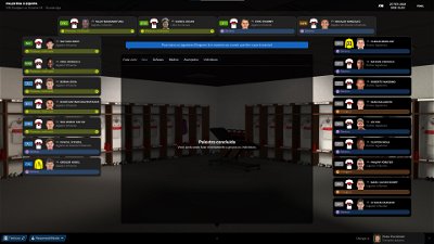
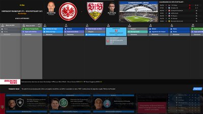
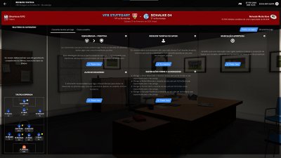
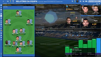
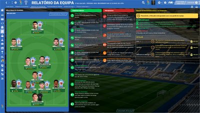
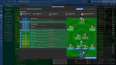
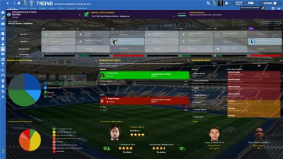
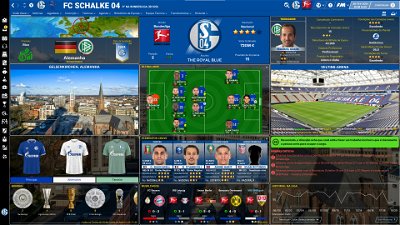
- Following the great idea of majesticeternity, Tyburn and a31632 (from Sports Interactive community) I included in several xmls a code for personalize the background in specific panels, namely club overview, player overview, board room, human profile and team training. These codes are not “activated” by default but if you want to have a different (customized) background in each one of that panels you just have to activate the codes. In the read me file I explain how you can do it.
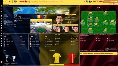
- Nation overall panel
- Nation overview panel
- Human profile panel
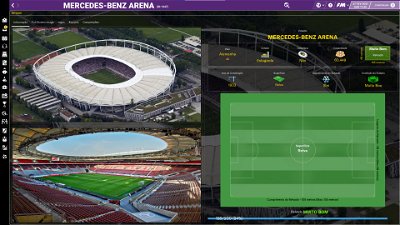
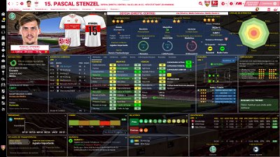
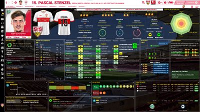
- Player profile stadium option in player overview panel
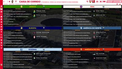
- News panel
The Skin pack also includes:
1. “Round country flags”, “round continents logos” and default logos specially made in metallic style by @Qvordrup from sourtitoutsi. Those graphics will be displayed in the title bar.
Thank you @Qvordrup by your great work and for your collaboration!!!
You can download the 2D packs prepared for Flutskin (titlebar and player overview panel) here in sourtitoutsi. FC style kits HERE; SS Kits style HERE
However, if you prefer edit your own kits, I also included in the pack a .pdf file explaining how you can edit the kits for Flutskin.
If you prefer SS'kits you can download this and replace the kits folder located here:
Documents\Sports Interactive\Football Manager 2021\skins\fm2021flutskin_dark\graphics\pictures\kits
HERE
The logos in country locators are now updated by @Qvordrup according the last version of metallic logos.
You can also download the stadiums background megapack and the citypics released by @DazS8 (thank you, my friend) HERE and HERE
And @geordie1981 has made a pack for inside "small" stadiums HERE
You can also download the sortitoutsi Backgrounds Megapack HERE
As always FlutSkin is completely free to download and I hope you enjoy it. However, if you want, you can reward my work donating whatever amount you wish. Any small amount is really appreciated.
You can do so by clicking the button down below:
SOME ADITTIONAL NOTES:
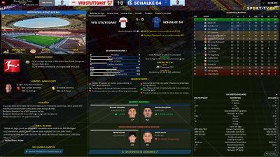
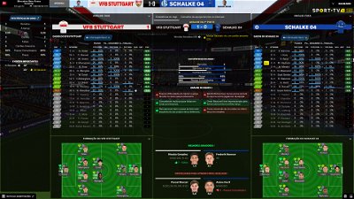
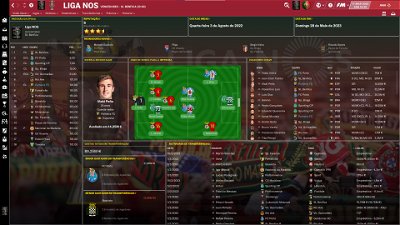
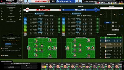
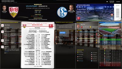
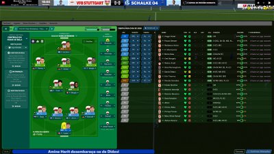
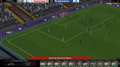
PLEASE NOTE THAT MANY SCREENSHOTS ARE FROM PREVIOUS VERSIONS OF THE SKIN
FOR THOSE WHO WANT TO MAKE THE GAME MORE DIFFICULT, YOU ALSO CAN DOWNLOAD AN ADAPTED VERSION OF THE SKIN (V. 15) WITH THE ATTRIBUTES VALUES HIDDEN. THIS ADAPTED VERSION WAS AN IDEA OF RICHBELL AND, ALTHOUGH WITH MY HELP, IT WAS RICHBELL WHO ALSO DID THE MAJORITY OF THE CHANGES. THANK YOU MY FRIEND!
Please note that for this version working well (with hidden attributes) you should remove the original version of the skin.
FOR THOSE WHO USE 2560x1440 RESOLUTION YOU ALSO CAN DOWNLOAD THE ADAPTED VERSION (v. 16.0) EDITED BY ROSEK
THE SKIN IS TOTALLY COMPATIBLE WITH 1920x1080 SCREEN RESOLUTION AND 4k (windows display settings 200%; game 100%).
YOU SHOULD USE IT IN FULL WINDOWS, ICONS ONLY
Important note regarding TV LOGOS:
Although the default tv logo is the one I use, of course you can easily change it; for that you just have to go to skin/graphics/icons/tv logos. In that folder there is a alt folder with many TV logos. You just have to replace the tv logo.png and the tv [email protected] for that one you want. Of course you should rename the new logos as tv logo and tv logo@2x. You also can use other logos made by you. The procedure to use them is exactly the same. However, I should remember that yo should use logos with the right height. For tv logo you should use 25px and for the @2x you should use 50px.
Resolution requirements:
This skin was made to work properly in 3840x2160 (4K with windows display settings 200%) and also 1920x1080 (1080p) full screen mode, sidebar icons only. As a result, some panels won’t work properly in other resolutions.
How to add Flut Skin in FM21
Download and extract the .rar file (using either 7-Zip for Windows or The Unarchiver for Mac).
Place the "fm2021flutskin_dark" folder here:
Documents\Sports Interactive\Football Manager 2021\skins
Create the folder "skins" if it doesn't exist. Start FM21 and go to Preferences screen and then into the Interface tab. You should see FM 2021 Flut Skin dark - Version 16.0 as an option in the skin drop down of the Overview box. Hit the Confirm button.
Please note this skin is provided as is. It has nothing to do with Sports Interactive or SEGA and won't be supported by them.
Dear all
This FLUTSKIN version 16 is the final version of FLUTSKIN for FM21!!
A great thank you to all FM fans who choose to play with FLUTSKIN and always keep me motivated to still improving the skin and gave me new ideas!!!
A special thank you to all players who decided to distinguish my work with a donation!! Although just a small part of FM Players who use the skin made a donation (I edited the skin as a hobby and, as you know, completely free), I always feel honoured and happy when people recognize the work done and decide to contribute. So, I reinforce, I have to give a special thank you to that friends of FlutsKin!!!!!!
Also a recognized thank you to those one who help me answering the questions and requests and adapted the FlutSkin (namely and specially Rosek for the help to answering questions and the adapted version for 2560x1440, and Richbell, for the adapted version with hidden attributes!!!!! And, of course I don't forget the skinners community who also indirectly contributed to FlutSkin with their creativity.
Also a special thank you to PATRES10, from fmslovakia for the 2D default kits (especially tailor-made for FlutSkin) anf to Michael Murray since I started editing the match inbetween highlights panel based on his amazing work!!
Now is time to stop editing the skin for this season. I wish to return for FM22. Lets wait and see since no one is able to predict the future.
MAIN CHANGES IN v16.0
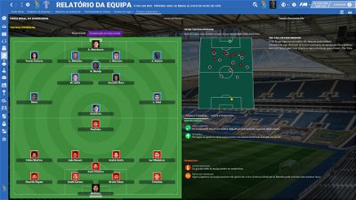
- Following the great idea of majesticeternity, Tyburn and a31632 (from Sports Interactive community) I included in several xmls a code for personalize the background in specific panels, namely club overview, player overview, board room, human profile and team training. These codes are not “activated” by default but if you want to have a different (customized) background in each one of that panels you just have to activate the codes. In the read me file I explain how you can do it.
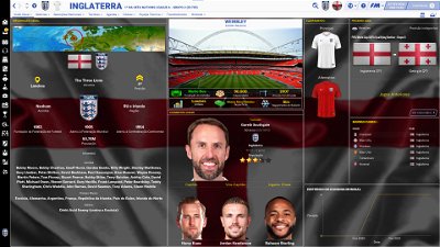
- Nation overall panel
- Nation overview panel
- Human profile panel
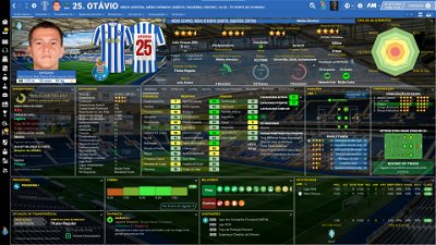
- Player profile stadium option in player overview panel
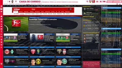
- News panel
The Skin pack also includes:
1. “Round country flags”, “round continents logos” and default logos specially made in metallic style by @Qvordrup from sourtitoutsi. Those graphics will be displayed in the title bar.
Thank you @Qvordrup by your great work and for your collaboration!!!
You can download the 2D packs prepared for Flutskin (titlebar and player overview panel) here in sourtitoutsi. FC style kits HERE; SS Kits style HERE
However, if you prefer edit your own kits, I also included in the pack a .pdf file explaining how you can edit the kits for Flutskin.
If you prefer SS'kits you can download this and replace the kits folder located here:
Documents\Sports Interactive\Football Manager 2021\skins\fm2021flutskin_dark\graphics\pictures\kits
HERE
The logos in country locators are now updated by @Qvordrup according the last version of metallic logos.
You can also download the stadiums background megapack and the citypics released by @DazS8 (thank you, my friend) HERE and HERE
And @geordie1981 has made a pack for inside "small" stadiums HERE
You can also download the sortitoutsi Backgrounds Megapack HERE
As always FlutSkin is completely free to download and I hope you enjoy it. However, if you want, you can reward my work donating whatever amount you wish. Any small amount is really appreciated.
You can do so by clicking the button down below:
SOME ADITTIONAL NOTES:
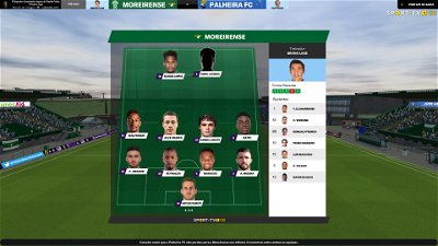
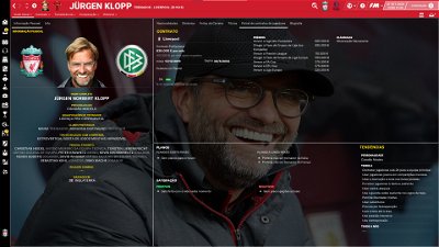
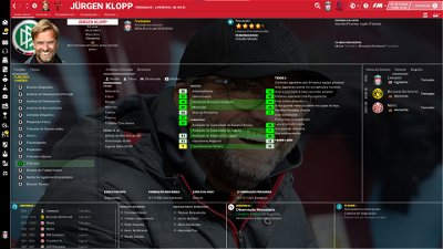
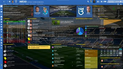
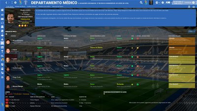
PLEASE NOTE THAT MANY SCREENSHOTS ARE FROM PREVIOUS VERSIONS OF THE SKIN
FOR THOSE WHO WANT TO MAKE THE GAME MORE DIFFICULT, YOU ALSO CAN DOWNLOAD AN ADAPTED VERSION OF THE SKIN (V. 15) WITH THE ATTRIBUTES VALUES HIDDEN. THIS ADAPTED VERSION WAS AN IDEA OF RICHBELL AND, ALTHOUGH WITH MY HELP, IT WAS RICHBELL WHO ALSO DID THE MAJORITY OF THE CHANGES. THANK YOU MY FRIEND!
Please note that for this version working well (with hidden attributes) you should remove the original version of the skin.
FOR THOSE WHO USE 2560x1440 RESOLUTION YOU ALSO CAN DOWNLOAD THE ADAPTED VERSION (v. 16.0) EDITED BY ROSEK
THE SKIN IS TOTALLY COMPATIBLE WITH 1920x1080 SCREEN RESOLUTION AND 4k (windows display settings 200%; game 100%).
YOU SHOULD USE IT IN FULL WINDOWS, ICONS ONLY
Important note regarding TV LOGOS:
Although the default tv logo is the one I use, of course you can easily change it; for that you just have to go to skin/graphics/icons/tv logos. In that folder there is a alt folder with many TV logos. You just have to replace the tv logo.png and the tv [email protected] for that one you want. Of course you should rename the new logos as tv logo and tv logo@2x. You also can use other logos made by you. The procedure to use them is exactly the same. However, I should remember that yo should use logos with the right height. For tv logo you should use 25px and for the @2x you should use 50px.
Resolution requirements:
This skin was made to work properly in 3840x2160 (4K with windows display settings 200%) and also 1920x1080 (1080p) full screen mode, sidebar icons only. As a result, some panels won’t work properly in other resolutions.
How to add Flut Skin in FM21
Download and extract the .rar file (using either 7-Zip for Windows or The Unarchiver for Mac).
Place the "fm2021flutskin_dark" folder here:
Documents\Sports Interactive\Football Manager 2021\skins
Please note this skin is provided as is. It has nothing to do with Sports Interactive or SEGA and won't be supported by them.
Comments
You'll need to Login to comment
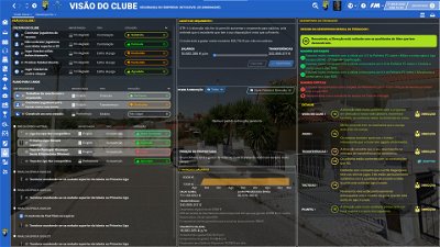
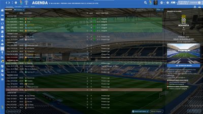
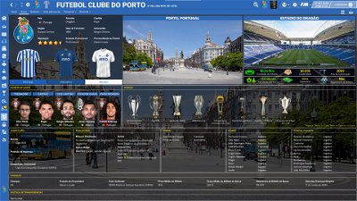
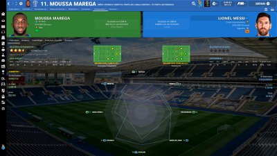
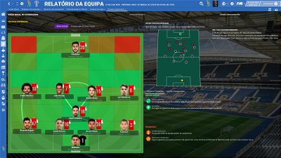
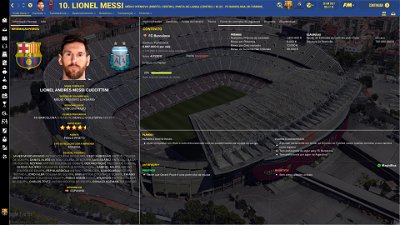
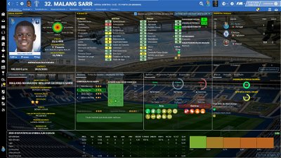
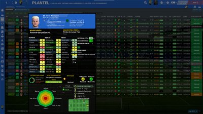

flut
Hi Charlston.
Yes, soon (maybe tomorrow) I will update the skin for version 14 🙂
cheers and keep safe
Bielsa is a legend
You are a true legend, after Leeds and Leicester wins, this weekend just gets better
flut
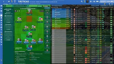
Thanks. I will use some lines of tactics (mentality, pression, marking and training type) and also include a promises tab,
WEGONNA
Happy to help as I intend to have your skin in the next FMs too 🙂
Moving on, I have made some changes to club overview, too, because my HDD space doesn't allow me to use city pics and I'm content with the “fix”. But my suggestion goes to player icons for key employees tab. I think adding a player info popup is more useful because we already have the player nationality right next to his picture and it's a big help for those like me hoarding hot prospects by simply browsing the club overviews for teams like Boca, River, Ajax etc.
What I have seems to be ok-ish if secondary color is a light color, but it's miserable if not. I have also removed the reputation info as I feel it's way too much info, but the problem is the way the popup button appears for other clubs and I would like to know if you have a fix for that:
Meanwhile, I think the nation panel would look better if the map is enlarged / streched to fit the entire area. What do you think?
flut
The info popup button is now included and is coloured according the primary colour of the club (I also included it it the manager of the club). Regarding the country locator, unfortunately is not possible due the width of the picture. If I try to enlarge it the picture doesn't work well (that's why I had to use it in that way, not filling all the space).
flut
Hi all
The new 14.0 version is now available with many tweaks/changes.
I hope you enjoy it!!
cheers
Bielsa is a legend
Cheers Flut, that’s tomorrow’s “working from home” sorted
mackboss
Thank you flut…awesome…!!!
cheers
Mag1lc2
Many, many, many thanks for an outstanding work my friend! 👍
Bielsa is a legend
Hi Rosek. hope you are well
i have club version in my logos and seems to work
where does team version go, what is the difference
kingofpain
Dear Flut,
thank you so much for your great work. What would FM be without your fantastic skin?
Stay healthy!!!
Greetings from Germany!!!
Rosek
Greetings.
The "team" file is intended for the ssk style kits to appear on the team panel. It is placed in the same location as the "club" file.
Best regards
Bielsa is a legend
thanks
is this correct place
Tony3983
great work mate!
will you be doing this as a light skin at all?
flut
mackboss, Charlston, Mag1lc2, kingofpain and Tony3983
Thanks for your kind words!! I really appreciated!!
Tony: this year I will not edit a light version. Sorry.
Rosek
Hello.
If it is in the right place you normally have this:
Hovis Dexter
Hi Flut
You've increased the size of the pre and post match press conference screens so that they now show 8 journalists without having to scroll down. Could you please let me know how to edit the appropriate screens so that I could increase the size of the box to show more journalists?
Rosek
Hello @flut .
I finish the update for the 2560*1440 résolution.
On the other hand, I don't know if it comes from me but I noticed this (nothing bad I reassure you). In the panel below, I have two indicators that do not work (or maybe not the right scale I do not know). And on the right, the photo of the keeper and the text is slightly too far to the left ( Same thing if I put the cursor on the "XG table", in French, the word Place is cut off at the P )
Good day to you and your loved ones.
flut
Hi Rosek
Regarding the pitch anf XG table first go to team report summary panel.xml and change (lines 190/191)
<container class="bordered_box" appearance="" >
<layout class="stick_to_sides_attachment" alignment="all" inset="0" apply_to_children="true" />
for
<container class="bordered_box" appearance="" >
<layout class="stick_to_sides_attachment" alignment="all" inset="10" apply_to_children="true" />
If the problem regarding the pitch still persist, go to team opposition report general performance1.xml and in the code
<widget class="pitch_with_tactics" id="plin" pitch_alignment="centre,can_scale" vertical="false" player_icon_file="tactics/tactics icon opposition match analysis1" icon_flags="show_name,show_number,show_extra_details,dont_colour_names,dont_fade_icons" pitch_vertical_padding="0" pitch_draw_grass="true" pitch_draw_goals="true" pitch_line_colour="white"/>
increase the value of pitch_vertical_padding="0"
Concerning the graphs, I don't know. In fact, in my game I tried to look at those graphs in different games saved and in a few, the graphs are empty but in others are with information (as in the screenshot below). Since I don't know where I can find that panels in the default skin I can't evaluate if is a skin problem…
Rosek
As for the 2 panels, I think they should work according to your capture.
For my lag problem, I succeeded thanks to your information
Thank you very much.
flut
Hi Dexter
Use this file (place it in newsitempanels folder).
In meantime I did some tweaks in the panel 🙂
aethelbeorn
Hi Flut
Which XML needs to be changed for me to move GK to the right some ?
Hovis Dexter
Hi Flut
That's brilliant - many thanks
flut
Go to pre match opponent scout report news panel.xml and increase the value in line 131
<integer id="pitch_vertical_padding" value="15" />
aethelbeorn
thank you
Mag1lc2
Hi Rosek!
When do you think you will release the v14 for our resolution? 😇
mackboss
Hi flut,
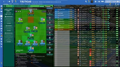
In the tatics sections, any posibility that only see the shirt fc'12 and don't change to shirts with number all the time…???
Thank You Flut..!!!
flut
Hi mackboss
Yes. I bieleve we can do it (I never tried yet…). However if you don't have the FC12 kits, no kit will be shown.
You just have to open tactics icon info panel overview16.xml and delete the following code
<widget class="tactics_kit_picture" id="kitp" keep_aspect_ratio="true" alignment="centre" scale_picture="true" number_inset_right="0" number_inset_top="0" number_height="45">
</widget>
Chunky677
Hi @flut , hope all is good. I was wondering about the LATEST EVENT UPDATES and ADVICE panel that appears on the left of the in-game match engine. This used to switch off during highlights, allowing me to see the pitch on the whole screen. Since updating to version 14, this does not disappear, which hampers the viewing of the game slightly. Could you tell me how to turn this off when there is action on the pitch? Thanks. Keep up the great work! Love it.
Bielsa is a legend
Click the clock once, that solves it