181,875
144
22,820
Extract the 7zip file into your skins folder and it should appear in the preferences
You can also get the skin on the steam workshop
28/1/14 - Updated to v1.02
1. Fixed lots of player and clubs actions
2. Fixed colours on sack race/next manager news items
3. Fixed formatting on formations in scout report news item
4. Translations of player actions have been replaced
You can also get the skin on the steam workshop
28/1/14 - Updated to v1.02
1. Fixed lots of player and clubs actions
2. Fixed colours on sack race/next manager news items
3. Fixed formatting on formations in scout report news item
4. Translations of player actions have been replaced
Comments
You'll need to Login to comment


sirwill
Whats this panel called?
Whats the graphic folder called?
mao89
TomDixon77
Not without redesigning the header, no.
That looks like a default panel. What caused that to pop up?
No.
sirwill
do youknow how to edit it?
TomDixon77
Not without knowing what it is, no.
sirwill
VP.
Still early days but you'll find them here http://sortitoutsi.net/downloads/view/9398/vps-stadium-backgrounds-english-prem#comment_136433
Sorry to jump into your thread Tom
Samirah
dfsFDS423423423
TomDixon77
That's odd, I thought I'd already changed that
marin_bar
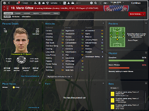
can you tell me how can I make player picture in attributes menu more bigger?
sirwill
Whats this panel called?
Whats the graphic folder called?
Please
theoffy
mapleleaftommoore
MichaelBridge_
For example, Swansea and Tottenham's bar colour is grey instead of white.
No worries if not.
dfsFDS423423423
TomDixon77
Out of interest, in what way is it worse?
TomDixon77
Cymro
dfsFDS423423423
The grey border around the header is too distracting and frankly ugly.
I couldn't figure out where all the buttons vanished like offer new contract or enquire about player.
TomDixon77
It's not actually grey, it's dependent on the current team/nation's second colour. It's mostly their to delineate the header and main screen area (otherwise it looks as though the tabs and action buttons are just floating about), as well as add a bit more colour to proceedings
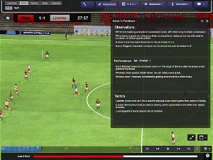
This is one of my bugbears with what SI have been doing to skinning since FM10. It's been harder and harder to do something that isn't basically a recolour of the default header without compromising somewhere else down the line. In this case, the autohiding actions on the match screen and using a more FMC like action button style (and then spending a while working out which actions you need, and which you don't). I think v1.02 should have solved most, if not all, of the missing actions.
dfsFDS423423423
asmirlfc
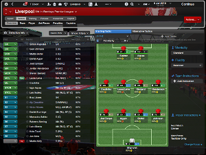
I just want to ask you how to change this tactic screen inside the tactic menu to bee bigger like in your screenshots ?
I use 23inch monitor and don't want these useless "next match menu"
Link here
TomDixon77
Strangely enough, you'd be better off with a smaller screen. That panel is resizeable and is omitted if the pitch panel above it needs all the space. I always shrink the screen down when taking screenshots,
asmirlfc
It's full screen. Last year it was some xml file to increase this tactic area
TomDixon77
Save and reload.
asmirlfc
Done it but the tactic area is the same just with no team next opponent panel under, it's just clear area now
TomDixon77
asmirlfc
It's still the same
TomDixon77