37,598
8
5,284
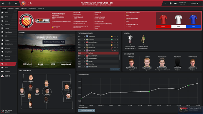
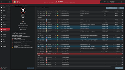
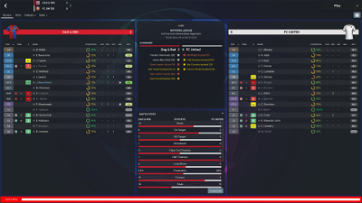
It's back! The beautiful, sleek TCS skin returns to FM19 and this time, it comes with a version designed by the biggest FM content creator, WorkTheSpace! I worked closely with Jack to help sculpt and design the special edition of TCS, which doubles down on the purple scheme introduced in the base skins, as well as incorporating the key features of TCS, including a brand new Player and Club Overview Screen and sleek, dark UI! The WTS also features minor tweaks to a few panels to help model the skin to Jack's ambition!
TCS'19 Highlights
v1.1 in all essence is a massive bug bash, having not released a skin for a while I was bound to slip up and make a few mistakes, which i did, mainly leading to a poorer experience for players using the zoom function, hopefully that should be rectified with this new version. The main feature for v1.1 is the Aero skin has been completely overhauled, with new graphics for the entire skin being created and tweaked along with new graphics colours, the introduction of transparency (and reduction in some cases), to popups, and other panels should lead to a better user experience and offer a more consistent and higher quality skin. As well as this we've introduced a new background selector in the base + WorkTheSpace skin, along with a more advanced selector for the Aero skin, with big credits going to Bossland (YACS Skin) for letting me borrow code and concepts from his. v1.1 also sees the introduction of various panels for the selector panel.
Full Changelist: https://pastebin.com/Dcuj9JRz
TCS'19 Highlights
- Sleek and Modern 'night-mode' skin Completely redesigned Player and Club Panels Brand new IBH and IBH Review Panels All panels darkened to make user experience more consistent Instant Result Button Three versions! Regular 'Night Mode', an Aero version akin to previous FMs and a brand new WorkTheSpace designed edition!
v1.1 in all essence is a massive bug bash, having not released a skin for a while I was bound to slip up and make a few mistakes, which i did, mainly leading to a poorer experience for players using the zoom function, hopefully that should be rectified with this new version. The main feature for v1.1 is the Aero skin has been completely overhauled, with new graphics for the entire skin being created and tweaked along with new graphics colours, the introduction of transparency (and reduction in some cases), to popups, and other panels should lead to a better user experience and offer a more consistent and higher quality skin. As well as this we've introduced a new background selector in the base + WorkTheSpace skin, along with a more advanced selector for the Aero skin, with big credits going to Bossland (YACS Skin) for letting me borrow code and concepts from his. v1.1 also sees the introduction of various panels for the selector panel.
Full Changelist: https://pastebin.com/Dcuj9JRz
Comments
You'll need to Login to comment


tv_capper
Would it be possible to get the staff profile pages to match the player profile pages? Just seems strange having different header sizes for each
(example images below)
delichris
Edit: I pulled the maps out of the head map and now the skin works.
xAtreyux
CHRISTOS GEORGIADIS
Bluestillidie00
If you're using the Aero or WTS version, you need to extract the regular skin as well.
ISynaxI
did copy + paste in documents ( SI folder) but nothing happened
tv_capper
Robbb81