Dear all
This is FLUTSKIN Version 8.0 for FM23!!
First of all I would like to give a great thank you to all FM fans who choose to play with FLUTSKIN and always keep me motivated to still editing the skin and gave me new ideas!!!
A special thank you to all of players who decided to distinguish my work with a donation!! Although just a small part of FM Players who use the skin made a donation (I edited the skin as a hobby and, as you know, completely free), I always feel honoured and happy when people recognize the work done and decide to contribute. So, I reinforce, I have to give a special thank you to that friends of FlutsKin!!!!!!
Also a thank you to all the skin makers who indirectly contribute to my work, and a special thank you to PATRES10, from fmslovakia for the 2D default kits (especially tailor-made for FlutSkin), to MICHAEL MURRAY since I started editing the match inbetween highlights panel based on his amazing work, to QVORDRUP, for the metallic “Round country flags” and his great collaboration in the “country locator maps”, to NUNO KOPIO for the “Square shiny flags” I included as alt files (for using as an alternative to the “Round country flags”) to PMPOU for his great contribution with many tickets to customize the skin, to DAZS8 for his great work in the addons for Flutskin. I also thank you for the contributes made by NOLEAFWILEN and RICHBELL.
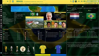
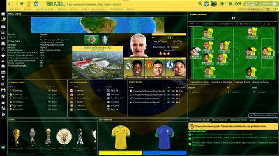
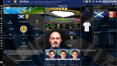
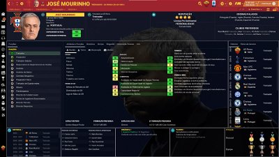
In FlutSkin you can find so many changes comparing to the default skin that I can’t present all of them here. I suggest you to go through the panels in order to see with your eyes all the changes!!
Main Changes in Version 8.0
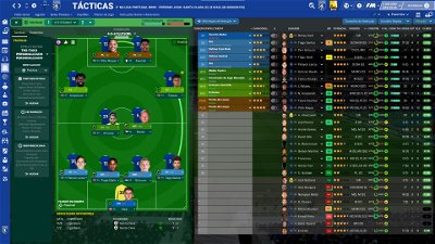
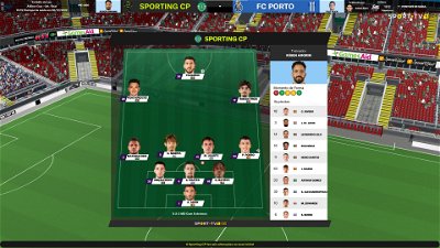
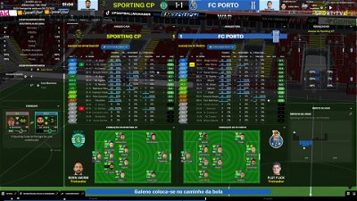
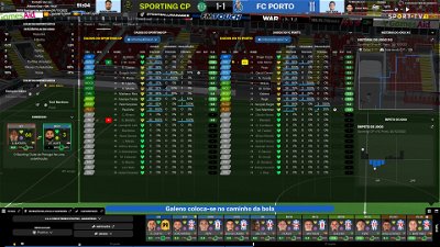
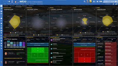
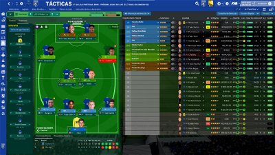
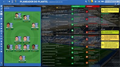
- Tactics Overview Panel (now the subs bench includes the player pictures)
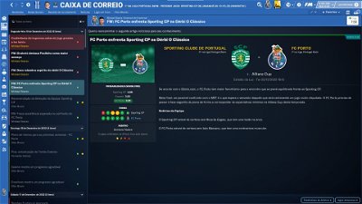
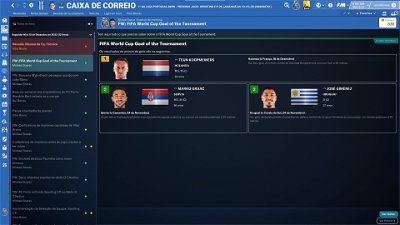
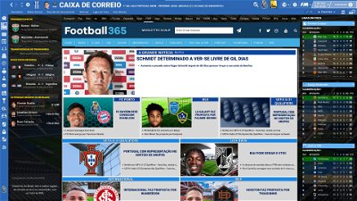
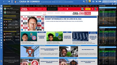
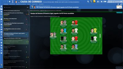
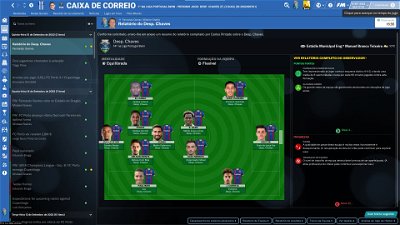
- Inbox panel (the height of the head bar was increased and tweaked)
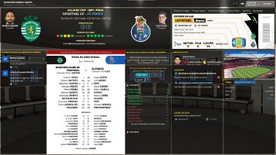
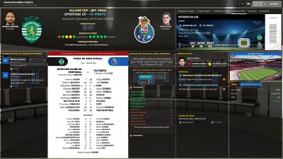
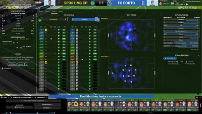
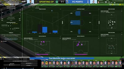
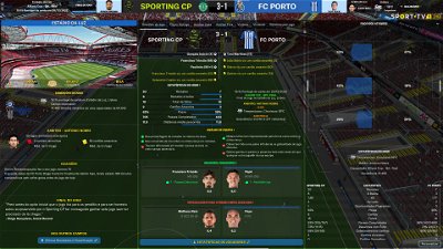
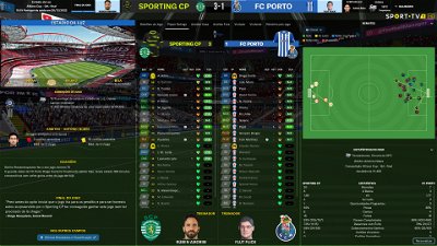
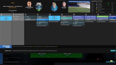
- Match Inbetween highlights (now all the panels can be resized with the mouse, in height and width, for a better customization)
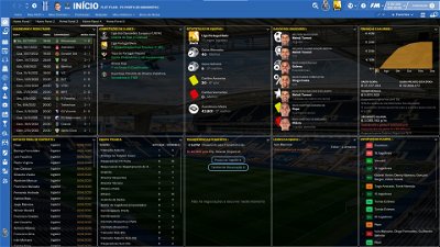
- Data hub → next opposition tweaked
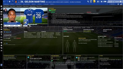
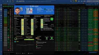
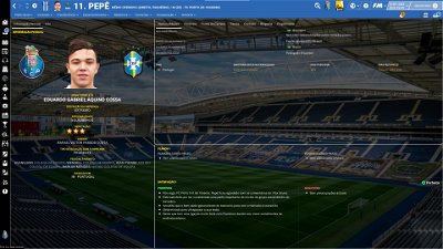
- Player popup panel tweaked (pros and cons panel included in the drop down arrow)
- New alts included (tickets alts - thank you PMPOU!; alt for black sidebar)
- Some other tweaks here and there
Main Changes in Version 7.0
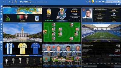
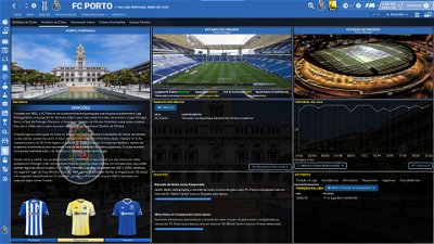
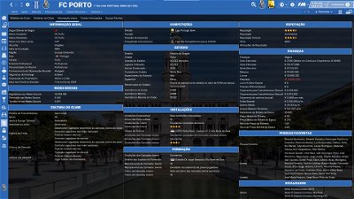
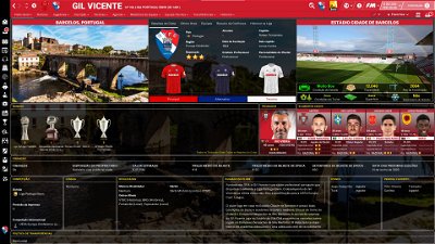
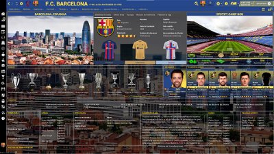
- Club Overview Panel (now 5 tabs, new information and tweaks)
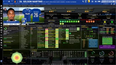
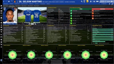
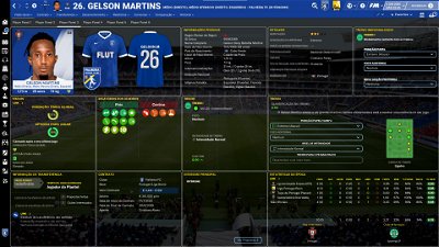
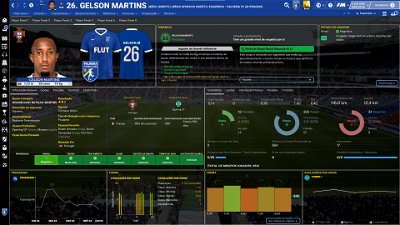
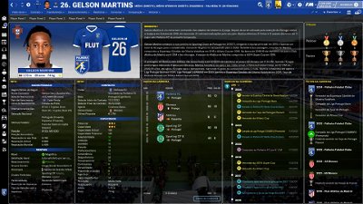
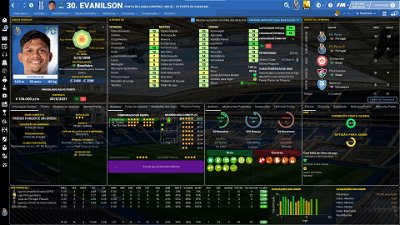
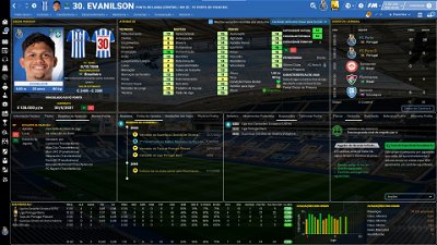
- Player Overview Panel (new information and the panels arrangement tweaked)
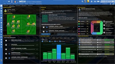
- Tactics Overview Panel (bigger pitch, subs bench on the left and information about previous matches with the opponent tweaked)
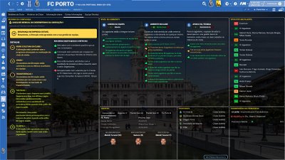
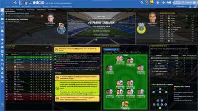
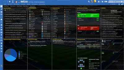
- Home panel (more results included in the results panel)
Main Changes in Version 6.0
-Home panel
- New tab included with more information
-Player Overview Panel
- Now you can use 6 (!) different tabs full of information
-Scoreboard
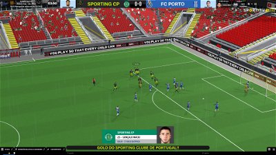
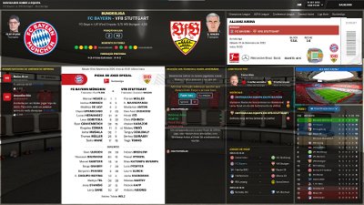
- Team full names included in the match scoreboard of UEFA competitions
-Match Team News panel
- Now you can choose among several tickets (I included tickets regarding UEFA competitions, BWIN Portuguese League, Bundesliga and a generic ticket, but, of course, you can customize your skin with the tickets you want)
-Calendar tweaked
-Reported bugs fixed
“Main Changes” in Version 5.0
- “New” Club overview panel
- now includes 3 different tabs including much more informations: club details, club history and key information (this tab full of club information). In the first tab the “followers in social networks” was included in the top middle panel.
- “New” stadium overview panel
- now includes much more stadium information
- “New” Nation overview panel and general panel
- Now include new information about each nation
- Player overview panel tweaked
- colours of attributes boxes and analysers tweaked
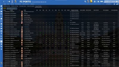
- Non player (staff) panel tweaked
- Current and Potential ability included
Please note that many of the screenshots above are not corresponding to the current version of the skin. As soon as possible I will try ti update the screenshots.
“Main Changes” in Version 4.0
- Player overview panel
- new set of tabs in the top middle box. Some of those tabs include new ring graphs of attribute analysis profile (physical, mental, technical, goalkeeping, defensive and offensive) which were created based on the great work of GROOT in his Electric Panther Skin. Thank you my friend!!; The other tabs include persoal details, biography and player stats full of data.
- Player attributes panel
- New tabs included in the middle boxes of the panel; stats box tweaked (with more data)
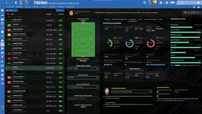
- Individual training panel
- New 5 tabs included
- New Bookmarks button included (now you can easily bookmark your favourite panels and have quickly acess to all of them)
- Lots of tweaks in player/staff list displayed in inbox panel (with much more information)
- Other tweaks here and there
- A few new alts (now you have a total of 24 alts for customize your Flutskin. However, please note that some of them could not entirely correspond to the current version of the skin)
- Finally, I would like to thank you Robin Heart who challenge me to do new things in the skin and gave me a new background picture for including in the background selector. Thank you, my friend!
“Main Changes” in Version 3.0
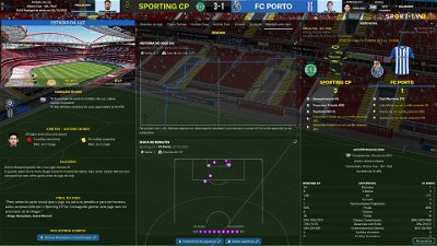
- Match inbetween highlights panel tweaked (now includes new information – pass map and match momentum – and four tabs for easily choose the information we want to see during the match)
- Ingame editor included in match day header panel
- Club affiliates panel tweaked
- Club overview panel tweaked (club details tweaked)
- Some other tweaks here and there
- Reported bugs fixed
- New Alts added:
- 1. grey titlebar and sidebar
- 2. player attributes not displayed (since I didn’t test all the panels, if you find a panel including player attributes yet, please let me know)
- 3. club details in club overview panel as it was in the last version of the skin
“Main Changes” in Version 2.0
Changes
- New Intro panel, now with 4 backgrounds rotating with each other
- New ticket picture in the pre-match panel (thank you, NunoKopio, for the new image)
- A few panels in news panel tweaked
Bugs fixed
- Competition Team stats panel and competition player stats panel
- Shorlist panel
- Player coach report for contract negotiations
- Player coach report for contract promises
- Tactics set pieces panel
- Team report scout report panel
- Scouting centre assignment card for recruitment focus panel
- Coach summary report boxes (player profile panel and player attributes panel)
“Main Changes” in Version 1.0
- Intro panel (new background included)
- Social news (size of the panels increased)
- New alt for match titlebar/scoreboard, including clock, teams (only the team logos) and score
- Reported bugs fixed
- Note 1: I also decided to keep the panels of the Uefa Cups, Bundesliga and EFL as default. However, I included a new alt for those who prefer using the match titlebar of the FlutSkin, in all competitions.
The pack includes many alt files for customize the skin (please read the read me file included in the pack) and several tutorials: 1) how should be the configs for the stadiums packs; 2) how can you adjust the size and the place of the kit number in player overview panel; 3) how can you do the 2D kits adapted for Flutskin. BEFORE ASKING QUESTIONS OR REQUESTS, PLEASE TAKE A LOOK AT THE ALT FOLDERS AND ALSO AT THE READ ME AND TUTORIAL FILES!!
You can download the 2D packs prepared for Flutskin (titlebar and player overview panel) here in sourtitoutsi. FC style kits https://sortitoutsi.net/content/44727/2d-kits-1819-for-flutskin-titlebarplayer-overview-v10 SS Kits style https://sortitoutsi.net/content/57825/ss-kits-as-logo-left-for-flut-skin
If you prefer SS'kits as default kits, you can download this and replace the kits folder located here: Documents\Sports Interactive\Football Manager 2022\skins\fm2022flutskin_dark\graphics\pictures\kits
HERE
However, if you prefer edit your own kits, I also included in the pack a .pdf file explaining how you can edit the kits for Flutskin.
The sortitoutsi Backgrounds Megapack includes player, competition and stadium backgrounds, as well as beautiful city images: https://sortitoutsi.net/graphics/style/17/sortitoutsi-backgrounds-megapack
As always FlutSkin is completely free to download and I hope you enjoy it. However, if you want, you can reward my work donating whatever amount you wish. Any small amount is really appreciated.
You can donate by clicking here:
https://www.paypal.com/donate/?cmd=_s-xclick&hosted_button_id=E9P4RXKNQBQBS
THE SKIN IS TOTALLY COMPATIBLE WITH 1920x1080 SCREEN RESOLUTION AND 4k (windows display settings 200%; game 100%).
YOU SHOULD USE IT IN FULL WINDOWS, ICONS ONLY
Important note regarding TV LOGOS:
Although the default tv logo is the one I use, of course you can easily change it; for that you just have to go to skin/graphics/icons/tv logos. In that folder there is a alt folder with many TV logos. You just have to replace the tv logo.png and the tv [email protected] for that one you want. Of course you should rename the new logos as tv logo and tv logo@2x. You also can use other logos made by you. The procedure to use them is exactly the same. However, I should remember that yo should use logos with the right height. For tv logo you should use 25px and for the @2x you should use 50px.
Resolution requirements:
This skin was made to work properly in 3840x2160 (4K with windows display settings 200%) and also 1920x1080 (1080p) full screen mode, sidebar icons only. As a result, some panels won’t work properly in other resolutions.
[b]How to add Flut Skin in FM23[/b]
Download and extract the .zip file (using either 7-Zip for Windows or The Unarchiver for Mac).
Place the "fm2023flutskin_dark" folder here:
Documents\Sports Interactive\Football Manager 2023\skins
[*] Create the folder "skins" if it doesn't exist.
[*] Start FM23 and go to Preferences screen and then into the Interface tab.
[*] You should see FM 2023 Flut Skin dark - 8.0 as an option in the skin drop down of the Overview box.
[*] Hit the Confirm button.
Please note this skin is provided as is. It has nothing to do with Sports Interactive or SEGA and won't be supported by them.
Comments
You'll need to Login to comment

kfnielsen
I really want that panel
toilet_in_tibet
Hi, oh yes that looks good! I'd really like to use colors of attributes that I've set in the FM preferences, like below
I wonder if this possible 😀
Thank you!
NVHeat
NVHeat
iv been cooking Christmas dinner…haha….but your answer is in the feed above
kfnielsen
thanks and merry christmas
flut
BAR15E: when you extract the pack you should look inside the extracted folder. You can see another folder with the name of the skin. is that folder you should place in the skins folder of the game.
toilet_in_tibet and kfnielsen: in the next relaese I will include an alt for playing with player attributes without boxes
Stefanovski: thanks. I already fixed it and the fix will be included in the next version of the skin.
bagigino
What folder do you put the alts tickets? Thank
Elkhanan Aharon
Good day, I do not have skills allocated for a certain position in the player's attributes. How can I fix this? Thanks
toilet_in_tibet
thank you! absolute legend! it looks awesome
NVHeat
you use that for all panels on fluts skin…..replacing the bottom line of code..
nikolaosaek
Hi flut, happy new year. Is there a way to have the classic manager scene at the game menu and not the 4 pictures that change?
Remco van Schaik
Hi @flut
Love your work!
Question, How can I get the PSV and maccabi titles centered in the middle?
flut
Hi nikolasaek. happy new year!!
You can use this file (place it in panels/game folder)
flut
Hi and thanks!
Sorry but I didn't understand. Could you please explain a little bit what do you want. Ah, by the way, you know you can open the right panel clicking on its left border and pull it to the left, right?
what is “classic manager scene at the game menu” ?
flut
Hi all
Now you can download the FlutSkin for FM23, Version 4.0.
Happy New Year!
McG84
Great work once again Flut 👏
Arturito91
hi flut why the attributes colour is so pale ?
Bielsa is a legend
Hi @flut incredible update, but i have pale attributes also
flut
Hi all
Some of you (kfihu and Bielsa for now) reported the “pale” attributes.
In fact I changed a little bit the attributes boxes colours in order to have smooth colours instead of more vivid colors. I also made the new analyser graphics with that colours for a perfect match between the attributes boxes colours and the ring colours. However, you can go back to the previous colours.
For that, go to the settings.xml and change
<!-- background attribute box colours Flut FM23-->
<colour name="unknown attribute background" red="146" green="82" blue="143"/>
<colour name="low attribute background" red="244" green="152" blue="152"/>
<colour name="normal attribute background" red="249" green="248" blue="140"/>
<colour name="good attribute background" red="204" green="237" blue="173"/>
<colour name="excellent attribute background" red="132" green="213" blue="124"/>
<!-- background attribute box colours Flut 20 v2
<colour name="unknown attribute background" red="146" green="82" blue="143"/>
<colour name="low attribute background" red="247" green="121" blue="121"/>
<colour name="normal attribute background" red="245" green="245" blue="85"/>
<colour name="good attribute background" value="green 200" />
<colour name="excellent attribute background" value="green" />-->
for
<!-- background attribute box colours Flut FM23
<colour name="unknown attribute background" red="146" green="82" blue="143"/>
<colour name="low attribute background" red="244" green="152" blue="152"/>
<colour name="normal attribute background" red="249" green="248" blue="140"/>
<colour name="good attribute background" red="204" green="237" blue="173"/>
<colour name="excellent attribute background" red="132" green="213" blue="124"/>-->
<!-- background attribute box colours Flut 20 v2-->
<colour name="unknown attribute background" red="146" green="82" blue="143"/>
<colour name="low attribute background" red="247" green="121" blue="121"/>
<colour name="normal attribute background" red="245" green="245" blue="85"/>
<colour name="good attribute background" value="green 200" />
<colour name="excellent attribute background" value="green" />
cheers
SC00P
same..
Bielsa is a legend
The fix to config works
Remco van Schaik
Hi @flut
How do I get Panel 1 more centered of the screen.
flut
What is your screen resolution?
Remco van Schaik
1920x1080p
flut
Ok. Thanks. So, why you want to move the panels? If you are playing 100% Zoom with that resolution, you just have to drag the right panel to the left in order to fill the full screen (without that horrible space in the middle) 🙂
Joe5p
Hi flut,
Thank you for this amazing skin.
Is there any way I can alter anything to show the media logos on news feed screens as well as the images that appear already (or instead of one of the images)?
I guess it might vary depending upon the type of news report. I know in the social feed it does show media logos where logos are in use but was wondering if there is a way to apply it in the news feed too? I guess maybe an issue might be how to include it without making things look too cluttered (and also allowing for the fact most people probably don't have or use too many media logos).
Just thought to ask because as well as adding a bit more realism, it helps with monitoring the sources used at a glance if working on media files in the editor.
If not possible, thanks for taking the time to consider and thanks again for the brilliant skin.
Thanks
Remco van Schaik
I have adjust it to 100% (it was on 125%🤦🏽♂️) and now its working.
Thank you so much 🙏🏼
IAmTheStag
Hi, Just a heads up if you decide to use the alt for playing with player attributes without background boxes then the Current Ability and Potential Ability vanishes with a dark background due to the numbers being in black colour. The only way I have been able to work around this is by adding the boxes code back in for CA and PA. Is there a way to change the CA and PA colour instead?
<widget class="attribute_label" alignment="centre,can_scale" colour="black" style="semi_bold" use_attribute_colour_as_bg="true" size="10" appearance="boxes/custom/attributes/paper" height="23" >
I also have a issue with an overlay in the kit area of the player profile since updating to v4 and I cannot work out how to fix this. This appears against all 6 profile card options. The only profile it looks okay on it Profile FLUT Card Club Background Colour.
IAmTheStag
also wondered if it is possible to add in CA and PA on screen anywhere on the staff profile page so it is visible without having to use the in game editor?
Thanks