Juan Pablo Hernández - Submissions - Cut-Out Player Faces Megapack
2000161680Timeline
@mons I just can't understand it.
If I compare my image to yours, same pixel height top and bottom. The difference is the position on the horizontal axis. You've refocused the image. I had the same thing yesterday, but the other way round, I'd centred the head and you'd moved it off-centre. I can't understand the correct position of the head now 🙂
I still need to find the right brightness/contrast that you want on the faces.
There are 3 things that I did to tweak it:
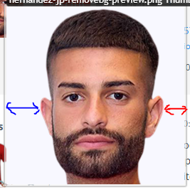
a) I centred the image in the canvas. Yours had a lot more space to the left of the head than it did to the right:
b) I added a collar because yours didn't have one:
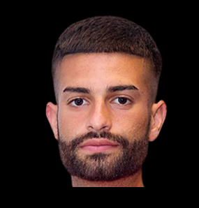
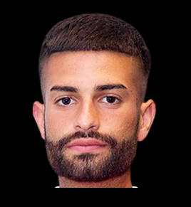
c) I used the auto-contrast feature and/or the brighten image function (can't remember which). There isn't any right or wrong way for this, really. Yours is fine, I just thought it'd look better if slightly brightened.

 Background and Stadium Packs


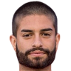



@Debenja Good cut, but please remember that we want all cuts to include a little bit of collar. At the same time, the ideal cut only contains 2-3 pixels beneath the chin. Since in some sources like this one, the person in the image may have a longer neck than usual, this would be quite difficult to achieve naturally.
I'll fix this one myself, but please keep it in mind for any future cuts you may do 👍
Here's a video of the process on how to nudge the collar upwards: