Nikita Iosifov - Submissions - Cut-Out Player Faces Megapack
58152145
Submitted
21 Jan 2024 20:30:33
Timeline
This image is a response to
#272104
This image is part of a pack:
Lokomotiv Moscow 2020-2021
This image is part of a pack:
Villarreal
Completed
by geordie1981
on 06 Sep 2021 11:16:59
This image is part of a pack:
Villarreal CF 2021/22
Pending
by DarkNaples
on 01 Oct 2021 21:53:08
Completed
by mons
on 02 Oct 2021 06:47:48
It's good that you're nudging the collar up @DarkNaples, but it doesn't need to go that far up because he looks like a hunchback now 😉
Generally speaking, it's better to crop the image 2-3 pixels beneath the chin and have only a few pixels of collar showing, like the older version cut from the same source. I find cuts tend to look much better that way 🙂
Better like this?
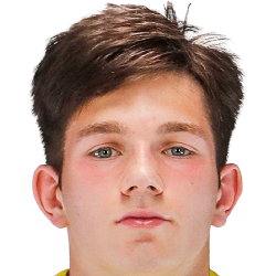
Better like this?
Sure, and if the chin and collar are cropped even further down, the better 🙂
Completed
by mons
on 05 Jan 2024 14:20:43
This image is part of a pack:
Russian 1

 Background and Stadium Packs









It's good that you're nudging the collar up @DarkNaples, but it doesn't need to go that far up because he looks like a hunchback now 😉
Generally speaking, it's better to crop the image 2-3 pixels beneath the chin and have only a few pixels of collar showing, like the older version cut from the same source. I find cuts tend to look much better that way 🙂