Leotrim Nitaj - Submissions - Cut-Out Player Faces Megapack
98040381
Submitted
15 Sep 2020 01:29:15
Timeline
This image is a response to
#172065
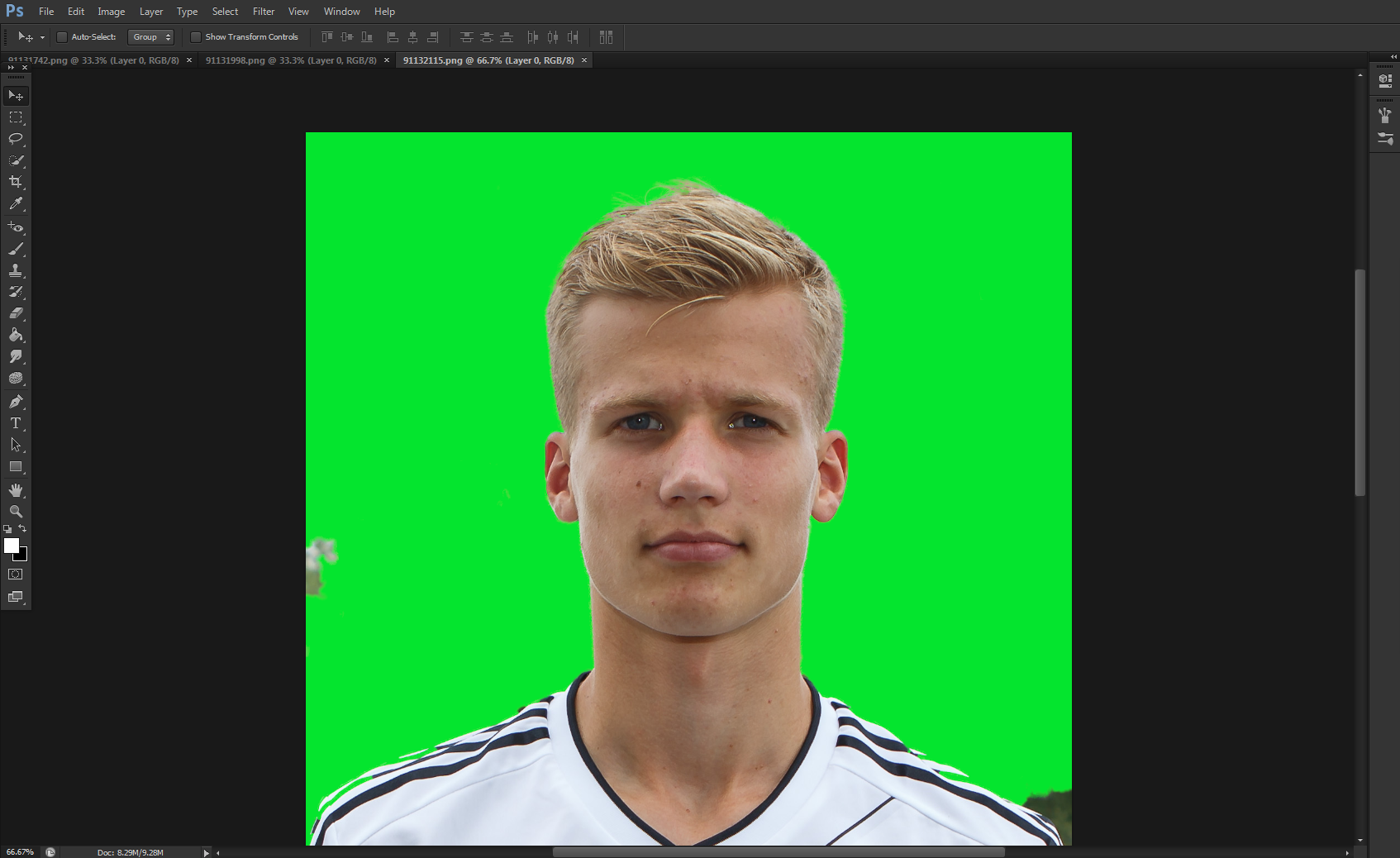
just on the collars debate, this picture is a perfect example of if I had left a bit of collar showing, it would have looked a bit shit due to the length of the lads neck.
sometimes its just not possible as it would detract from the cut.
I don't have the pic at hand, but there's a very simple way to "shorten" the neck and thus include the collar in a realistic and practical manner. I seem to recall @HRiddick posting it a while ago.
@Bothan Spy @mons
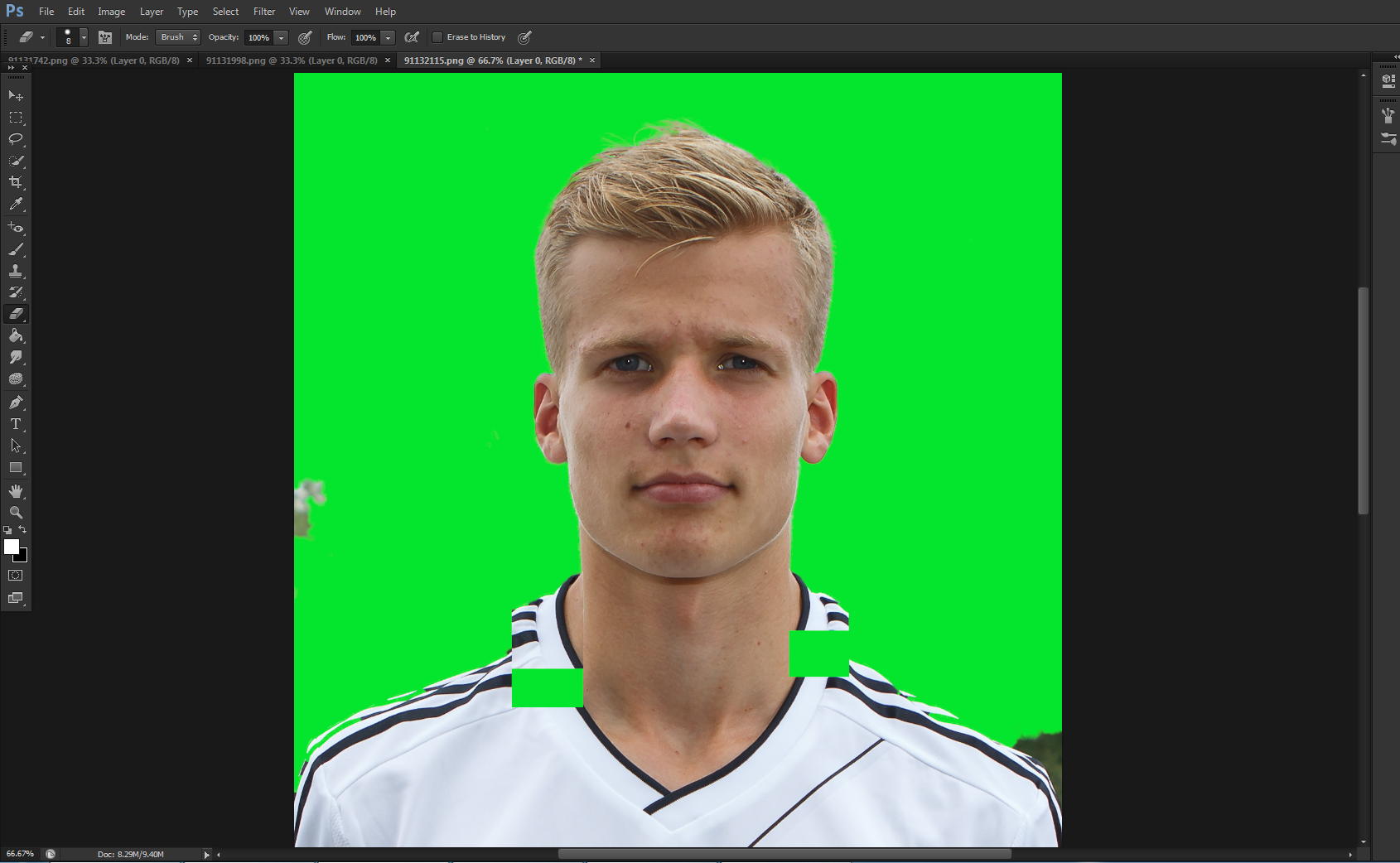
If your going to cut close to the chin but the collar disappears move the collar up before cutting, with either the marquee tool or the laso tool.
Example
Before
After
thanks for this! I will try it! 
I still think adding collars is pointless but I will endeavour to do better! ha ha.
my argument is, if I add a red collar to a player, and in game he signs for say Everton, then it doesn't look right...
surely a good, plain cut-out showing no team colours would be better? just my opinion...
@mons @HRiddick
thanks for this! I will try it!
I still think adding collars is pointless but I will endeavour to do better! ha ha.
my argument is, if I add a red collar to a player, and in game he signs for say Everton, then it doesn't look right...
surely a good, plain cut-out showing no team colours would be better? just my opinion...
@mons @HRiddick
My personal opinion is that the image just looks odd if the neck continues out of frame (it's been referred to in the past as "chicken neck" effect). However, sometimes if a player's neck is particularly long it *can* look bizarre moving the collar up to just under the chin (this image would probably be a good example), so with these I will compromise by not quite cutting directly below the chin but still moving the collar up, so it doesn't look like the player's neck has been squashed. It's up to your personal preference how you want to deal with it but the general consensus since I've been cutting for the megapack is to have a bit of kit in the cut - doesn't have to be more than two or three pixels worth!
FAO @Bothan Spy and @HRiddick and everyone else really, by way of background information, the original reason why a bit of collar was originally included (apart from "it looks better" was that the default SI cuts, on which this pack was based, all include collars and so the decision way back in the day was taken to have a standardised approach to include collars wherever possible.
This image is a response to
#277395
Thanks @MMXX 

 Background and Stadium Packs


sometimes its just not possible as it would detract from the cut.