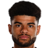
Philip Billing - Submissions - Cut-Out Player Faces Megapack
29121437
Submitted
01 Oct 2024 13:41:59
Timeline
This image is part of a pack:
Premier League 2018 Improvements ( 96 pics HD, without Man Ut/City/Tottenham) [Old Request]
This image is part of a pack:
Huddersfield [Old Request Response]
This image is part of a pack:
Huddersfield [Old Request Response]
This image is part of a pack:
Huddersfield Town [Old Request Response]
This image is part of a pack:
Huddersfield Town [Old Request]
This image is part of a pack:
Huddersfield Town Teampack [Old Pack Submission]
This image is part of a pack:
Huddersfield Town [Old Request Response]
This image is part of a pack:
AFC Bournemouth [Old Request Response]
This image is part of a pack:
AFC Bournemouth [Old Request]
Media not found #231686
This image is a response to
#231685
This image is a response to
#231685
Needs cropping but definitely a substantial quality improvement.
Needs cropping but definitely a substantial quality improvement.
I disagree it is an improvement, let alone a substantial one. The current cut was only produced a couple of months or so ago and there is nothing at all different in his looks.
Sources like this are the reason behind point 5 in the guidelines to making improvement requests: Ask yourself, is it really an improvement to the existing MP image? If it's the same face and hairstyle with just this season's new kit, it's probably just an alternative.
I felt the quality of the current cut is very poor and this is easily recognisable upon first glance. There is also excessive lighting which affects the quality and appearance of the photo, especially in comparison to the other Bournemouth player photos.
The suggested cut has balanced lighting exposure and a higher pixel count for the same area as the current cut, so yes it is definitely an improvement. I didn't realise cuts are rejected simply because the player has the same face and hair.
The suggested cut has balanced lighting exposure and a higher pixel count for the same area as the current cut, so yes it is definitely an improvement. I didn't realise cuts are rejected simply because the player has the same face and hair.
@BanOly you're right that the current MP image isn't the best quality, but with this one it would have to be upscaled to fit the 250*250px size for megapack cutouts, and would also suffer a loss of image quality.
@weeniehutjr yes most likely, but I'm working on finding a larger version of the same image, most likely the original.
@weeniehutjr yes most likely, but I'm working on finding a larger version of the same image, most likely the original.
The image you requested is the largest version of that source, it's from the Premier League website and they only upload as 500*500px, annoyingly. As well as that, their cutouts are done quickly and messily, leaving visual "snow" around the edges of the hair etc which needs to be cleaned up if it's going to be put in the megapack.
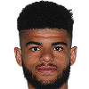
I've cleaned this one and upscaled to the correct dimensions, since I agree with you that the current MP cutout can be improved upon, but it's not ideal as the hair edges have lost some definition and there's only so much that a sharpening filter can do to limit the loss of quality from upscaling. @mons

I felt the quality of the current cut is very poor and this is easily recognisable upon first glance. There is also excessive lighting which affects the quality and appearance of the photo, especially in comparison to the other Bournemouth player photos.
The suggested cut has balanced lighting exposure and a higher pixel count for the same area as the current cut, so yes it is definitely an improvement. I didn't realise cuts are rejected simply because the player has the same face and hair.
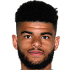
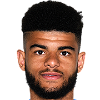
I've just realised it was me who cut the current MP version, from this source and I think it's a higher-resolution source than the one requested now. I've tried removing the blue-ish hue above the ear bit but I'm not too sure it's that much better:
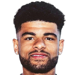
I've also tried cleaning and resizing your cut, but the fact it has no collar and needs upscaling means it's unlikely to be an improvement:
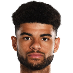
Besides, when a good and recent cut is already available, there frankly isn't any need for the same player to have a new cut. With hundreds of thousands of cuts in the megapack, I prefer that cutters' time is spent on sources which are genuine improvements, and not ones which are just slightly different, which is why sources like this are usually rejected. Of course, once one is cut, of course I compare it and add it to the MP if need be, but it's frankly usually a waste of cutter's time and of mine too.
Edit: @weeniehutjr, yours is a bit better than mine methinks, but I'd posted all the above already before you did, and didn't feel like deleting it
@mons As an aside, for sources like the current MP cutout where the shadows are too bright/pale, I find using the Levels or Curves adjustments in Photoshop (rather than just Brightness) to increase the shadows are very useful.
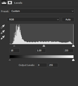
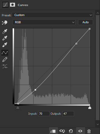
Comparison between shadows-increased and the one you posted:
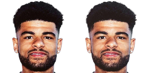


Comparison between shadows-increased and the one you posted:

@weeniehutjr, call me thick but I genuinely can't see much difference there 

 Background and Stadium Packs




mons