415,970
2,066
27,196
FM 2021 FLUT skin dark - Version 16.0
Dear all
This FLUTSKIN version 16 is the final version of FLUTSKIN for FM21!!
A great thank you to all FM fans who choose to play with FLUTSKIN and always keep me motivated to still improving the skin and gave me new ideas!!!
A special thank you to all players who decided to distinguish my work with a donation!! Although just a small part of FM Players who use the skin made a donation (I edited the skin as a hobby and, as you know, completely free), I always feel honoured and happy when people recognize the work done and decide to contribute. So, I reinforce, I have to give a special thank you to that friends of FlutsKin!!!!!!
Also a recognized thank you to those one who help me answering the questions and requests and adapted the FlutSkin (namely and specially Rosek for the help to answering questions and the adapted version for 2560x1440, and Richbell, for the adapted version with hidden attributes!!!!! And, of course I don't forget the skinners community who also indirectly contributed to FlutSkin with their creativity.
Also a special thank you to PATRES10, from fmslovakia for the 2D default kits (especially tailor-made for FlutSkin) anf to Michael Murray since I started editing the match inbetween highlights panel based on his amazing work!!
Now is time to stop editing the skin for this season. I wish to return for FM22. Lets wait and see since no one is able to predict the future.
MAIN CHANGES IN v16.0
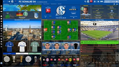
- Following the great idea of majesticeternity, Tyburn and a31632 (from Sports Interactive community) I included in several xmls a code for personalize the background in specific panels, namely club overview, player overview, board room, human profile and team training. These codes are not “activated” by default but if you want to have a different (customized) background in each one of that panels you just have to activate the codes. In the read me file I explain how you can do it.
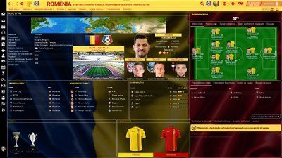
- Nation overall panel
- Nation overview panel
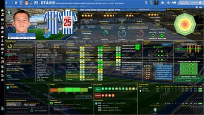
- Human profile panel
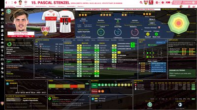
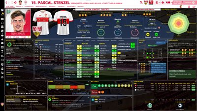
- Player profile stadium option in player overview panel
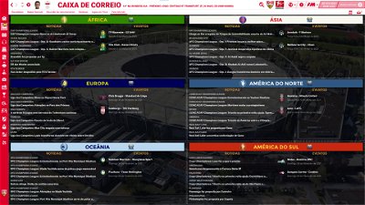
- News panel
The Skin pack also includes:
1. “Round country flags”, “round continents logos” and default logos specially made in metallic style by @Qvordrup from sourtitoutsi. Those graphics will be displayed in the title bar.
Thank you @Qvordrup by your great work and for your collaboration!!!
You can download the 2D packs prepared for Flutskin (titlebar and player overview panel) here in sourtitoutsi. FC style kits HERE; SS Kits style HERE
However, if you prefer edit your own kits, I also included in the pack a .pdf file explaining how you can edit the kits for Flutskin.
If you prefer SS'kits you can download this and replace the kits folder located here:
Documents\Sports Interactive\Football Manager 2021\skins\fm2021flutskin_dark\graphics\pictures\kits
HERE
The logos in country locators are now updated by @Qvordrup according the last version of metallic logos.
You can also download the stadiums background megapack and the citypics released by @DazS8 (thank you, my friend) HERE and HERE
And @geordie1981 has made a pack for inside "small" stadiums HERE
You can also download the sortitoutsi Backgrounds Megapack HERE
As always FlutSkin is completely free to download and I hope you enjoy it. However, if you want, you can reward my work donating whatever amount you wish. Any small amount is really appreciated.
You can do so by clicking the button down below:
SOME ADITTIONAL NOTES:
PLEASE NOTE THAT MANY SCREENSHOTS ARE FROM PREVIOUS VERSIONS OF THE SKIN
FOR THOSE WHO WANT TO MAKE THE GAME MORE DIFFICULT, YOU ALSO CAN DOWNLOAD AN ADAPTED VERSION OF THE SKIN (V. 15) WITH THE ATTRIBUTES VALUES HIDDEN. THIS ADAPTED VERSION WAS AN IDEA OF RICHBELL AND, ALTHOUGH WITH MY HELP, IT WAS RICHBELL WHO ALSO DID THE MAJORITY OF THE CHANGES. THANK YOU MY FRIEND!
Please note that for this version working well (with hidden attributes) you should remove the original version of the skin.
FOR THOSE WHO USE 2560x1440 RESOLUTION YOU ALSO CAN DOWNLOAD THE ADAPTED VERSION (v. 16.0) EDITED BY ROSEK
THE SKIN IS TOTALLY COMPATIBLE WITH 1920x1080 SCREEN RESOLUTION AND 4k (windows display settings 200%; game 100%).
YOU SHOULD USE IT IN FULL WINDOWS, ICONS ONLY
Important note regarding TV LOGOS:
Although the default tv logo is the one I use, of course you can easily change it; for that you just have to go to skin/graphics/icons/tv logos. In that folder there is a alt folder with many TV logos. You just have to replace the tv logo.png and the tv [email protected] for that one you want. Of course you should rename the new logos as tv logo and tv logo@2x. You also can use other logos made by you. The procedure to use them is exactly the same. However, I should remember that yo should use logos with the right height. For tv logo you should use 25px and for the @2x you should use 50px.
Resolution requirements:
This skin was made to work properly in 3840x2160 (4K with windows display settings 200%) and also 1920x1080 (1080p) full screen mode, sidebar icons only. As a result, some panels won’t work properly in other resolutions.
How to add Flut Skin in FM21
Download and extract the .rar file (using either 7-Zip for Windows or The Unarchiver for Mac).
Place the "fm2021flutskin_dark" folder here:
Documents\Sports Interactive\Football Manager 2021\skins
Create the folder "skins" if it doesn't exist. Start FM21 and go to Preferences screen and then into the Interface tab. You should see FM 2021 Flut Skin dark - Version 16.0 as an option in the skin drop down of the Overview box. Hit the Confirm button.
Please note this skin is provided as is. It has nothing to do with Sports Interactive or SEGA and won't be supported by them.
Dear all
This FLUTSKIN version 16 is the final version of FLUTSKIN for FM21!!
A great thank you to all FM fans who choose to play with FLUTSKIN and always keep me motivated to still improving the skin and gave me new ideas!!!
A special thank you to all players who decided to distinguish my work with a donation!! Although just a small part of FM Players who use the skin made a donation (I edited the skin as a hobby and, as you know, completely free), I always feel honoured and happy when people recognize the work done and decide to contribute. So, I reinforce, I have to give a special thank you to that friends of FlutsKin!!!!!!
Also a recognized thank you to those one who help me answering the questions and requests and adapted the FlutSkin (namely and specially Rosek for the help to answering questions and the adapted version for 2560x1440, and Richbell, for the adapted version with hidden attributes!!!!! And, of course I don't forget the skinners community who also indirectly contributed to FlutSkin with their creativity.
Also a special thank you to PATRES10, from fmslovakia for the 2D default kits (especially tailor-made for FlutSkin) anf to Michael Murray since I started editing the match inbetween highlights panel based on his amazing work!!
Now is time to stop editing the skin for this season. I wish to return for FM22. Lets wait and see since no one is able to predict the future.
MAIN CHANGES IN v16.0
- Following the great idea of majesticeternity, Tyburn and a31632 (from Sports Interactive community) I included in several xmls a code for personalize the background in specific panels, namely club overview, player overview, board room, human profile and team training. These codes are not “activated” by default but if you want to have a different (customized) background in each one of that panels you just have to activate the codes. In the read me file I explain how you can do it.
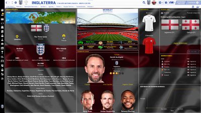
- Nation overall panel
- Nation overview panel
- Human profile panel
- Player profile stadium option in player overview panel
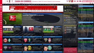
- News panel
The Skin pack also includes:
1. “Round country flags”, “round continents logos” and default logos specially made in metallic style by @Qvordrup from sourtitoutsi. Those graphics will be displayed in the title bar.
Thank you @Qvordrup by your great work and for your collaboration!!!
You can download the 2D packs prepared for Flutskin (titlebar and player overview panel) here in sourtitoutsi. FC style kits HERE; SS Kits style HERE
However, if you prefer edit your own kits, I also included in the pack a .pdf file explaining how you can edit the kits for Flutskin.
If you prefer SS'kits you can download this and replace the kits folder located here:
Documents\Sports Interactive\Football Manager 2021\skins\fm2021flutskin_dark\graphics\pictures\kits
HERE
The logos in country locators are now updated by @Qvordrup according the last version of metallic logos.
You can also download the stadiums background megapack and the citypics released by @DazS8 (thank you, my friend) HERE and HERE
And @geordie1981 has made a pack for inside "small" stadiums HERE
You can also download the sortitoutsi Backgrounds Megapack HERE
As always FlutSkin is completely free to download and I hope you enjoy it. However, if you want, you can reward my work donating whatever amount you wish. Any small amount is really appreciated.
You can do so by clicking the button down below:
SOME ADITTIONAL NOTES:
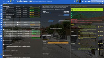
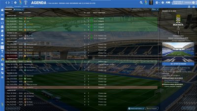
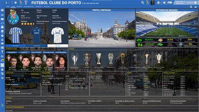
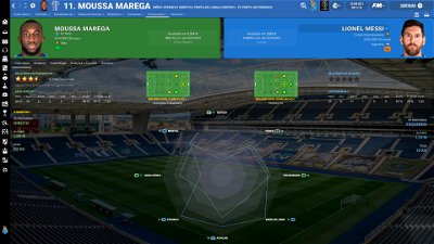
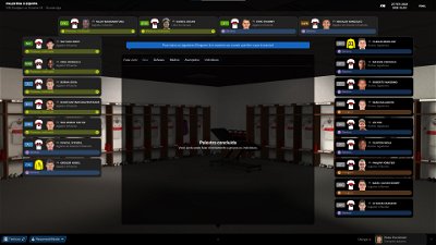
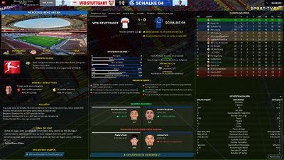
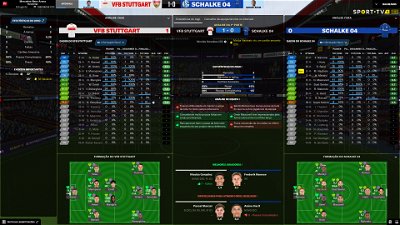
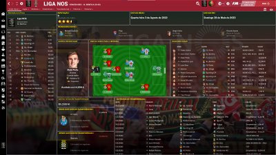
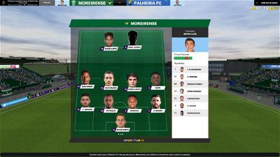
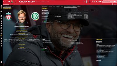
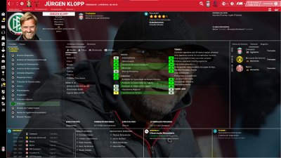
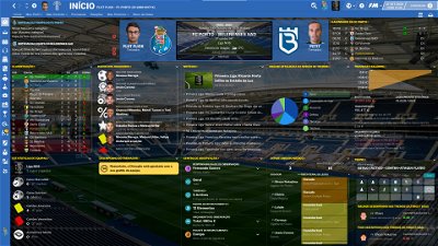
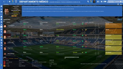
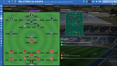
PLEASE NOTE THAT MANY SCREENSHOTS ARE FROM PREVIOUS VERSIONS OF THE SKIN
FOR THOSE WHO WANT TO MAKE THE GAME MORE DIFFICULT, YOU ALSO CAN DOWNLOAD AN ADAPTED VERSION OF THE SKIN (V. 15) WITH THE ATTRIBUTES VALUES HIDDEN. THIS ADAPTED VERSION WAS AN IDEA OF RICHBELL AND, ALTHOUGH WITH MY HELP, IT WAS RICHBELL WHO ALSO DID THE MAJORITY OF THE CHANGES. THANK YOU MY FRIEND!
Please note that for this version working well (with hidden attributes) you should remove the original version of the skin.
FOR THOSE WHO USE 2560x1440 RESOLUTION YOU ALSO CAN DOWNLOAD THE ADAPTED VERSION (v. 16.0) EDITED BY ROSEK
THE SKIN IS TOTALLY COMPATIBLE WITH 1920x1080 SCREEN RESOLUTION AND 4k (windows display settings 200%; game 100%).
YOU SHOULD USE IT IN FULL WINDOWS, ICONS ONLY
Important note regarding TV LOGOS:
Although the default tv logo is the one I use, of course you can easily change it; for that you just have to go to skin/graphics/icons/tv logos. In that folder there is a alt folder with many TV logos. You just have to replace the tv logo.png and the tv [email protected] for that one you want. Of course you should rename the new logos as tv logo and tv logo@2x. You also can use other logos made by you. The procedure to use them is exactly the same. However, I should remember that yo should use logos with the right height. For tv logo you should use 25px and for the @2x you should use 50px.
Resolution requirements:
This skin was made to work properly in 3840x2160 (4K with windows display settings 200%) and also 1920x1080 (1080p) full screen mode, sidebar icons only. As a result, some panels won’t work properly in other resolutions.
How to add Flut Skin in FM21
Download and extract the .rar file (using either 7-Zip for Windows or The Unarchiver for Mac).
Place the "fm2021flutskin_dark" folder here:
Documents\Sports Interactive\Football Manager 2021\skins
Please note this skin is provided as is. It has nothing to do with Sports Interactive or SEGA and won't be supported by them.
Comments
You'll need to Login to comment

Evil-Muffin7
UK ISP blocks this site but here is an alternative link
https://mega.nz/file/wUMDXS4Z#1PBM4nApFK5eP1fmRbLQin3N-94Z7CX_ltwZS121c4k
Bielsa is a Legend
legend, thanks-have a great weekend of sport
Mag1lc2
@ Rosek
It is possible to become the final version in 2560 x 1440 in near future? 😇
for me, the normal Version works fine in my 2560 x 1440 Screen/Monitor
*everytime i use the special 2560 x 1440 Version - not all is fine, like with normal Version
🙂
Mag1lc2
I can't confirm at all, it must be due to your configuration.
so when I always pasted the document (copy skin folder to skins folder) for example jersey back number proportions were wrong and so on.
When I used the normal document, these problems were not present.
edit.
+ i used V16 - so wqhd Version V16 is not released, so i can not test, if that V16 wqhd works fine, now, for me
🙂
Greetings from Germany
🙂
Rellom Q
I can confirm this. Never really got the special version to fit at all, something always seems to be off and scaled wrong.
To me, is the normal version with 125% zoom, by far and large the best option for 1440 screen.
for me too, my Friend @RellomQ
Greetings to your lovely Danish
Bielsa is a Legend
I would find it interesting to see who Fluts disciples support in the football world
me-Leeds United with a soft spot for York City
flut
As I believe you already know lol: FC Porto (from Spain I like Barcelona; from England, Man City and Liverpool)
Bielsa is a Legend
Yep, I got Porto, decent choice
we just signed Firpo from Barca and Harrison from city
Mag1lc2
Instead of complaining now, it would have been better for the errors to be reported via screenshot so that the creator can fix them. To suddenly announce that the WQHD version would never fit is absolute nonsense.
gholliday87
Oh, indeed! Thanks for all the assistance @flut
Rellom Q
I was not complaining, more so giving my opinion on the matter. I'm not sure with what mindset Flut created the 1440p edition, but to me is it worse then the 1080p. Oh, and sure let me show you, and explain why I believe so.
First off, I'm an old man (not really,) but I like to be able to see the text I'm playing with. That mean playing with 100% zoom on any sort of skin, is out of the question unless I played on a 24 inch 1080p screen. Since that is not the case, and I play on a 32 inch 1440p screen, I tend to zoom in.
Alright, so lets look at profiles. This is 1080p version, with 125% zoom, which is what I normal use.
1080p 125% profile
Let's us compare that to 1440p with 125% zoom:
1440p 125% profile
I'm aware that the kits, would be an easy fix, so look past that. The scaling was clearly not intended with 1440p skin, as the boxes are very small, or way to big. Okay, so lets take a look at 110% zoom with the 1440p skin just for the sake of it.
1440p 110% profile
A little better, but to me, is the boxes still to small, or to big with wasted space, here on 110% zoom. Also, much of the text is getting a little small imo. Like I said, I like 125% zoom on a big screen. And finally, lets see it on 100% zoom like it was most likely intended to be used.
1440 100% profile
Right, so this might look sort of okay on a screenshot, but I can't read the text. Simple as that, and I also don't like the massives amounts of wasted space in the boxes, specially around the attribute box. This is all opinion, and mine is, that 1080p with 125% is by far an large the best when it come to the player profile.
Moving on to the home overview. Again, starting with 1080p 125% zoom.
1080p 125% Home
Compared to 1440p with 125%, followed by 110% and 100%
1440p 125% home
1440p 110% home
1440p 100% home
A lot less scaling problems here on the Home overview screen, and the obvious difference to the managers bar is duo to changes between 1440p v14 and 1080p v16 … so this is a case, would it not really matter what version I used. On the other hand, let us take a quick look at the club screen with only 1440p 125% zoom and 1080p 125% zoom.
1080p 125% Club
1440p 125% club
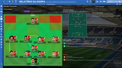
The scaling problem with the numbers on the “last starting 11," only appers here on 125% zoom, and not on 110% and 100%
Alright, so I went on and took screenshots of pretty much all the different overviews and windows. Most of them are very similar to each other, when I compare 1440p and 1080p with 125% zoom. Where I see the biggest problem with 1440p, is on the player window. Now, anyone could argue that the 1440p skin should be played on 100% zoom, and it would all be perfectly fine. Sure, but I can't see or read anything with that zoom … Like I said, this was never a problem to me, as the 1080p version is pretty much perfect on 125% zoom.
Honestly, I'm just happy to have a skin that are so far and beyond better then the standard (purple,) hellish biblically side show, SI made.
Mag1lc2
The 2560 x 1440 version can only be played with 100% zoom. But we have the greater resolution in order to have more space.
The fact that you cannot read this correctly is not a fault of the skin.
Therefore, your blanket statement from the previous post bothers me that something always did not fit with the WQHD version and would be wrong. Because that's not true.
With 100% zoom everything is fine. Nobody can do anything about the fact that you cannot read this, but you cannot blame the WQHD version for that and make a general statement that something would always be wrong with it.
Rellom Q
So an skin, that should be optimized for 1440p, can only be played with 100% zoom?
Right, completely pointless then. Why would I want more “space” over being able to read and see what is in the boxes?
This makes no sense to me, and is the direct opposite of optimizing a skin for a given resolution imo.
flut
Hi Mag1lc2 and Rellom Q.
I took a look at your debate and I believe both are right.
On one hand, as Magg1lc2 said, and considering the opinion of the people who use it (I didn't test it in my PC), the version adapted by Rosek works well in 1440p, 100% zoom. May be (I don't know, but I believe so) it can be optimised in order to use a little bit better the space of the content in some boxes. However, it should be noted that it was the first time that Rosek edit a skin. He put lots of effort and did a great work in the skin for that specific resolution (even if, as I said, some boxes could be optimised). That's why I, and, I believe, the users of FlutSkin should be recognized to Rosek. And it also should be noted that Rosek always is receptive to feedback and suggestions, and always tried to improve his version based on that feedback/suggestions (that's why, I believe, Mag1lc2 did his first comment responding to Rellom Q comment).
On other hand, is true when Rellom Q refer that a skin should be edited in order to support several screen resolutions. However, as you can see, despite the original skin works well in 1440p 125% zoom (which is great to know) I also did it for a specific resolution (that's why Rosek decided to do his adapted version for 1440p). Of course you always can ask why I did it for a specific resolution. The answer is easy: 1. the work to do a skin for different resolutions is hard, since for all stuff works well, besides the work to adjust some panels and boxes, we have to use the priority codification (the code responsible for “give the instructions” regarding what panels should be displayed in each resolution, since, for example, in small resolutions only some panels can be displayed) which implies many tests - thus it requires much more free time to work on the skin; 2. in spite of editing FlutSkin for many years, I'm not a programming expert either and, then, I'm not sure if I can do a skin which completely works well in various resolutions (since I don't like when only some panels work well).
So…in the end, the good news, and the most important thing, is that both of you, with different versions and zooms, play FM with the skin working well 🙂
cheers
Bielsa is a Legend
Here here, we must remember that no other skin gets such dedicated support from the creator, we should all be thankful to Flut and Roses for the tremendous work
i just can’t imagine playing the game without the skin, in fact I don’t buy it until Flut has done his first version
Mag1lc2
True words mate! 👍
Rosek
@flut A huge Thank you to you for this message. You said all.
flut
Dear all
I just finished to include the link for download the FlutSkin v16 adapted by Rosek for 2560x1440, 100% Zoom!!
Once again, thank you my friend!!!
See you (I hope) in FM22!!!
Bielsa is a Legend
Thanks for the best skin again Flut. Have a great summer, good luck to Porto
flut
Thanks!!
and good luck also to Leeds United!!! 🙂 🙂
FM Bard
Thanks for so much hard work Flut. Really, really appreciated.
If I could ask one more thing it would be that you change the name that appears on the paypal account so I can donate without having to explain what “Flut Skin” is…….. 😂
Thanks, but sorry, the wqhd Version, for me, not optimal. many menue Positions are wrong…sorry
i go back to normal V16 Version and then with Zoom 110 %
= that works in my Case better….
Edit: here: Example of something wrong.
Zoom 110 % - because with 100 % Zoom ( is the text sooooo small)
you can see: something in Kits Menue wrong.
down no full menues showing..
*the dark/grey Background colour is my own picture, what i include in backgrounds Folder…
Thank for helping!
Mag1lc2
Das wurde hier schon 1000000 Mal erwähnt, dass man nur mit Icons in der Seitenleiste spielen soll, und nicht mit voller Seitenleiste, Das trifft übrigens auch auf den normalen Flut Skin zu.
Das steht auch dick und fett auf der ersten Seite im ersten Post, etwa im unteren Drittel:
Resolution requirements:
This skin was made to work properly in 3840x2160 (4K with windows display settings 200%) and also 1920x1080 (1080p) full screen mode, sidebar icons only. As a result, some panels won’t work properly in other resolutions.
Nochmal: Ich bin seit einigen Versionen Beta Tester der WQHD Version, und spiele zig Stunden damit, bevor sie released wird. SIE HAT KEINE FEHLER!
Der “Fehler” sitzt meistens 30cm vor dem Monitor.
Sorry for writing in my native language german (Mr. Old School is an german user), but I can´t believe that some users furthermore think, the WQHD Version has mistakes.
sidebar icons only = i do not like that: Icons only
*but okay, i set them now in the Settings, then test one more time the wqhd adapted Version.
Zoom 100 %, Full Screen (2560 * 1440)
= same result: Player Overview: kits showing wrong ( and yes, i delete Cache and reload Skin first)
+ same result: Infos down under, the boxes not really fine…
** with normal V 16 Skin Verion both Errors “not”, so - why did you not believe in our Words..
Good Night
.)
Fei.Long
Hi Flut,
I am having some issues with the red home kit, it just doesn't display for some reason in the match screen. Any reason why it won't display (it displays everywhere else (I use Aa_season 20_21 FC kits as well). Thanks.
Bielsa is a Legend
That is the issue with English teams in Europe, you need the in game editor and go in and remove kits used for Europe and refresh the skin and they will appear
McG84
Hi,
I was wondering how you can move the players surname up? I was going into panals then generic and then into kit icon 14 and then under name of player adjust the numbers to suit. Whatever numbers I change the position of the surname doesn't change. I know in earlier versions of the skin the surname would move.