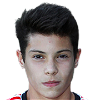
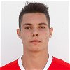
Filipe Soares - Submissions - Cut-Out Player Faces Megapack
83111342
Submitted
21 Jan 2024 20:30:33
Timeline
This image is part of a pack:
SLB U19 [Old Request]
This image is a response to
#167705
if Mons says thats not a better image then im going to cry!
ha ha!
Should have some shirt!
if Mons says thats not a better image then im going to cry!
ha ha!
You really should upload these as finished cuts, you know
Should have some shirt!
i disagree. i think cuts look better without shirts. just my opinion.
You really should upload these as finished cuts, you know
lol! im gunna hang up my 'scissors'!
yeah i had a brain fart! sorry!
i disagree. i think cuts look better without shirts. just my opinion.
Made one without once, Baja then told me it was necessary: "please before doing more cuts especially requests,visit this thread.You need to pay much more attention on hair details,all cuts must have a little bit shirt etc."
One of my first cuts on here: https://sortitoutsi.net/graphics/request/6917
yeah ive just read that thread. thanks for that. i have been cutting faces for a while now and it was just a bit of banter between myself and mons.
baja is very strict with his tastes. my advice would be to try and cut a few images out from very good sources to improve your technique. if you have a poor image to work with when starting out, it can end up looking shabby.
baja is very strict with his tastes. my advice would be to try and cut a few images out from very good sources to improve your technique. if you have a poor image to work with when starting out, it can end up looking shabby.
yeah ive just read that thread. thanks for that. i have been cutting faces for a while now and it was just a bit of banter between myself and mons.
baja is very strict with his tastes. my advice would be to try and cut a few images out from very good sources to improve your technique. if you have a poor image to work with when starting out, it can end up looking shabby.
That was 3 months ago, my technique is much improved with lots of hair detail and no snow.
There's a difference between

and


@Bothan Spy
This facepack style exists for about 10 years,and we agreed images should have a bit of shirt or collar included.That is the standard.
You might like shirtless images,but it's easier for you to get rid of collar or shirt after uploading them in standard style,than for other cutter to add it later.
This facepack style exists for about 10 years,and we agreed images should have a bit of shirt or collar included.That is the standard.
You might like shirtless images,but it's easier for you to get rid of collar or shirt after uploading them in standard style,than for other cutter to add it later.
i think hes just showing off... 
tbh, i prefer shirtless mainly because players can be transferred so having say a blue shirt when they have been bought by Liverpool would not look right. plus i think its best to get close to the chin as much as possible. but that's just my opinion...
tbh, i prefer shirtless mainly because players can be transferred so having say a blue shirt when they have been bought by Liverpool would not look right. plus i think its best to get close to the chin as much as possible. but that's just my opinion...
i think hes just showing off...
tbh, i prefer shirtless mainly because players can be transferred so having say a blue shirt when they have been bought by Liverpool would not look right. plus i think its best to get close to the chin as much as possible. but that's just my opinion...
Getting close to the chin shouldn't be a problem using to method
i don't know why you're looking to baja for inspiration, he cant cut around hair! lol! 
"Do as i say, not as i do!"
tbh, as long as the cut looks good, who really cares? i try my best although i am far from perfect. I quite like a few imperfections as it sometimes gives the cut a bit of personality. i enjoy helping folk give their players a face, even if im not the best cutter in the world. i run a shit out of date photoshop and the only work i regularly do on a computer is FM and porn watching.
i cut the image. if it looks good then great. i don't get too hung up on chins, shirts, warts, boils, etc. i have my preference and i appreciate it might not be too everybodies taste. a face is a face. if its clear and looks good then who gives a shit? @BajaHater @WorldEarl @mons @bakizp
perfection is for losers! ha ha. i maybe a bit eccentric, but i do my best.
@Bothan Spy, I for one appreciate your work and that of all the cutters. However, the standard cut should be 180x180 pixels, front-facing, contain as many hair details and as little snow as possible, have as little pixels above the head/hair and below the chin/beard as possible and also have a little bit of collar. This has been to standard for many years, so unless unavoidable, it would be preferable if all cuts abide to this standard so that MP cuts are as consistent across the board as possible 
This image is part of a pack:
Estoril [Old Request]
This image is part of a pack:
Pending improvement images mixpack 77 [12 images] [11.02] [Old Request Response]
This image is part of a pack:
Pending improvement images mixpack 77 [12 images] [11.02] [Old Request]
Source has been included in this mixpack round-up of uncut improvement requests.
This image is a response to
#227833
There's no any real difference.
sorry mate didn't mean to complete the request, just wanted to show you the cut I done to see what i can work on to get better
sorry mate didn't mean to complete the request, just wanted to show you the cut I done to see what i can work on to get better
The canvas size needs to be 250x250. There should be a little space beneath the chin, maybe 2-3 pixels, whereas you cut it just above the bottom of it. Ideally, the source could also have been rotated some 2 degrees clockwise before being cropped so that it's perfectly upright; you can usually tell this is the case when the tops of the ears are perfectly in-line.
Not bad at all, keep trying. Perhaps instead of uploading completed cuts, for now you can attach your work in the comments to see what could be improved

 Background and Stadium Packs


ha ha!