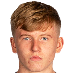
Josh Doig - Submissions - Cut-Out Player Faces Megapack
61093823
Submitted
06 Sep 2022 20:20:05
Timeline
This image is part of a pack:
Scottish_Premiership_new_pack_1 [Old Request]
Thanks - really appreciate that. I'd been wondering how to lose the annoying white edges 
Thanks - really appreciate that. I'd been wondering how to lose the annoying white edges
I've cut this one:

But the other one has had a good cut produced separately elsewhere, so I'm not going to re-cut. Both will be included in the upcoming 12.02 pack
This image is part of a pack:
Hibernian [Old Request Response]
This image is part of a pack:
Hibernian [Old Request]
Completed
by mons
on 29 Mar 2022 15:45:41
Rejected
by mons
on 13 Jul 2022 16:48:44
@tv_capper With the paper texture over the image I'm not sure if this would be an improvement - might be worth waiting for an official photoshoot to be released
This image is part of a pack:
Hellas Verona
Pending
by Belajariman
on 18 Aug 2022 16:45:11
In Progress
by Belajariman
on 18 Aug 2022 16:46:40
Completed
by Belajariman
on 30 Aug 2022 17:23:34
This image is a response to
#2345522
This image is part of a pack:
Hellas Verona
Pending
by Belajariman
on 30 Aug 2022 17:25:18
Completed
by mons
on 30 Aug 2022 17:29:44

 Background and Stadium Packs


Additionally, we prefer our cuts to be cropped much closer to the chin to ensure the focus is on the face. The usual guideline is that 2-3 pixels below the chin are sufficient.
The original source is at https://scottishschoolsfa.co.uk/wp-content/uploads/2018/12/JoshDoig-400x543.jpg. If you remove the -400x543 from the URL, you get a much larger version which will give a higher quality cut
To get a good cut, I would crop that one, to something like this, then put it through remove.bg. You’d get something like this:
The next step would be to put the collar a little bit higher as per the guidelines in the collar spoiler in this thread (not sure if a similar process can be done with paint.net), rotate it clockwise a degree or two, then crop it to 250x250
Give it a go with this one and also with your other cut if you can; will bring you much better results for relatively little extra work. Once you get used to it, this whole process can take a minute or two maximum per source image