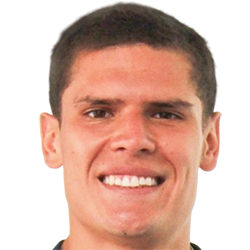
Sebastián Gonzáles - Submissions - Cut-Out Player Faces Megapack
77059843
Submitted
24 Aug 2023 11:42:18
Timeline
Media not found #243573
This image is a response to
#243572
This image is a response to
#243572
They can be 250x250? I thought all images should be 180x180, that's why I've always been doing them like that
They can be 250x250? I thought all images should be 180x180, that's why I've always been doing them like that
Ever since the start of 2018, we took a decision to start cutting sources in 250x250 whenever it was large enough to allow it
weeniehutjr's advice to rotate sources before cropping them is also worth keeping in mind. Cut-outs look much better in-game when they are horizontal rather than slanting to a side
Alright mate. Done!
Alright mate. Done!
Good work
Do keep in mind for the future that all cuts should include a little bit of collar to avoid the chicken-neck effect. At the same time, the ideal cut only contains 2-3 pixels beneath the chin. Since in some sources like this one, the person in the image may have a longer neck than usual, this would be quite difficult to achieve naturally. This video & this post display a simple technique of how to cut close to the chin and still display a bit of the collar
@Jose Moreno Mendoza, I've given it another go myself. I rotated it a little bit more and nudged the collar upwards. I also left a lot less space around the head so that the screen real estate is maximised


This image is part of a pack:
Alianza Lima
Pending
by Jose Moreno Mendoza
on 31 Mar 2021 06:04:26
Completed
by mons
on 31 Mar 2021 08:19:02
Rejected
by mons
on 31 Mar 2021 15:00:32
This image is part of a pack:
50 cuts mainly Alianza Lima
Pending
by Jan Edwinssen
on 20 Jun 2021 09:04:09
Completed
by mons
on 20 Jun 2021 09:34:28
This image is part of a pack:
Deportivo Coopsol
Completed
by NiceLad
on 23 Aug 2023 14:43:56

 Background and Stadium Packs


weeniehutjr