Stipe Biuk - Submissions - Cut-Out Player Faces Megapack
24060277
Submitted
15 Apr 2024 08:52:21
Timeline
This image is a response to
#265477
@JasonLFC10 See this post for getting the full-size images https://sortitoutsi.net/comments/get/456277
@RT7 Just wondering, what adjustments are you applying to the image apart from cropping/rotating? This cutout and this one both have something weird going on with colours/contrast compared to the source images, where the colours look muted "flattened", like in this cutout from two days ago I redid, but not quite as noticeable. I made an example below to show what I mean, on the right is your cutout and on the left is an edit I made, where I used some adjustment layers to try and fix the colours/contrast, but it still lacks some detail compared to the original image. Is it possibly that you're letting remove.bg resize the image for images larger than 500px*500px (0.25 megapixels)? When I first started using remove.bg I noticed that colours were sometimes edited in the resized version of large images, but not when I manually resized the image in Photoshop first.
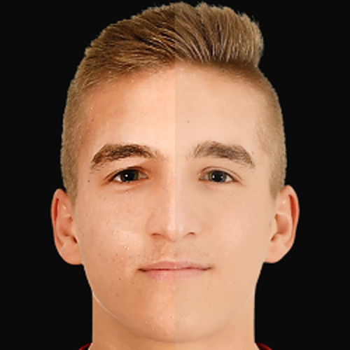
Here's the same comparison with the the original image (no colour correction) on the left and your cutout on the right
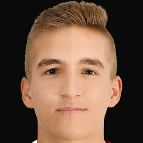

Here's the same comparison with the the original image (no colour correction) on the left and your cutout on the right

@RT7 Just wondering, what adjustments are you applying to the image apart from cropping/rotating? This cutout and this one both have something weird going on with colours/contrast compared to the source images, where the colours look muted "flattened", like in this cutout from two days ago I redid, but not quite as noticeable. I made an example below to show what I mean, on the right is your cutout and on the left is an edit I made, where I used some adjustment layers to try and fix the colours/contrast, but it still lacks some detail compared to the original image. Is it possibly that you're letting remove.bg resize the image for images larger than 500px*500px (0.25 megapixels)? When I first started using remove.bg I noticed that colours were sometimes edited in the resized version of large images, but not when I manually resized the image in Photoshop first.
Here's the same comparison with the the original image (no colour correction) on the left and your cutout on the right
A bit of highlights, because otherwise the images appear dark and grayish
A bit of highlights, because otherwise the images appear dark and grayish
And are you doing it with Photopea, or Photoshop/paint.NET/GIMP? There's probably a different adjustment that will get better results
And are you doing it with Photopea, or Photoshop/paint.NET/GIMP? There's probably a different adjustment that will get better results
I use https://pixlr.com/e/
Are you using the Highlights/Shadows tool with settings like this? That doesn't brighten the whole image, but just brightens the shadows to make them closer in brightness to the existing highlights and results in a faded image. Instead I'd recommend using either the Brightness/Contrast adjustment (settings of +10 Brightness +15 Contrast for this image look about right) or the Levels or Curves adjustments, and then the Vibrance adjustment if the image is still too grey or desaturated.
Here's my attempt to fix the contrast/colours btw @mons (not perfect, but quicker than cutting from scratch
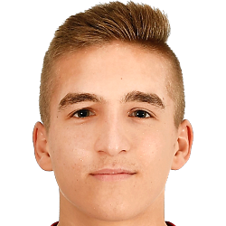
This image is part of a pack:
Croatia Missings & Renews Part 4
Pending
by BBB-Croatia
on 23 Feb 2021 15:54:36
Completed
by mons
on 23 Feb 2021 16:01:29
This image is part of a pack:
Hajduk Split Update
Pending
by BBB-Croatia
on 05 May 2022 18:50:03
Completed
by mons
on 06 May 2022 07:56:41
This image is part of a pack:
Request mixpack + fixes
Completed
by mons
on 06 May 2022 09:15:12
This image is part of a pack:
LAFC
Completed
by geordie1981
on 29 Mar 2023 08:52:10
This image is part of a pack:
Valla

 Background and Stadium Packs


Side Splitting Pass