sortitoutsi
Football Manager Graphics
- FM24 Graphics
- FM24 Player Faces
- FM24 Logos
- FM24 Kits
- FM24 Backgrounds
- FM24 Installation Instructions
Football Manager Guides Database
Football Manager Data Update
Football Manager Shortlists
- FM24/25 Update Guides
- FM24/25 Update Shortlists
- Best FM24/25 Update Wonderkids
- Cheap FM24/25 Update Wonderkids
- FM24/25 Update Young Players aged 21-25
- FM24/25 Update Best Free Players
- FM24/25 Update Expiring Contracts
- FM24/25 Update Bargain Players
- FM24/25 Update Injury Prone Players
- FM24/25 Update Richest Clubs
- Best FM24/25 Update Facilities
- FM24 Guides
- FM24 Shortlists
- Best FM24 Wonderkids
- Cheap FM24 Wonderkids
- FM24 Young Players aged 21-25
- FM24 Best Free Players
- FM24 Expiring Contracts
- FM24 Bargain Players
- FM24 Injury Prone Players
- FM24 Richest Clubs
- Best FM24 Facilities
This site is not endorsed by Sports Interactive or SEGA and is intended for entertainment purposes only. The views expressed on this site are the views of the individual contributors and not those of Sports Interactive or SEGA.

VP.
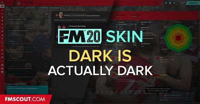
Big thanks to Wannachupbrew for allowing me to upload here
deacon87
jaorno11
stevemc
moonbeam
Unfortunately no. It was my favorite skin during the beta, but since the update from beta to full game, I've got several problems. The dark grey background appears instead of the match engine, but I also get this dark grey background instead of the manager appearance ("add manager" page or the manager in main menu), like this. Also dark grey background instead of the dressing room (for example during pre-match team talk) and board room.
moonbeam
Okay I've just used your W.I.P. base skin to enable custom backgrounds (found on SI's official forums), and now everything is much better for me. Finally I can see the board room, the dressing room, the manager in the start menu, the manager in the "add manager" page... although everything with that dark overlay that bothers also the 3D match engine. (Link with pic of example). A big step forward for me. Now I'll wait for the final solution, to get rid of this overlay.
stevemc
This is where I'm stuck now too...
Tommy Hughes
Hi! Is this the issue you're talking about?
https://community.sigames.com/topic/503221-fm20-urgent-changes-to-client-object-browser-and-add-manager/
wannachupbrew
Enos
wannachupbrew
It was on the beta. SI have changed the 3d backgrounds for the full release and it has stuffed things up a bit. I'm gonna have a look at it later and figure out a way around it.
stevemc
No I've tried that, there is still a cast over the 3D match engine - when trying to use background pictures on the menus.
This is the problem here; https://community.sigames.com/topic/503652-base-skin-with-background-pack-support-no-cast-on-3d-match-engine/
EDIT: Looks like it may have been solved? https://community.sigames.com/topic/503755-fm20skin-base-skin-with-backgrounds-support/
tdurb0
wannachupbrew
I'm away right now so I can't test it, but it *should* work. If someone can download the new version and confirm for me that would be great.
tonitche
Yes it works now, many thanks !
darkhell26
It works! Thanks alot!
Grimnir
@VP. you may want to check I have done this correctly!
robygn63
In this skin is there istant result button ?
wannachupbrew
Yes
tonskudaigle
Would it be possible to have a bit more details in the club info view? I really miss the simple club details view where you can quickly see the following info in condensed space:
- league playing in + country
- position
- media prediction
- year founded
- professional status
- finances (rich/secure etc)
- national reputation
- estimated value
- youth and training facilities levels
- average attendance
fmilln7