Dear all
This is FLUTSKIN version 6.0 for FM22!!
Ten years (!!!!) after start editing the Flutskin I would like to give a great thank you to all FM fans who choose to play with FLUTSKIN and always keep me motivated to still editing the skin and gave me new ideas!!!
A special thank you to all of players who decided to distinguish my work with a donation!! Although just a small part of FM Players who use the skin made a donation (I edited the skin as a hobby and, as you know, completely free), I always feel honoured and happy when people recognize the work done and decide to contribute. So, I reinforce, I have to give a special thank you to that friends of FlutsKin!!!!!!
Also a thank you to all the skin makers who indirectly contribute to my work, and a special thank you to PATRES10, from fmslovakia for the 2D default kits (especially tailor-made for FlutSkin), to MICHAEL MURRAY since I started editing the match inbetween highlights panel based on his amazing work, to QVORDRUP, for the metallic “Round country flags” and his great collaboration in the “country locator maps”, to NUNO KOPIO for the “Square shiny flags” I included as alt files (for using as an alternative to the “Round country flags”) and to DAZS8 for his great work in the addons for Flutskin.
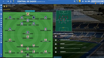
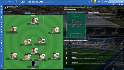
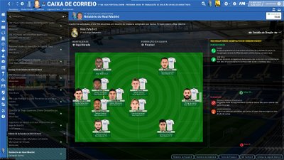
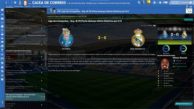
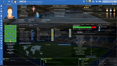
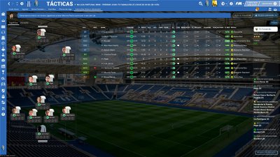
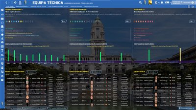
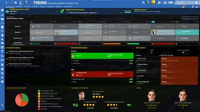
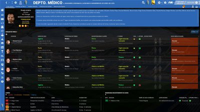
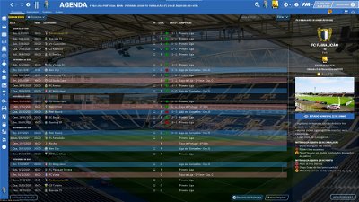
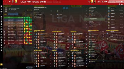
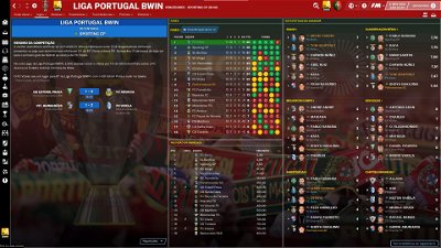
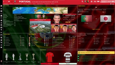
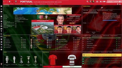
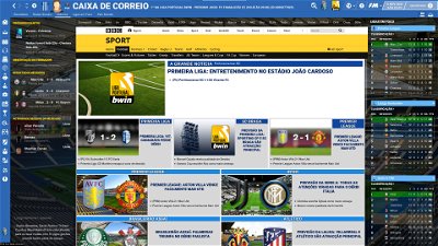
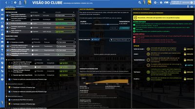
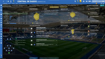
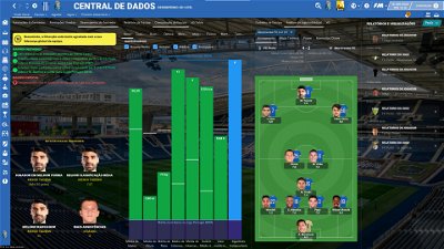
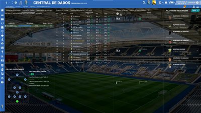
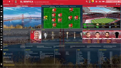
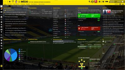
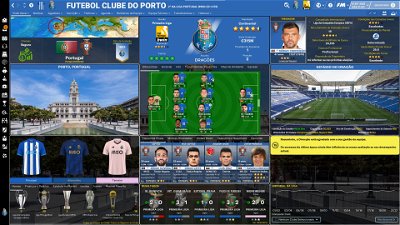
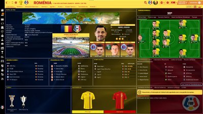
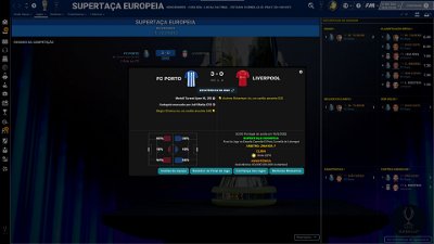
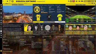
This FLUTSKIN for FM22 is almost equal to the last version of Flutskin for FM21. Therefore, you can find so many changes comparing to the default skin that I can’t present them here. I suggest you to see with your eyes all the changes!!
Main changes in 6.0 of FLUTSKIN:
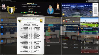
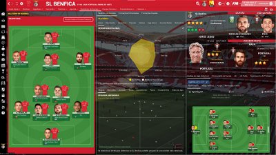
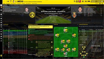
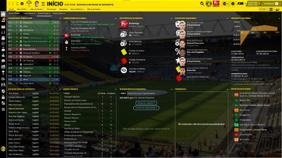
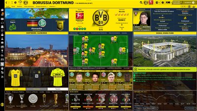
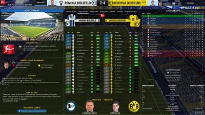
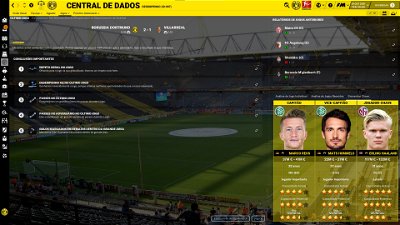
- Home panel (individual match analysis included)
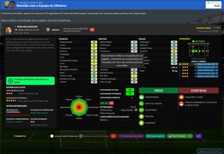
- Player popup panel (information about media handling style and personality included)
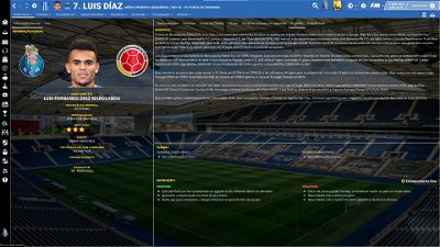
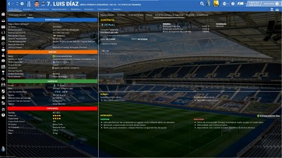
- Player profile panel (drop down arrow with two profile styles included; profile 1 as it was in version 5.0; profile 2 with the front and back kits instead of the attributes analyser)
The pack includes many alt files for customize the skin (please read the read me file included in the pack) and several tutorials: 1) how should be the configs for the stadiums packs; 2) how can you adjust the size and the place of the kit number in player overview panel; 3) how can you do the 2D kits adapted for Flutskin. BEFORE ASKING QUESTIONS OR REQUESTS, PLEASE TAKE A LOOK AT THE ALT FOLDERS AND ALSO AT THE READ ME AND TUTORIAL FILES!!
You can also can download the FlutSkin v. 3.0 for 3440x1440 adapted by NOLEAFWILEN and the FlutSkin v 6.0 with hidden attributes, adapted by RICHBELL. Thank you, my friends!
Main changes in 5.0 of FLUTSKIN:
-New Home panel (now you can easily look at all the information navigatin among 4 different tabs)
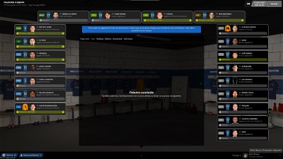
-Match inbetween highlights panel tweaked (manager picture and team logo in the formation panels included)
-Full match review panel tweaked (manager pictures included in the tab)
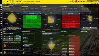
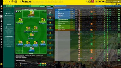
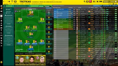
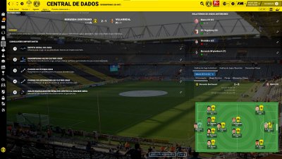
-Tactics overview panel and data hub match overview tweaked (three tabs included)
-Mentoring popup add players tweaked (many new columns included)
-Some tweaks in social group detailed description
-Finally the percentage graph (sharpness/physical) in the match players bar widget is working perfectly, changing continuously.
This version 4.0 of FLUTSKIN includes a few changes, only. Here are the main changes:
-Match players bar widget ("New" layout, with position colours and nation flags included)
-Math full review (new tab including player ratings included in the central box of the panel)
-New alt folder for those who prefer play the game with some special backgrounds in some panels (tunnel, press conference, briefing, medical centre, training, board room, dressingroom,…).
-Bugs fixed and small tweaks here and there
Main changes in FLUTSKIN 3.0 (you can check the changes in the screenshots)
-Human manager (last starting XI included)
-Subs popup panel in the match (player pictures included)
-Match panel (5 last minutes possession bar included - alternating with the commentary bar; match timeline bar/events included)
-"New" match titlebar (added some new information, including the referee with the picture; match scoreboard centred in the screen; transparency in all the panels, except the match scoreboard included; the bar height was also increased a little)
-Bugs fixed and some tweaks here and there
Main changes in FLUTSKIN 2.0 (you can check the changes in the screenshots)
-Club Overview panel tweaked ("new" results box and player value included in the key players box)
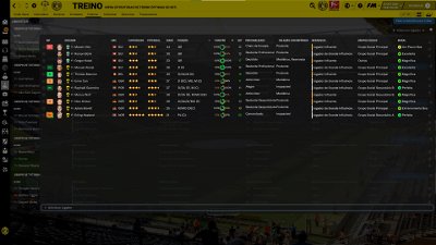
-Inbox training focus tweaked
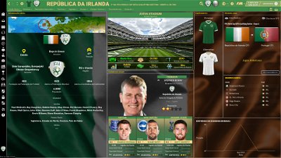
-Last starting eleven included in the nation overview panel
-New match bar widget (buttons directly accessing substitutions and opponent instructions included; bigger kits without be covered by the player picture included)
-New instant result panel (new buttons to access much more information; new information included and bigger kits included)
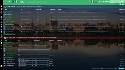
-Staff changes panel tweaked
-Missing transfer deadline day button in titlebar was included
-Other small tweaks and bugs fixed
Main changes in FLUTSKIN 1.0 (you can check the changes in the screenshots)
-Club overview panel (last starting XI included)
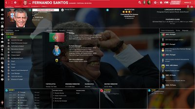
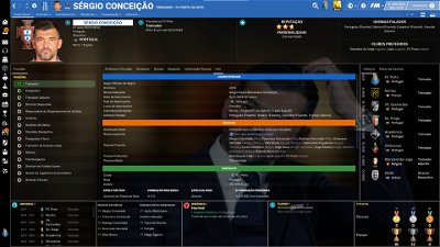
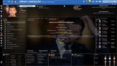
-Human profile and non player profile (new information included in new tabs)
-Small caption tweaked (picture of the player who scored a goal enlarged)
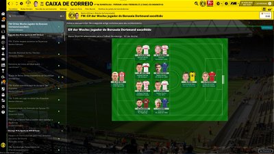
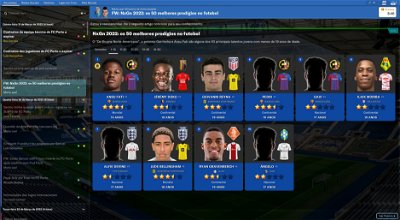
-Various inbox panels changed (50 best wonderkids of the year and several scout reports)
-Bugs fixed and other tweaks here and there
The pack also includes many alt files for customize the skin and several tutorials: 1) how should be the configs for the stadiums packs; 2) how can you adjust the size and the place of the kit number in player overview panel; 3) how can you do the 2D kits adapted for Flutskin
Main changes in FLUTSKIN BETA 2 (you can check the changes in the screenshots)
-“New” overall club panel (layout tweaked and a new tabbed container included with more information and, in particular the LAST STARTING ELEVEN)
-New Data HUB (totally renewed with for panels and three tabbed containers with much more information)
-Human profile and Manager Profile with a new tab containing the honours of the manager, organized by club/nation)
-Player attributes panel with a new right bottom box, replacing the older which doesn't work)
-Country locators updated (thank you QVORDRUP!!!)
-Bugs fixed
You can download the 2D packs prepared for Flutskin (titlebar and player overview panel) here in sourtitoutsi. FC style kits https://sortitoutsi.net/content/44727/2d-kits-1819-for-flutskin-titlebarplayer-overview-v10 SS Kits style https://sortitoutsi.net/content/57825/ss-kits-as-logo-left-for-flut-skin
If you prefer SS'kits as default kits, you can download this and replace the kits folder located here: Documents\Sports Interactive\Football Manager 2022\skins\fm2022flutskin_dark\graphics\pictures\kits
HERE
However, if you prefer edit your own kits, I also included in the pack a .pdf file explaining how you can edit the kits for Flutskin.
The logos in country locators are now updated by QVORDRUP according the last version of metallic logos.
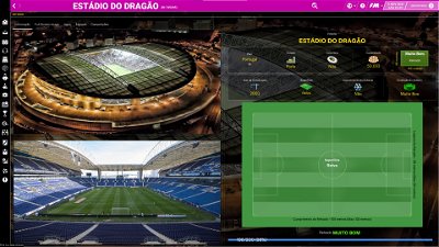
You can also download the stadiums background megapack and the citypics released by @[DazS8] https://sortitoutsi.net/forums/topic/44650/city-pictures-mega-pack and https://www.fmscout.com/a-fm20-stadiums-megapack-flut.html#c47975
And @[geordie1981] has made a pack for inside "small" stadiums https://sortitoutsi.net/downloads/view/45950/fmt-stadium-superpack
You can also download the sortitoutsi Backgrounds Megapack https://sortitoutsi.net/graphics/style/17/sortitoutsi-backgrounds-megapack
As always FlutSkin is completely free to download and I hope you enjoy it. However, if you want, you can reward my work donating whatever amount you wish. Any small amount is really appreciated.
You can donate by clicking here:
https://www.paypal.com/donate/?cmd=_s-xclick&hosted_button_id=E9P4RXKNQBQBS
THE SKIN IS TOTALLY COMPATIBLE WITH 1920x1080 SCREEN RESOLUTION AND 4k (windows display settings 200%; game 100%).
YOU SHOULD USE IT IN FULL WINDOWS, ICONS ONLY
Important note regarding TV LOGOS:
Although the default tv logo is the one I use, of course you can easily change it; for that you just have to go to skin/graphics/icons/tv logos. In that folder there is a alt folder with many TV logos. You just have to replace the tv logo.png and the tv [email protected] for that one you want. Of course you should rename the new logos as tv logo and tv logo@2x. You also can use other logos made by you. The procedure to use them is exactly the same. However, I should remember that yo should use logos with the right height. For tv logo you should use 25px and for the @2x you should use 50px.
Important note regarding kit number and name in the player overview panel:
Since many people asked about the adjustments in the number and name in the kits (in player overview panel), and also since I already answered that many many times, I decided to make my “job” easier, avoiding answering that question again, and again and again 🙂.
Thus I did a tutorial which is included in the skin pack.
Resolution requirements:
This skin was made to work properly in 3840x2160 (4K with windows display settings 200%) and also 1920x1080 (1080p) full screen mode, sidebar icons only. As a result, some panels won’t work properly in other resolutions.
[b]How to add Flut Skin in FM22[/b]
Download and extract the .rar file (using either 7-Zip for Windows or The Unarchiver for Mac).
Place the "fm2022flutskin_dark" folder here:
Documents\Sports Interactive\Football Manager 2022\skins
[*] Create the folder "skins" if it doesn't exist.
[*] Start FM22 and go to Preferences screen and then into the Interface tab.
[*] You should see FM 2021 Flut Skin dark - 5.0 as an option in the skin drop down of the Overview box.
[*] Hit the Confirm button.
Please note this skin is provided as is. It has nothing to do with Sports Interactive or SEGA and won't be supported by them.
Comments
You'll need to Login to comment

Stefaan78
Dear Flut, a small question about stats colours for players, I prefer to play with my own colour scheme but when I change colours in the preferences (change colours for the actual skin), they only occur in staff stats but not players stats? Those stay in the color scheme chosen by you.
Can you please advise me? Thank you in advance.
flut
Hi 🙂
What colours do you want to change? The colours of the background attributes boxes?
If so, go to settings.xml and change them in the following piece of code (after the changes don't forget to reload the game).
<colour name="unknown attribute background" red="146" green="82" blue="143"/>
<colour name="low attribute background" red="247" green="121" blue="121"/>
<colour name="normal attribute background" red="245" green="245" blue="85"/>
<colour name="good attribute background" value="green 200" />
<colour name="excellent attribute background" value="green" />
Stefaan78
Yes indeed I want to change the background colours of the attribute boxes 🙂 Thank you very much.
I always play with red for best attributes, green for good attributes, yellow for medium attributes and blue for weak.
I've tried to play with your colours but after all those years it's hard to adapt my mind LOL
I'm going to do it right away!
All the best and thanks again for your work.
Hello, the Flut Skin did not use the Feature for Inbox Media Graphics? right?
now, i saw in other Skin, that they include real media Graphics in inbox panel, so that example to play with spanish teams, you have inbox real media graphics like marca and then some more real media partners or the newspaper who are in spanish…
thanks for including in next flut skin Update, if you can and want. 😊⚽
more Example: (for Germany)
Sky Sport Bundesliga HD Graphic + Transfermarkt.de Homepage Graphic + Kicker Homepage Graphic + from the Club you play the Web Service Graphic…..
…\Documents\Sports Interactive\Football Manager 2022\skins\fm2022flutskin_dark\graphics\boxes\custom\inbox
inbox.png
inbox1.png
inbox2png
inbox3.png
inbox.xml
+ can you include in 3d match, a timeline ?
so then we can select example to see, the replays for getting cards because in the normal replay settings it is not possible to show replay for cards..
Thanks !!!!
Edit: in the Screesnhot i put the Timeline Idea to the green marked place. possible?
+
can you set the Scoreboard litle bit bigger? i mean, put the line wider + wider downwards.
at the moment the whole thing seems a bit trapped and squeezed
Edit:
+ Substitutions in 3dmatch: missing Player faces - can you include that?
Edit: with your Skin i have not 3 kits in the menue, just 2
example Barcelona, three kits in kits folder, but ingame just 2 of them showing - not the 3rd KIt
thanks for Fix, if you can fix that.
flut
Hi
Is correct. the skin didn't use them and I don't know that option. Could you please show me screenshots?
flut
I don't know (yet) how include the timeline (I couldn't find the xml responsible for that…).
Regarding the other questions:
@flut two Screenshots for you.
Scoreboard Screen: Scoreboard: Can you make the Panel wider/bigger to the right side + bigger to downwards side + the Logo rigth Side bigger Style
Scoreboard Screen: Subs: i mean the Subs in the Place at the bottom middle - here are no Player faces, just only the Names, when i change the Players…
Inbox Graphics: this is a Screen from other User (@Sh@rk ) who has that include in his Skin ( not Flut Skin). maybe he can help you with Infos..😊
Timeline: i read in forum, i am not sure if this forum or the other forum (sigames.com) that other Skin Creator include Timeline in 3d Match. I hope you find that or anybody can help with Infos, like @gimn85 😊
flut
Hi
I already changed the match titlebar, increasing the height (see screenshot).
Regarding the inbox I took a look on you screenshot but I don't like the effect. Sorry. Thus, I will not include it.
Regarding the player pics on the small caption of subs, I really don't know how to do it since I already tried but without success.
did i use older Skin of you? or do you use other match titlebar as i do?
= i use FLUTSKIN_FM22_V2 (put the Folder “fm2022flutskin_dark” into skin Folder)
match titlebar: can you use the full lengh of the titlebar to show the Scoreboard?
+ make the match titlebar a little bit bigger downside
= then the long Clubnames looks better/smoother, i think.
or alternativ: set the match titlebar ( i mean in that bar the part of Club KIt / Club Name and the Result = in then Middle/central of the match titlebar
here example what i mean.(Screenshot)
** i like the full match titelbar Idea totally… i hope you set your Idea of match titlebar ( Club KIt then Full Club Name) to full match titlebar. 🙏🙏🙏
..
inbox Graphics: no Problem 😊
..
Timeline: we will see… 😊
flut
Hi all
As last year, Richbell adapted the FlutSkin for those who prefer playing with hidden attributes. Thank you, my friend!
Therefore, now you can download that adapted version!!
Rich B
Thanks for adding this to your skin files. Must say I am buzzing with it. And I didn’t have to ask you soooo many questions this time haha.
Have a happy new year matey
@flut
https://s20.directupload.net/images/211229/bkerbf75.png
…\Documents\Sports Interactive\Football Manager 2022\skins\fm2022flutskin_dark\panels\match\match title bar.xml
in Line 5 i changed to. <container height="110">
now, ingame the match title is for me better. “but" which file/bar is for the Background of the match title bar? you can see in the Screen, that the bar, i also want to make bigger, so that background and match title bar are fine compatible and the background is full over that Place.. Thanks for Helping !!! 🙏
flut
There is several files you should edit (xmls and also graphics .png). Thus, is not easy to explain how you should do. In the next release the match titlebar will have 60 (instead of 40, but not 110). If we use more space in the height, the panels of match inbetween highlights will be smaller and that is not ok. Also if we use all the horizontal space in the match titlebar, the panel for “Waiting for next highlight...” will not be displayed and (worst), when you go to review the incidents of a played match, the timeline will also not be displayed……
+ left side, the Wheater Infos much better so read/see
+ he has a timeline, i think, under the central Scoreboard, i love it.
= this match titlebar is in the Skin “[FM22] Cat 22 Skin - English Version” - i hope you take a lot at that - amazing Idea for match titlebar, i think…
Edit: play fm22 with the Flut skin + that Inew dea of match titlebar - amazing !!!
= Idea: change the Background Colours in the match titlebar ( where you can see the Team Name and Logo) to the Team Colour and not, just now: in grey / dark grey
Jonfun
Joyboy
My laptop has a 1920 x 1080 resolution, which version would be best to download?
Joyboy
I would also like to play in windowed mode. 🙂
flut
Hi all
I tweaked the match titlebar (now a little bit higher and wider) and included the graph for “last 5 minutes” which alternate with the comments, and also included the match time slide bar (now we can follow the timeline of the match). Here is a screenshot.
flut
Please read the pdf I included explaining how you can fix that problem.
flut
The “normal” flutskin. However, if you will play in windowed mode maybe some panels will not completely adjusted since the skin works well in full window, icons only.
Joyboy
Thanks Flut.
i love it. ❣️❣️❣️
Thanks !!!
🎮🎮⚽⚽⚽😊
flut
HI and happy new year
💖 Thanks @flut - i edit my PC new with other System Software. Now i finished and i want to install fm22 and many stuff and then want to continue my FM22 Save. “but” first" i want to use your newest Skin Version. So, i wait, till you release the new Skin Version. 😊 Cheers
StatboyVT
Thanks to you both, I love this addition.
Quick question: is there a way to make the current ability numerical rating in the player info screen go away? I really need a way to keep myself from cheating, haha.
flut
Hi all
Now you can download the FlutSkin v3.0.
Happy new year to all!!
💖💖💖
Happy New year to you pal
McG84
Well done Flut once again 👏👏👏