
Gavin Brown - Submissions - Cut-Out Player Faces Megapack
90092353 Background and Stadium Packs

Submitted
29 Oct 2019 04:46:08
Timeline


This image is a response to
#233719
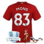
@Bothan Spy just so you're aware, a lot of the cuts you upload are darker than the original source image (and I think less saturated). This one is particularly noticeable. Might be a good idea to use a brightness/saturation adjustment layer or check your colour settings on your image editor
im slightly colour blind. so im sorry about that. ive realised it is an issue.
i think i may have to stop cutting. i didn't realise it was so bad
im slightly colour blind. so im sorry about that. ive realised it is an issue.
i think i may have to stop cutting. i didn't realise it was so bad
As far as the cutting goes, there's nothing wrong with the cutout you uploaded, it's just dark/underexposed and colour balance is too red/not enough green. The colour issue's nothing too extreme (I can get it looking more natural with some adjustment layers experimentation), just something I thought you should be aware of.
If you're using Photoshop can you post your colour settings (Shift+Ctrl+K shortcut for Ps, I don't know if it's different for other image editors)? It might be that something is a wrong setting there. Alternatively it might be that you applied an adjustment layer instead, if so could you say which ones you used?
In the meantime perhaps leaving colour-correction to @mons if he feels it's necessary would be a good idea? (Sorry to suggest adding to your workload mons
 )
)
As far as the cutting goes, there's nothing wrong with the cutout you uploaded, it's just dark/underexposed and colour balance is too red/not enough green. The colour issue's nothing too extreme (I can get it looking more natural with some adjustment layers experimentation), just something I thought you should be aware of.
If you're using Photoshop can you post your colour settings (Shift+Ctrl+K shortcut for Ps, I don't know if it's different for other image editors)? It might be that something is a wrong setting there. Alternatively it might be that you applied an adjustment layer instead, if so could you say which ones you used?
In the meantime perhaps leaving colour-correction to @mons if he feels it's necessary would be a good idea? (Sorry to suggest adding to your workload mons
It's something I do all the time already, and have done for many many years, rest assured
 . I actually brought it to Bothan Spy's attention via PM, but it's really nothing particularly major. I'd go as far as saying it could be down to personal preference, but I prefer to brighten them up a little bit when compared to this one, but again it's no biggie
weeniehutjr