Jack Baldwin - Submissions - Cut-Out Player Faces Megapack
29036679
Submitted
01 Sep 2024 22:20:30
Timeline
This image is part of a pack:
New & Improvement Mix 5 [Old Pack Submission]
This image is a response to
#178618
This image is part of a pack:
Sunderland [Old Request]
This image is part of a pack:
Sunderland [Old Request Response]
This image is part of a pack:
Sunderland [Old Request Response]
This image is part of a pack:
Sunderland Part 2 [Old Request]
This image is part of a pack:
Bristol Rovers 2020/21
Pending
by JoeMoon1506
on 08 Dec 2020 11:55:24
Completed
by mons
on 09 Dec 2020 08:56:48
This image is part of a pack:
Ross County
Completed
by NiceLad
on 07 Dec 2023 17:50:28
This image is part of a pack:
Northampton 24-25
This image is part of a pack:
Northampton 24-25

 Background and Stadium Packs


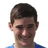
Firstly, you only need to leave 2 or 3 pixels of space above the head - in this example you're leaving too much space. By leaving only a few pixels of space, the size of the face in the cutout becomes larger which looks better in-game.
The same goes for the space below the chin, which only needs to be a few pixels as well. Remember that all cutouts should include some of the collar too - in the cases where cropping closer to the chin would remove the collar, you can follow this guide to easily move the collar up towards the chin.
Finally, in some of the cutouts, the player's head is also tilted at an angle. You can use the crop/rotate tool to rotate the images a few degrees (in this case around five degrees clockwise) so that it's upright instead. If you're not sure how to do that there's a guide here or here if you don't use Photoshop