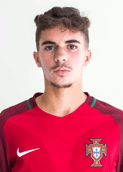
Vitinha - Submissions - Cut-Out Player Faces Megapack
83174762
Submitted
07 Jul 2024 17:40:28
Timeline
This image is part of a pack:
Portugal Mixpack 35 [Old Request Response]
This image is a response to
#162571
This image is part of a pack:
Portugal Mixpack 52 [Old Request Response]
This image is part of a pack:
FC Porto [Old Request]
This image is part of a pack:
FC Porto [Old Request Response]
This image is a response to
#253992
This image is a response to
#268556
Better?
improvement? he looks very similar to current image
@SimaoEsteves If you want a more recent picture in your game you can use this one: https://sortitoutsi.net/graphics/request/65930
As far as cutting out images goes, you still need to improve your cutting technique: Your cutout is blurry whereas the source you requested, even though it's still large enough not to have a blurry cutout. Additionally as it's only 180px that wouldn't be enough to be an improvement. Remember to follow the advice you've been given, because you seem to be making the same mistakes as before.
@mons Was the request I linked missed or just not an improvement? The image quality is obviously not quite as good as the current cutout.
@SimaoEsteves If you want a more recent picture in your game you can use this one: https://sortitoutsi.net/graphics/request/65930
As far as cutting out images goes, you still need to improve your cutting technique: Your cutout is blurry whereas the source you requested, even though it's still large enough not to have a blurry cutout. Additionally as it's only 180px that wouldn't be enough to be an improvement. Remember to follow the advice you've been given, because you seem to be making the same mistakes as before.
@mons Was the request I linked missed or just not an improvement? The image quality is obviously not quite as good as the current cutout.
In this case, I felt it didn't have the necessary quality to be an improvement. Nothing wrong with the cut itself, but the source wasn't the best.
This image is part of a pack:
Portugal u-21 [Old Request Response]
This image is part of a pack:
Premier League Leaguepack 2020/21 [Old Request Response]
This image is part of a pack:
Porto
Pending
by Belajariman
on 11 Sep 2021 19:09:00
Completed
by mons
on 12 Sep 2021 06:47:26
This image is part of a pack:
Paris Saint-Germain
Completed
by HRiddick
on 06 Sep 2022 18:12:42
This image is part of a pack:
Portugal - World Cup 2022
This image is a response to
#2424034
This image is part of a pack:
Portugal - World Cup 2022
Completed
by HRiddick
on 23 Nov 2022 21:15:01
This image is part of a pack:
PSG missing
Pending
by TheTongPro
on 14 Mar 2024 15:58:56
In Progress
by TheTongPro
on 21 Mar 2024 14:30:04
Completed
by mons
on 21 Mar 2024 17:00:10

 Background and Stadium Packs












mons